Abstract art is not one visual language but a cluster of related approaches, from disciplined geometry to sweeping gesture and immersive fields of color. In this guide, I break down the main styles, explain how they differ, and show what to watch for when you are looking at a painting, comparing movements, or evaluating an artwork for a collection.
The main families of abstraction are easier to read once you sort them by structure and surface
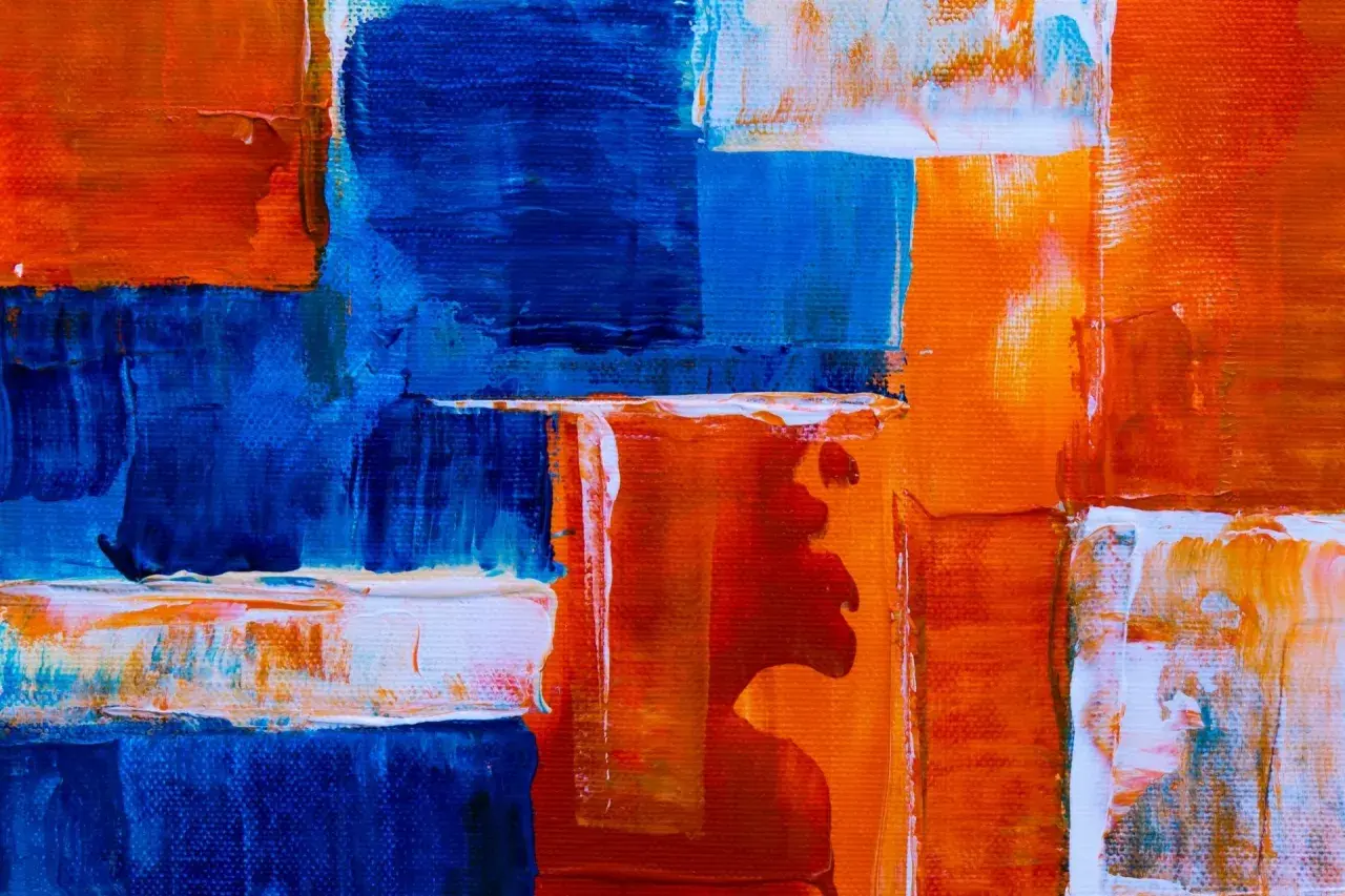
- Geometric and hard-edge works rely on clean shapes, sharp transitions, and controlled composition.
- Gestural, action-based, and lyrical works emphasize movement, brushwork, and emotional energy.
- Color field painting uses broad areas of color to create scale, atmosphere, and quiet intensity.
- Minimal abstraction strips the image down to essentials, leaving proportion, spacing, and material presence to do the work.
- Labels often overlap, so the best reading comes from looking at technique, not just the title.
- For collectors and conservators, surface condition, support, and provenance matter as much as style.
How abstract art is organized in practice
I find it most useful to treat abstraction as an umbrella category. Some works still allude to landscape, figure, or object; others refuse reference almost completely and stay non-objective. The difference matters, but it is not a strict wall. A painting can be geometric and minimal at the same time, or gestural and color-driven, which is why art historians and dealers usually describe abstraction by its dominant logic rather than by a single label.
That logic usually comes down to a few recurring priorities: line, shape, color, motion, surface, or reduction. If the work is built from measured forms, it points toward geometric abstraction. If the artist’s hand is visible in drips, sweeps, or bursts, the work leans expressive. If the image becomes mostly atmosphere or a sustained zone of color, the focus shifts again. Abstraction is not one style; it is a set of decisions about what the artist wants the viewer to notice first.
Once you look at it that way, the major families become much easier to separate.

The major styles most viewers mean when they talk about abstraction
| Style | What it usually looks like | What the style emphasizes | How I read it |
|---|---|---|---|
| Geometric abstraction | Squares, circles, grids, triangles, and interlocking forms with a clear structure | Order, proportion, and visual logic | I look for planning, balance, and whether the composition feels built rather than improvised |
| Hard-edge painting | Flat color zones divided by crisp, clean borders | Clarity and precision | I check for sharp transitions, taped edges, and a controlled surface with little visible brushwork |
| Gestural or action painting | Drips, arcs, slashes, and dense layers of energetic marks | Movement and physical process | I ask whether the painting records the artist’s body in motion |
| Color field painting | Large areas of open, luminous, or stained color with minimal incident | Atmosphere, scale, and immersion | I read the work as a sustained color experience rather than a picture of something |
| Lyrical abstraction | Fluid lines, soft transitions, and painterly rhythm | Spontaneity and emotional fluency | I look for a looser, more poetic handling of paint |
| Minimal abstraction | Few forms, restrained palettes, and plenty of negative space | Reduction and presence | I pay attention to spacing, material, and how little the artist uses to do a lot |
| Op art | Optical vibration, pattern, and visual instability | Perception itself | I ask how the image affects the eye, not just what the image contains |
If you remember only one thing from this section, let it be this: geometry organizes space, gesture records action, color field expands experience, and minimalism removes almost everything except essentials. That distinction will help in the gallery and in the archive.
How to read an abstract work in under a minute
When I am looking at an unfamiliar abstraction, I start with four questions. Is the structure planned or improvised? Are the edges sharp or soft? Does the surface feel painted, poured, scraped, or stained? And is the work asking for close inspection or for a wide, immersive view? Those answers usually tell me more than the title does.
- Look at the edges first. Clean borders suggest control; softened or bleeding edges suggest a more fluid process.
- Check the surface. Thick impasto, visible drips, and layered texture point to gestural work; thin stains or wash-like fields point elsewhere.
- Notice repetition. Grids, repeated blocks, or consistent intervals often belong to geometric or minimal abstraction.
- Judge the scale of the experience. If the painting seems to envelop you, color field thinking may be at work. If it feels like a record of motion, the artist is probably privileging the act of painting.
- Ask what is being reduced. Some artists reduce subject matter, some reduce color, and some reduce form itself.
This is where many viewers get tripped up. Two paintings can both be abstract, but one may behave like architecture and the other like weather. If you can tell those apart, you are already reading with more precision than most casual labels allow. That distinction becomes even more important once you look at the history behind the styles.
Why the American postwar context matters
In the United States, abstraction took on unusual force after World War II, especially in New York. Abstract Expressionism made scale, spontaneity, and the artist’s gesture feel central to modern painting. That same broad movement later split into different directions, including color field painting and more physically aggressive action painting. In practical terms, the divide is simple: one side pushes toward expressive event, while the other pushes toward sustained visual atmosphere.
Hard-edge painting developed partly as a response to that loose energy. It favored cleaner divisions, flatter color, and a more impersonal finish. Minimalism went further by stripping away expressive excess and insisting on objecthood, proportion, and material presence. What ties these developments together is not sameness, but a shared refusal of traditional representation.
I also think it helps to keep the international background in view. Kandinsky, Mondrian, Malevich, and broader European modernism all helped build the language of abstraction before the American postwar scene amplified it. So when someone talks about the history of abstract painting in the U.S., they are really talking about one powerful chapter in a much larger story. The styles are easier to appreciate when you see how they answer one another.
What preservation and authentication questions change from one style to another
For a site that cares about fine art preservation and authentication, abstraction is especially interesting because the evidence often lives in the surface. In representational art, a forgery may fail because the anatomy is wrong. In abstract art, the issue is usually subtler: the support, the paint handling, the scale, and the rhythm of the marks have to fit the artist’s known practice. That makes technique and provenance unusually important.
Different styles also age differently. Thickly built gestural works can crack, blister, or lose cohesion if the layers move at different rates. Color field paintings, especially those built with stains or thin washes, can be vulnerable to fading and abrasion because the surface is so quiet and open. Hard-edge works often reveal every conservation intervention, because a slightly altered edge or an overcleaned plane is immediately visible. Minimal works can be even less forgiving; a tiny defect can disrupt the whole balance.
When I evaluate an abstract work, I pay attention to whether the surface still tells the same story the artist intended. On a geometric work, the question is alignment. On a gestural work, it is vitality. On a color field work, it is atmospheric depth. On a minimal work, it is restraint without deadness. That is a useful way to think about both condition and authenticity.
Provenance matters here too, especially when the object offers few figurative clues. Exhibition history, studio documentation, material consistency, and period-specific supports can matter more than a dramatic visual first impression. Abstract art rewards close looking, but it also punishes lazy certainty.What I would remember before assigning a label
The best way to talk about abstraction is to stay specific. Instead of saying a work is simply “abstract,” I ask what is dominating the composition, what process produced it, and what kind of viewing it asks for. That keeps the description useful rather than vague, which is exactly what a collector, student, or cataloguer needs.
- Structure tells you whether the work is geometric, hard-edge, or minimal.
- Gesture tells you whether the work is closer to action painting or lyrical abstraction.
- Color tells you whether the artist is building atmosphere, contrast, or optical pressure.
- Surface tells you how the work was made and how it should be preserved.
- Provenance tells you whether the object fits the artist’s known period, materials, and practice.
Once you can separate structure, gesture, color, and reduction, the types of abstract art stop looking interchangeable. You start seeing them as different solutions to the same problem, which is how to make painting carry feeling, order, and meaning without leaning on recognizable objects.