Illusion-based art has always been more than a visual stunt, because the best examples make the viewer question how depth, matter, and movement are read in the first place. In optical illusions art, surface, viewpoint, and composition work together, which is why the style keeps returning in painting, mural work, and contemporary installation. I will map the main movements, explain the mechanics behind the effect, and show why conservation and authentication matter so much for these works.
The clearest way to read illusionistic art is by style, technique, and viewing distance.
- This is not one single movement. It is a family of approaches, from trompe-l'oeil to Op Art and anamorphosis.
- Op Art is built from geometry, repetition, and contrast, while trompe-l'oeil depends on convincing realism.
- In the United States, 19th-century still-life painters and 1960s Op Art are the two historical anchors most readers should know.
- Some works need one exact viewing angle, while others change as you move around them.
- Condition matters. Faded color, dirty varnish, or poor lighting can weaken the illusion fast.
- The strongest pieces do more than fool the eye. They use the trick to sharpen an idea about perception itself.
What makes an image feel physically unstable
At its core, illusionistic art exploits a mismatch between what the eye receives and what the brain expects. The image may be flat, but the viewer reads it as deep, tilted, vibrating, or even moving because the artist has controlled the signals that usually tell us where a surface ends and space begins. That is why the genre can feel theatrical without becoming shallow.
What I find most useful is to separate the effect into two jobs. One job is to imitate reality closely enough that the viewer trusts the image. The other is to disturb that trust just enough that the viewer notices perception itself. That distinction matters, because the genre is at its strongest when the image is doing more than merely copying reality.
Once you see that split, the major styles become easier to sort. Some aim for deception, some for optical vibration, and some for impossible space, which is exactly where the history gets interesting.
The main styles behind the illusion
I usually group the field into five strands. They overlap, but each one asks a different question of the viewer.
| Style | Core strategy | What the viewer experiences | Historic pressure point | Main limitation |
|---|---|---|---|---|
| Trompe-l'oeil | Hyper-realistic imitation of objects, paper, fabric, or architectural detail | The surface seems to extend beyond itself | Ancient precedents, 17th-century Europe, and a strong 19th-century American still-life tradition | It can feel empty if technical finish is not matched by concept |
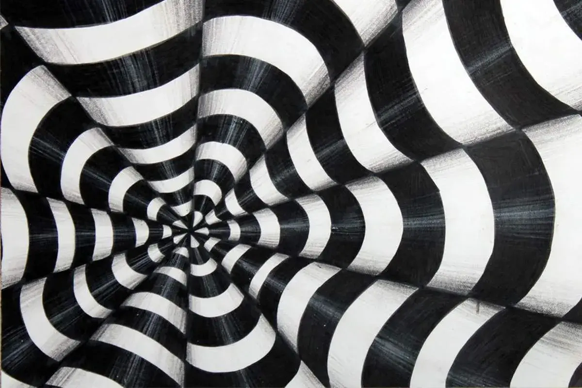
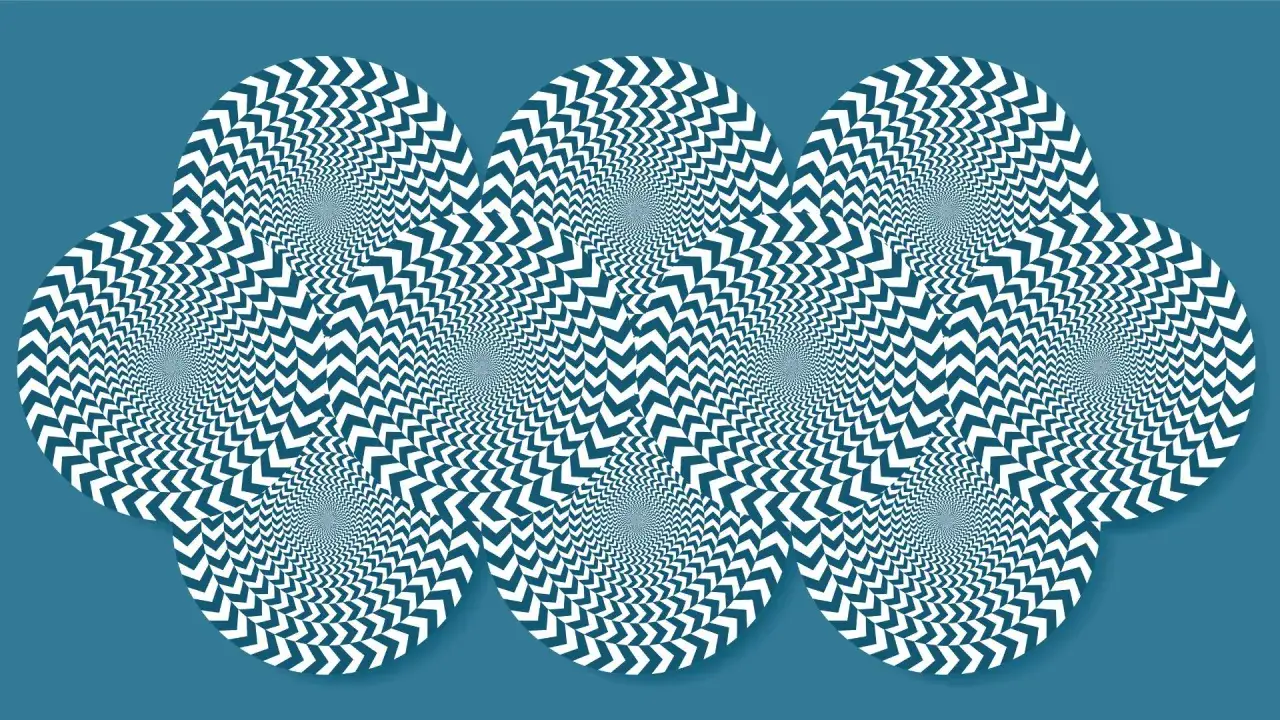
| Op Art | Repeated geometry, contrast, and color interaction | The image flickers, pulses, or appears to move | The 1960s, especially the 1965 moment when it entered the U.S. mainstream | It can read as mechanical if the composition lacks rhythm |
| Anamorphosis | Distortion that resolves only from one precise angle or through a mirror | The image looks broken until the correct viewpoint is found | Renaissance and Baroque experiments | It is fragile by design and heavily dependent on placement |
| Forced perspective | Scaled forms and alignment tricks reshape spatial cues | Rooms, facades, or stage sets feel larger or deeper than they are | Architecture, theater, and site-specific installation | It only works from the intended route or viewing position |
| Immersive illusion installation | Paint, props, light, and camera-friendly staging work as one system | The viewer becomes part of the scene | Contemporary public art and photo culture | It can photograph better than it holds up in person |
I separate these traditions because readers often collapse them into one bucket, which hides the real differences in intent. Once you sort them, the mechanics become easier to read and the historical lineages stop blurring together.
How artists build the effect layer by layer
The illusion is usually constructed in stages, not guessed into existence. A strong work begins with a clear visual premise, then uses formal tools to hold the viewer inside that premise long enough for the deception to register.
Perspective and vanishing points
Linear perspective is the most obvious tool, but it is also the most misunderstood. The point is not just to create depth; it is to decide where depth should collapse, where lines should converge, and how much spatial pressure the image can carry before it breaks. When that structure is tight, even simple forms can feel architecturally convincing.Repetition and rhythm
Op Art depends on repetition the way music depends on pulse. Alternating lines, grids, and color bands create visual tension because the eye keeps trying to organize them into a stable pattern. If the rhythm is too loose, the work feels random. If it is too rigid, the effect becomes static and loses energy.
Color and contrast
High contrast can make forms appear to tremble, advance, or recede. In black-and-white work, the effect is blunt and immediate; in color-driven work, it can become more atmospheric and more psychologically unsettled. I think this is where many beginners misjudge the genre, because they assume the trick comes from geometry alone. In practice, color temperature and value contrast often do just as much work.
Read Also: Traditional Chinese Painting - Styles, Formats & Care
Viewpoint and installation
Some works are designed for one fixed position, and that is not a weakness. It is part of the composition. Anamorphic murals, painted ceilings, and certain floor pieces depend on a very specific sightline, which means the viewer is not simply looking at the work but completing it. That is a more demanding relationship than casual viewing, and it is one reason these pieces can be so memorable.
There are also common mistakes. Artists sometimes overload a single surface with too many competing effects, which makes the image noisy instead of persuasive. Others ignore lighting, even though gloss, shadow, and glare can either sharpen the illusion or flatten it completely. The best works feel controlled because every layer has a job.
That control is exactly what separates a polished trick from a serious art-historical statement, and the strongest examples make that distinction obvious.
The artists and works I would keep on your radar
Some names are unavoidable here, and for good reason. Bridget Riley turned line and color into vibration, showing that Op Art could be elegant rather than merely noisy. Victor Vasarely helped define the movement as a systematic visual language, not just a set of optical stunts. M.C. Escher is not Op Art in the strict historical sense, but his impossible constructions belong in the same conversation because they turn logic itself into a visual puzzle.
In the United States, the tradition looks different but just as rich. William Harnett and John Haberle made trompe-l'oeil still lifes that forced viewers to test the surface with their eyes before trusting what they saw. That American line matters because it shows the technique was never only a European curiosity. It became part of the broader history of realism, display, and visual wit.
- Bridget Riley - Essential for understanding how abstract pattern can create physical sensation rather than simple decoration.
- Victor Vasarely - Important for the system-building side of Op Art, where geometry becomes a repeatable language.
- M.C. Escher - Useful for seeing how impossible space can still feel logically constructed.
- William Harnett - A key figure in American trompe-l'oeil, especially for still-life realism.
- John Haberle - Known for microscopic detail and for making ordinary objects seem almost embarrassingly present.
The 1965 The Responsive Eye exhibition at MoMA is still the reference point many American histories use when explaining how Op Art entered the mainstream. That moment matters because it shows the movement was not confined to studios; it became part of public visual culture almost immediately.
Those examples also explain why these works are more fragile than they look, which is where preservation starts to matter.
Why preservation and authentication change how the illusion reads
Illusion-based works are unusually sensitive to condition. A yellowed varnish, a smudged surface, or a clumsy restoration can flatten contrast and make a once-convincing image feel dead. In other words, conservation is not just about keeping the object intact. It is about preserving the visual logic that makes the work function.
Authentication can be just as complicated. These works often depend on preparatory drawings, precise geometry, specific pigments, or a documented method of placement. If a mural or installation was designed around one exact sightline, then the installation record becomes part of the evidence. For temporary work, photography and documentation are not secondary materials. They are often the only stable archive.
- Check whether the illusion depends on a single viewpoint or several.
- Inspect whether surface wear has softened edges or reduced contrast.
- Be cautious with aggressive cleaning, because over-restoration can erase the very sharpness the artist relied on.
- Keep installation notes and photographs, especially for site-specific or temporary work.
For collectors, curators, and conservators, the real question is whether the work still delivers its intended visual effect after years of handling and environmental change. If it no longer does, the artwork may still be original, but it is not fully legible anymore.
That leads naturally to the viewer’s side of the equation, because the work can only succeed if it is seen in the right way.
How I would look at these works in a gallery
When I stand in front of illusionistic art, I do not try to “solve” it immediately. I start by letting the image work at its intended distance, then I move closer and off-axis to see what changes. That simple shift often reveals whether the illusion is structurally sound or just momentarily impressive.
- Begin at the intended viewing distance before moving in.
- Step slightly to the side and see whether the image collapses, mutates, or stays coherent.
- Check whether the instability is the point, or whether the work is trying to disappear into realism.
- Notice how lighting changes the surface across the day, especially with gloss or metallic paint.
- Ask what the illusion is doing for the idea behind it: satire, architecture, movement, or pure visual tension.
This is where the art stops being a novelty. A good work keeps its discipline even after the surprise is gone, and that is usually the sign that the artist understood the medium rather than just borrowing a visual trick.
The detail that separates a clever trick from a lasting work
What I trust most in optical illusions art is not the gimmick itself but the discipline underneath it. The strongest works keep their meaning when the surprise fades, because they are built on balance, timing, and a clear idea about what the eye should do.
If I were judging one of these pieces for a collection, I would ask three questions: does the illusion still work from the intended position, does the surface condition support the effect, and does the work offer something beyond the joke of deception? When the answer is yes, the piece usually earns a place in art history, not just in visual entertainment.