Fernando Botero art style is one of the easiest to recognize and one of the easiest to misread. At a glance, the rounded figures, compressed spaces, and smooth surfaces can look playful; on closer inspection, they reveal a precise visual system built around volume, balance, and quiet social commentary. Here I break down what defines the style, where it came from, how to read its meaning, and what matters most when you are looking at Botero works in a museum or collection.
Key points about Botero’s visual language
- His signature move is not simple “fatness” but the enlargement of form until it feels monumental and self-contained.
- The style combines Renaissance discipline, Latin American subject matter, and a highly controlled sense of humor.
- Many works carry social or political critique, even when the surface looks calm or elegant.
- Painting and sculpture follow the same logic: smooth contours, stable mass, and very little visual noise.
- For authentication and preservation, provenance, surface handling, and material consistency matter as much as instant recognition.
What makes Botero’s figures feel monumental
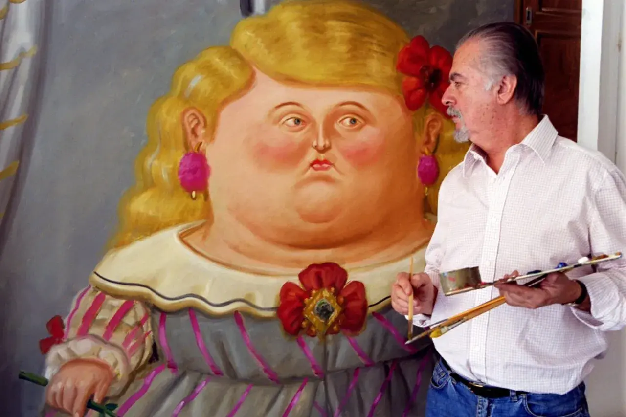
Botero’s figures are not enlarged by accident. He pushes torsos, faces, animals, instruments, and household objects into exaggerated volume so they feel weighty, compact, and almost architectural. That core language is often called Boterismo, and it depends on a paradox: the forms are obviously distorted, yet they rarely feel unstable.
I think that is what separates Botero from simple caricature. The contours stay clean, the bodies remain centered, and the compositions are usually calm rather than chaotic. Eyes, mouths, and limbs are often small in relation to the outer form, which makes the subject feel monumental without turning it into visual chaos. The result is a style that looks easy from far away and very disciplined up close.
That discipline becomes clearer once you look at where the style came from.
Where the style came from
Botero studied the old masters in Madrid and Florence, and that training left a clear mark on his work. He absorbed Renaissance ideas about perspective, structure, and volume, but he did not copy Renaissance painting outright. Instead, he turned that classical foundation into a language that could carry Colombian subjects, contemporary figures, and private memories at the same time.His early visual world also mattered. Posters of bullfights, images inspired by Gustave Doré, and the cultural atmosphere of Medellín fed into his imagination long before his mature style settled. One of the most useful stories about his development is the mandolin episode: a small opening made the instrument feel unexpectedly huge, and that shift helped him understand how tiny details can make a form feel more powerful. From that point on, volume was not a trick. It was the logic of the work.
Those influences matter because they explain why the style is so much more than a visual gimmick.
How to read the meaning behind the exaggeration
Botero is often described as humorous, and that is not wrong, but humor is only the first layer. In works such as The Presidential Family, the inflated bodies feel like a critique of power, ceremony, and self-importance. The figures are not just physically enlarged; they are psychologically sealed off, which makes the scene feel both comic and unsettling.
I read Botero’s best works as controlled ambiguity. He rarely tells the viewer exactly how to feel. Instead, he gives you a surface that seems pleasant, then lets the scene tilt toward irony, unease, or political comment. That is why his images can hold two moods at once. They are approachable, but they are not innocent. Even his most decorative still lifes and domestic scenes can carry a subtle pressure underneath the charm.
- Humor makes the work immediately accessible.
- Stillness gives the figures a strange, almost ceremonial dignity.
- Exaggeration keeps the image from becoming naturalistic in a conventional sense.
- Critique appears indirectly, which often makes it more effective.
Once you understand that balance, the recurring subjects in his work start to look less repetitive and more intentional.
The recurring subjects that define his world
Botero returned to a small number of subjects again and again because they let him test the same visual language across different emotional registers. Still lifes with fruit, flowers, and instruments turn volume into abundance. Portraits of families, priests, generals, and aristocrats turn volume into social theater. Bathers, dancers, bullfighters, and musicians let him explore pose, rhythm, and bodily presence without abandoning his calm, controlled surfaces.
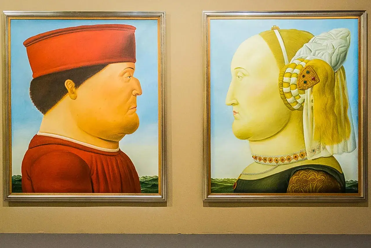
His reworkings of famous images are especially revealing. When he revisits a canonical subject like the Mona Lisa or a Renaissance portrait, he is not simply parodying an old master. He is asking what happens when a recognized image is rebuilt around mass instead of delicate proportion. That is one of the clearest clues to his method: Botero does not exaggerate at random. He repeats the same logic across portraits, interiors, animals, and still lifes so the viewer can feel the consistency of the system.
Why his sculpture carries the same idea into public space
Botero’s sculpture makes his idea of volume impossible to miss because the viewer has to move around it. In bronze, the rounded bodies keep the same smooth, controlled mass you see in the paintings, but now the form occupies actual space and changes with the light. That shift is important: a Botero sculpture is not just a painted figure made larger. It is the same visual grammar translated into three dimensions.
I would describe his public sculptures as arguments for presence. They stand comfortably in plazas, museum courtyards, and open streets without looking restless or theatrical. They invite viewing from multiple angles, and they often invite touch as well, which is rare for contemporary monumental art. The surface finish matters here. A polished contour, a bronze patina, or even a slight shift in light can change how the mass is read.
In other words, sculpture is not a side note in his career. It is the clearest extension of the same formal idea.
How Botero fits beside realism, caricature, and modern figuration
Botero sits near several movements, but he belongs fully to none of them. He shares subject matter with realism, the visual wit of caricature, and the broad appeal of modern figurative art, yet he departs from each one at a crucial point. I find this comparison useful because it stops people from reducing him to a single label.
| Lens | What it shares with Botero | Where Botero differs | Why that difference matters |
|---|---|---|---|
| Realism | Recognizable people, objects, and scenes | He bends proportion instead of reproducing it faithfully | The work aims for presence, not optical accuracy |
| Caricature | Exaggeration and a hint of humor | He keeps the tone controlled and often solemn | The image can be witty without becoming a joke |
| Pop Art | Familiar icons and public-facing imagery | He is less interested in consumer culture than in volume and social critique | The work feels personal and cultural, not detached and commercial |
| Modern figuration | Human forms remain central | He simplifies anatomy into a signature mass-based language | The body becomes a formal idea, not just a subject |
If I had to place him in one phrase, I would call him a figurative modernist with a highly disciplined distortion. That distinction matters because Botero is often mistaken for being merely decorative, when the structure of the work is actually very strict.
That same precision becomes important when you shift from interpretation to identification.
What collectors and conservators should notice first
For museums, dealers, and collectors, recognition is only the starting point. A Botero-like silhouette is not enough to authenticate a work, and in a market that includes paintings, drawings, prints, and bronzes, the paper trail matters a great deal. I would start with three things: surface discipline, material consistency, and documentation.
- Surface discipline means the contours should feel intentional, not soft in an accidental way.
- Material consistency matters because paint sheen, bronze patina, and casting quality all affect how the volume reads.
- Documentation matters because provenance, exhibition history, and invoices often clarify what the eye cannot.
- Condition matters because overcleaning, repainting, or worn surfaces can flatten the very effect that defines the work.
From a conservation perspective, Botero is deceptively demanding. Smooth passages show damage quickly, and any break in the surface can change the feeling of stability. If I were cataloguing one of his works, I would describe proportion, contour, finish, and spatial compression before I moved on to secondary details. Those first observations usually tell you more than a decorative reading ever will.
Why Botero still reads clearly in galleries and collections
Botero lasts because his style solves a problem many artists only partly resolve: it turns a recognizable image into a coherent visual language. The rounded forms are not a joke and not a mascot. They are a deliberate grammar of volume that can carry humor, critique, stillness, and monumentality at the same time.
If you remember one practical thing, make it this: do not reduce Botero to size. His work is strongest when you read the full system behind the exaggeration, because that system is what keeps the paintings, sculptures, and public monuments readable long after the first glance.