The giclee meaning is simpler than the buzz around it suggests: it refers to a high-quality inkjet print made for fine art use, usually with archival inks and carefully chosen paper or canvas. What matters more than the label is the workflow behind it, because materials and color management decide whether a print will age gracefully or just look impressive on day one. In the sections below, I break down the process, the materials, the real differences from ordinary prints, and the details I check before I trust the term.
What matters most about giclée printing
- Giclée is a fine-art inkjet print made with archival intent, not just any print from a digital file.
- The process depends on accurate color management, pigment inks, and a suitable paper or canvas.
- Not every inkjet print deserves the label; materials and production standards separate it from basic output.
- Collectors care about giclée because it can preserve detail, color depth, and edition consistency when done well.
- If a seller cannot name the ink, paper, and workflow, I treat the claim cautiously.
What giclée means in fine art printing
In fine art terms, giclée usually means a digital print produced on a high-resolution inkjet printer with archival materials. The word is pronounced zhee-klay, and it was coined to describe a print that sat closer to art reproduction than to everyday office output.
That distinction matters. A giclée print is not defined only by the printer type; it is defined by the combination of source file quality, ink choice, substrate, and the intention to make a long-lasting, color-accurate print. In practice, that usually means pigment inks and a fine art paper or canvas chosen for permanence and surface character.
I also think it helps to treat the term as descriptive rather than magical. It tells you the print was made with a certain standard in mind, but it does not automatically guarantee excellence. That definition only becomes useful when you see how the print is actually built, which is where the process matters.
How the giclée printing process actually works
The giclée process is more deliberate than a simple “print file” workflow. It starts with a file that can hold enough detail for the final size, then moves through color correction, test output, printing, and inspection. When the process is handled well, the final print preserves texture, tonal transitions, and subtle color shifts that would be easy to lose in a lower-grade reproduction.
1. Prepare the source image or scan
If the artwork begins on paper, canvas, or film, it is usually scanned or photographed at high resolution. The goal is not just sharpness; it is faithful capture of surface detail, edges, and color relationships. For digital art, the file has to be clean enough to withstand enlargement without breaking down into visible artifacts.
2. Match color and tone
This is where color management earns its keep. A studio uses ICC profiles, which are instruction sets that help the printer predict how a specific ink and paper combination will behave. Without that step, the same file can shift warmer, cooler, flatter, or darker than intended.
3. Print with controlled droplets
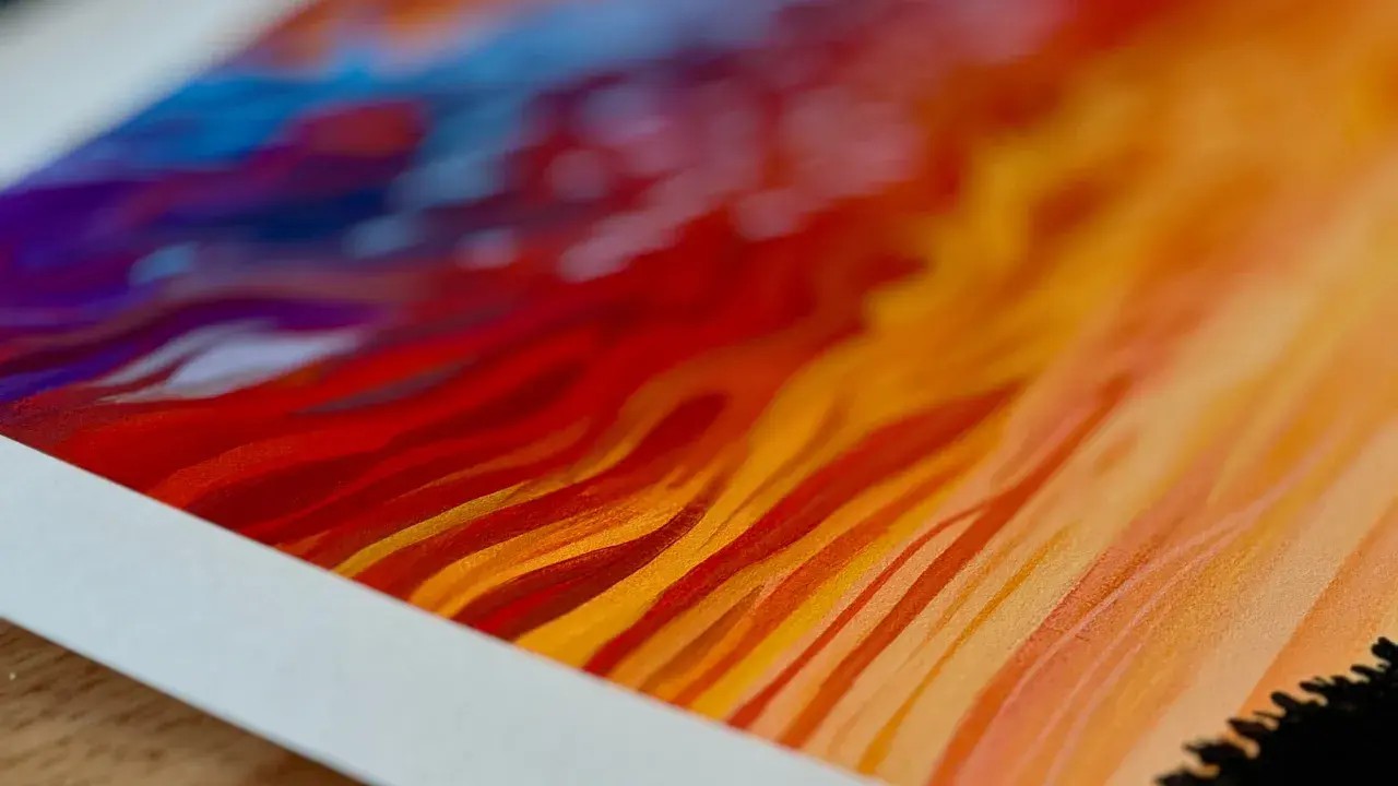
The printer lays down extremely small ink droplets in carefully calibrated patterns. The result is smoother gradients and finer detail than most consumer prints can manage. In a good setup, the printer is not just reproducing color; it is translating the artwork into a stable physical object.
4. Dry, inspect, and finish
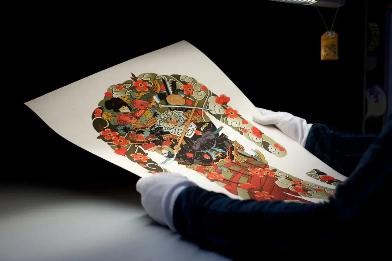
After printing, the piece needs time to dry and settle. Then it is inspected for banding, color drift, dust, and edge issues. If the print is meant for sale or editioning, it may be trimmed, signed, numbered, or mounted according to the artist’s workflow.
Many studios aim for roughly 300 ppi at final print size, but that is only a working rule, not a universal law. The real question is whether the file, the viewing distance, and the paper surface all support the intended result. Once the workflow is clear, the material choices become the real test.
Which materials separate a real giclée from an ordinary inkjet print
If I had to reduce this to one sentence, I would say that the materials are what turn a good digital file into a serious fine art print. The term gets thrown around loosely online, but the ink and substrate do most of the actual work.
Pigment inks
Pigment inks are the backbone of most archival giclée workflows. They tend to offer better resistance to fading than many dye-based inks, especially when paired with the right paper and display conditions. That is one reason they are favored for fine art reproductions and collector-grade editions.
Fine art papers and canvas
Look for acid-free, lignin-free papers with a known surface character, such as smooth matte, cotton rag, baryta, or textured watercolor-style paper. Each surface changes how the image feels. A matte rag paper can soften glare and make a print feel more painterly, while a smoother baryta-style surface often gives photographs deeper blacks and more apparent clarity.
Canvas can also work well, particularly for paintings and larger decorative pieces, but I would choose it for the image, not just because it sounds premium. The wrong surface can flatten the expression of the original work.
Read Also: What Is Fine Art? Intent, Technique & Materials Explained
Profiles and coatings
ICC profiles help the printer and paper combination behave predictably, while coatings or receptive layers help hold the ink in place. Those two details are easy to overlook, yet they strongly affect color accuracy, sharpness, and drying behavior. When they are missing or poorly matched, the print may still look acceptable at first glance and fall apart under closer inspection.
Those material choices make more sense when you compare them with standard inkjet and poster printing.
Giclée and standard inkjet prints are not the same thing
One of the biggest misunderstandings I see is the assumption that every inkjet print is a giclée. It is not. Giclée is a quality-oriented category within inkjet printing, and the term is used most credibly when the print is made with archival materials and careful production standards.
The word itself is not a regulated certification. That means the label can be used honestly, loosely, or even opportunistically. If you care about preservation, the details matter far more than the name on the sales page.
| Aspect | Giclée print | Standard inkjet print | Poster print |
|---|---|---|---|
| Ink | Usually pigment-based and chosen for permanence | Pigment or dye, depending on the setup | Often commercial inks optimized for cost |
| Paper or canvas | Fine art, archival substrates | Photo paper, office paper, or some art papers | Lightweight display paper |
| Color management | Custom profiles and proofing are common | May be basic or inconsistent | Usually minimal |
| Goal | Fine art reproduction and longevity | General reproduction or everyday use | Short-term display |
| Collector value | Higher when documented and editioned | Depends on materials and intent | Usually low |
The table is useful, but I would still put the emphasis on workflow. A well-made inkjet print can be impressive, but giclée implies a stricter standard for materials, consistency, and archival intent. After that, I move from theory to the practical checks I would make before buying or editioning a print.
How I judge quality before I trust the label
When I evaluate a print description, I ask a few direct questions. If the seller can answer them clearly, I have more confidence in the result. If the answer is vague, the word giclée is probably doing more marketing work than informational work.
- What ink system is used? Pigment ink is usually the safer choice for longevity.
- What paper or canvas is it printed on? The substrate should be named, not described only as “premium.”
- Was the file color-managed? Proper profiling and proofing reduce unpleasant surprises.
- Is the print editioned? If it is meant to be collectible, numbering and documentation should be clear.
- Are the blacks clean and the gradients smooth? Banding, harsh transitions, or flat shadows usually point to weak production control.
The most common mistake is assuming resolution alone is enough. A sharp file on the wrong paper still looks wrong. Another mistake is buying based on surface gloss or texture alone, without asking how the print will age in the light and humidity of its actual display environment.
My own shortcut is simple: if the studio cannot tell me the printer, ink family, and substrate, I assume the label is incomplete. That is where the decision becomes less about terminology and more about whether the print deserves long-term preservation.
When giclée is worth the extra care
Giclée makes the most sense when the print is meant to live as more than decoration. If I am making an editioned artwork, a museum-style reproduction, a photographic print with subtle tonal work, or a collector piece, I want the extra control that this workflow gives me. It is especially useful when the original has fine brushwork, layered color, or a paper surface that deserves to be respected in the reproduction.
It is less compelling for temporary decor, quick proofs, or bulk display pieces where price and speed matter more than permanence. That is not a criticism of simpler printing methods; it is just a recognition that different uses justify different standards.
- Best fit: fine art editions, archival reproductions, portfolio pieces, gallery work.
- Less necessary: drafts, short-term signage, casual posters, one-off test prints.
- Main tradeoff: better materials and tighter control usually mean higher cost and more careful handling.
If the goal is to preserve both visual quality and value, giclée is often worth the effort. If the goal is simply to get an image on the wall fast, the extra precision may not be necessary.
The details that decide whether a giclée print lasts
If I had to reduce the whole subject to one rule, I would say this: the label matters less than the chain of decisions behind it. Archival ink, a compatible substrate, accurate color management, and honest description are what make the result worth preserving.
That is why I treat giclée as a production standard, not a magic word. When those pieces line up, the print can deliver the tonal depth, surface texture, and permanence that collectors expect; when they do not, the term is just decoration. For anyone buying, selling, or archiving fine art reproductions, those are the details worth asking about first.