Detailed abstract art is not about crowding a canvas; it is about building visual depth through layered marks, texture, and controlled tension. The strongest examples reward both a quick glance and a slow inspection, because the surface keeps changing as your eye moves across it.
Here I break down what makes this kind of abstraction work, how the major movements shaped it, and what I look for when I want to judge a piece in person. If you care about art history, preservation, or collecting, the difference between a convincing surface and a merely busy one matters more than it first appears.
The surface and structure tell the real story
- Intricacy in abstraction usually comes from layering, texture, line density, and material contrast rather than from recognizable imagery.
- Postwar American abstraction split into several languages, especially abstract expressionism, geometric abstraction, lyrical abstraction, and mixed-media collage.
- Strong works feel intentional: the detail has hierarchy, rhythm, and pauses, not just visual noise.
- Texture, impasto, collage, and varnish affect both how a work reads and how it should be handled.
- Condition, provenance, and technical evidence matter when you want to authenticate or preserve a highly worked surface.
Where intricate abstraction sits in art history
For a U.S. reader, the most useful historical anchor is postwar American abstraction. Abstract expressionism gave artists permission to treat the whole canvas as active space, and MoMA’s term for allover painting is a good shorthand for that idea: every area of the composition matters, whether the surface is built from layers, drips, stains, or embedded material. That is one reason these works can feel dense even when they never describe anything literal.
From there, the history branches in ways that help explain why some abstract works look detailed and others do not. Geometric abstraction turns detail into precision, repetition, and spacing. Lyrical abstraction turns it into flow, transparency, and color transitions. Mixed-media abstraction pushes into collage, abrasion, and surface erosion, so the work carries evidence of its own making. I find that distinction useful, because a canvas can be highly detailed without looking busy, and it can look busy without being resolved.
| Style | What the detail usually looks like | What it asks from the viewer | Typical effect |
|---|---|---|---|
| Abstract expressionism | Drips, gestures, impasto, revisions, and all-over coverage | Read movement and energy across the whole surface | Intensity, scale, immediacy |
| Geometric abstraction | Grids, intervals, hard edges, and repeated units | Notice structure, proportion, and control | Order, tension, clarity |
| Lyrical abstraction | Soft transitions, translucent color, drifting forms | Track atmosphere rather than contour | Rhythm, openness, calm |
| Mixed-media abstraction | Collage, sanding, scratching, seams, and material shifts | Read the painting as an object with history | Tactile complexity, layered meaning |
That historical split matters because the word “detail” means something different in each camp. Once you see the language a work is speaking, the next question is how the surface was actually built.
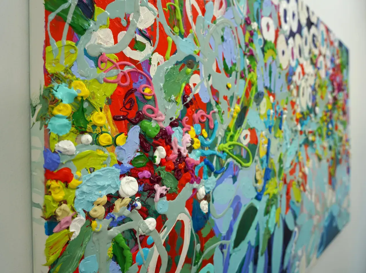
How artists build complexity with layers, marks, and materials
I think of texture as the grammar of this kind of painting. The National Gallery of Art’s texture guidance is useful here: texture can come from watery strokes, thick drips, short dabs, thick layers, mixed materials, or even scratching back into paint. In abstract work, those choices are not decoration. They are the structure.
Layering
Layering is the easiest way to create depth without relying on subject matter. A painter may begin with an underpainting, cover it with opaque passages, and then return with thin veils of color that let the earlier decisions remain partially visible. That creates visual memory. The eye senses that the surface has a past, and that sense of time is one of the strongest forms of detail in abstraction.
Mark making
Marks can be tiny or expansive, repeated or erratic, but they have to do something distinct. A field of small strokes, a grid of dots, or a sequence of directional brush marks can create structure even when there is no figure to anchor the image. I pay close attention to rhythm here. If the rhythm changes in a disciplined way, the painting usually feels intentional. If every mark is equally loud, the surface tends to flatten out emotionally.
Read Also: Botero's Art Style - Beyond "Fatness" - Uncover Its True Meaning
Material contrast
Some of the richest abstract works come from material conflict rather than painterly finesse. Collage, sand, graphite, wax, paper, or sanding can interrupt the paint surface and make the image feel excavated instead of simply applied. Mark Bradford is a good contemporary example of that logic: the surface reads as built, cut, and reopened, which gives the work a depth that a clean brush surface cannot fake. Once you understand how the material was built, you can read it more accurately in person, because photos flatten some of the very things that make it convincing.
How I read one in the gallery instead of on a screen
I do not trust a flat image alone when a work depends on sheen, relief, or scale. A close crop can make a surface look richer than it is, and a phone photo can hide the pauses that give the painting its structure. When I stand in front of an intricate abstraction, I usually move through it in this order.
- Step back first and look for the dominant movement, symmetry, or grid.
- Move closer and inspect the edges, transitions, and changes in finish.
- Check whether one area leads the eye or whether every inch is competing for attention.
- Look for revisions, interruptions, buried passages, or repeated decisions.
- Shift to the side, if possible, and catch the surface under raking light to see relief and gloss.
The reason I use that sequence is simple: good work keeps its logic at different distances. If a painting only works from far away, the detail may be superficial. If it only makes sense inches from the surface, the composition may be too fragmented. The best pieces hold together at both scales, and that is usually when I start thinking seriously about preservation as well as interpretation.
What preservation and authentication can reveal
Once a painting becomes highly textured or materially complex, condition stops being a side issue. Raised impasto can be vulnerable to abrasion, collage elements can separate at the seams, and mixed media often age at different speeds. That does not make the work fragile in a generic sense; it means each material carries its own risks, and those risks need to be understood before the work is moved, cleaned, or sold.
| What I look for | Why it matters | What it may suggest |
|---|---|---|
| Raised paint or loose surface material | These areas are easy to damage in transport or handling | Impasto that needs careful packing and display |
| Uneven gloss or darkened coatings | They can change the reading of the image and hide previous treatment | Old varnish, surface coating, or cleaning history |
| Collage edges, seams, or patched areas | Different materials often age at different rates | Possible adhesive failure or later repair |
| Unexpected overpaint or blocked passages | Later interventions can alter the artist’s original intent | Need for closer technical review |
| Material inconsistencies across the surface | They can indicate restoration, alteration, or a non-original addition | Further examination of provenance and technique |
When I need more than the naked eye can offer, UV and X-ray examination are the first technical tools I want. They can reveal repairs, earlier compositions, and surface treatments that normal light misses. For collectors, that information is not trivia; it changes how I think about value, risk, and whether the work still matches the artist’s method.
The simplest test for whether the detail earns its place
Before I call an abstract work successful, I ask three questions: does it have hierarchy, does the surface support the idea, and does it still hold up after ten minutes of looking? If the answer is yes, the detail is doing real structural work. If not, the painting may be labor-intensive without being deep.
- A strong work gives the eye places to rest and places to return.
- Its marks feel intentional, not merely crowded.
- Its materials match its ambition, so the surface does not feel disconnected from the composition.
- It remains interesting at both full distance and close inspection.
That is the version of abstraction I return to most often: not noisy, not overexplained, but dense enough to keep unfolding. When the composition, surface, and materials are aligned, detail becomes meaning rather than decoration, and the painting keeps earning attention long after the first glance.