Illusion-based art sits at an interesting point between craft and perception. A painting can seem to contain real depth, a wall can appear to bulge, and a pattern of lines can make a still surface feel unstable. This article breaks down optical illusion art, the major traditions behind it, and the practical clues I use when deciding whether the effect is meaningful or just clever.
Key ideas to keep in view
- Illusion-based art is a family of strategies, not one fixed style.
- Trompe l'oeil aims to make painted objects feel physically present, while Op art uses geometry and contrast to unsettle the eye.
- Line, contrast, perspective, scale, and viewpoint determine whether the effect holds.
- The strongest works still read as art, not just tricks, because the illusion supports meaning.
- Conservation can change the work more than casual viewers realize, especially when edges, gloss, or color balance shift.
What makes illusion-based art work
At its best, this kind of art exploits the way the brain sorts cues into depth, surface, and movement. I am not interested in it merely as a stunt. The better works use controlled contradiction: the eye receives one set of signals, the picture plane offers another, and the viewer has to negotiate the gap.
That gap is where the meaning lives. Strong illusionistic art rarely depends on one trick alone; it stacks cues such as shading, perspective, edge sharpness, reflected light, and pattern disruption so the image keeps convincing the viewer from more than one distance. When those cues are missing, the piece may still look decorative, but it loses the tension that makes the genre memorable.
Once you see that, the rest of the field becomes easier to read, because the major movements are mostly different answers to the same problem: how do you persuade, unsettle, or redirect the eye?
The movements and traditions behind it
There is no single lineage here. Some works try to imitate the real world so closely that the viewer mistakes representation for object; others abandon realism and instead use geometry to produce motion, flicker, or spatial uncertainty. For a reader in the United States, these are usually the clearest entry points: the older illusionist tradition and the later Op art movement.
| Tradition | Main goal | How it creates the effect | Typical viewer response | Why it matters |
|---|---|---|---|---|
| Trompe l'oeil | Make the painted surface feel physically real | Mimics objects, shadows, paper edges, and surface wear with high precision | Surprise, recognition, a brief double-take | It shows how realism can become a game of perception and authenticity |
| Op art | Make the eye sense movement, vibration, or instability | Uses repeated stripes, grids, contrast, and color interactions | Disorientation, rhythm, visual pulse | It turns perception itself into the subject of the work |
| Anamorphosis | Hide an image until the viewer finds the right viewpoint | Stretches or distorts the image so it resolves from one angle only | Puzzle-solving, theatrical reveal | It makes viewing position part of the artwork |
| Kinetic and interactive illusion | Let movement activate the effect | Uses shifting elements, reflective surfaces, or light-responsive structures | Immersion, bodily awareness, change over time | It expands illusion into space, motion, and participation |
What matters is that each tradition asks the viewer to do a different kind of work. Trompe l'oeil asks for belief, Op art asks for patience, anamorphosis asks for position, and kinetic illusion asks for movement.
That distinction matters when you evaluate a work, because the wrong expectations can make even a good piece seem weaker than it is.
The techniques artists rely on
When I analyze these works, I start with the mechanics. The effect usually comes from a small group of visual devices, and each one does a different job.
Line and repetition
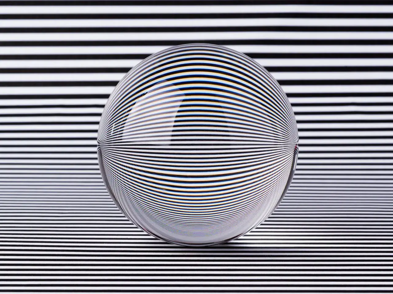
Parallel stripes, grids, and repeated curves create pressure on the eye. Slight changes in spacing or thickness can make a stable surface seem to ripple. This is the engine behind many Op art works, especially the black-and-white pieces that seem to pulse when you look at them too long.
Contrast and value
Deep shadows against bright highlights convince us that a form has volume. In still-life painting, this is what helps a paper edge look crisp or a glass surface look fragile. In flatter geometric work, high contrast can do the opposite and make the viewer feel that the surface is vibrating.
Perspective and viewpoint
Anamorphic works are built for one place in the room. From the wrong angle they look broken; from the right one they click into focus. That dependence on position is not a flaw. It is the point.
Read Also: Abstract Art Styles Explained - How to Read Any Painting
Texture and surface finish
Gloss, matte paint, and finely modeled texture all change how light lands on the work. A convincing illusion can fail if the finish is too uniform or if later conservation softens the original edge work. This is one reason these works reward close inspection under good lighting.
These techniques can be combined, and the best artists usually do combine them. A successful illusion is rarely the product of one clever move; it is the cumulative effect of several disciplined ones.
Examples that show the range of the genre
Looking at a few canonical examples is the fastest way to understand the range. If I had to teach the category with a handful of works, I would start here.
- Seventeenth-century trompe l'oeil still lifes - These paintings turn letters, flowers, curtains, and tabletop objects into tests of visual trust. They are important because they show that deception can be elegant rather than merely clever.
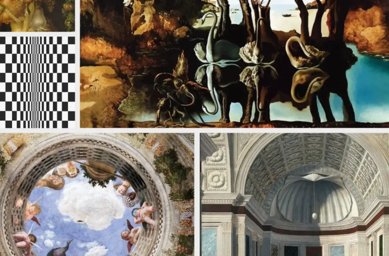
- Bridget Riley's striped canvases - Riley's early black-and-white works are not trying to imitate objects at all. Their strength is that the surface seems to move even though nothing literal is moving, which makes the viewer aware of perception itself.
- Victor Vasarely's modular compositions - Vasarely systematized the optical effect. His work matters because it shows how an illusion can be built from repeatable visual logic rather than from painterly imitation alone.
- M.C. Escher's impossible spaces - Escher is useful because he exposes the rules we rely on to read space. His stairways, waterfalls, and loops are convincing exactly until you begin to trace them carefully.
- Street anamorphosis and mural illusion - Contemporary pavement works make the viewer's body part of the composition. They are dramatic, but the best versions also reveal how much the effect depends on a specific point of view.
Those examples also explain why the category survives. It can be painterly, mathematical, theatrical, or public-facing without losing its central concern: what the eye thinks it sees versus what is actually there.
Why conservation and authentication are unusually tricky
Illusion-based works are sensitive to changes that look minor to a casual viewer. A slightly yellowed varnish can flatten contrast, a retouched edge can blunt a shadow, and a warped support can disturb a perspective system that once felt exact. If the illusion depends on precision, even a small material intervention can alter how the work reads.
That creates a real challenge for conservators and curators. Surface sheen, line weight, and color temperature are not cosmetic details here; they are part of the image architecture. When I look at a work of this kind, I want documentation of the artist's materials, preparatory drawings, installation instructions if they exist, and any records of past treatment. Those things do not just help with authentication. They help explain whether the work still behaves as intended.
For collectors and museums, the practical lesson is simple: do not treat illusionistic art like an ordinary image. Lighting, glazing, framing, and viewing distance can all change the experience, and poor treatment can quietly erase the very thing that makes the piece significant.What separates a lasting illusion from a gimmick
The difference is usually structural. A gimmick gets one reaction, quickly. A strong work keeps working after you move, pause, and return to it. The more I study the best examples, the more I look for three things: clarity of intent, control of technique, and a reason for the illusion to exist beyond surprise.
- Test it from more than one distance - If the image only works in a narrow sweet spot, that may be fine, but the artist should be using that constraint deliberately.
- Check whether the illusion serves composition - The eye should be guided, not simply ambushed.
- Look for meaning in the deception - The best works use visual uncertainty to say something about reality, representation, or perception itself.
- Notice how the surface behaves under light - If the work changes dramatically under different lighting, that is part of the experience, not a technical footnote.
In 2026, that standard still holds whether the work hangs in a museum, appears as a mural, or is built as an immersive installation. The medium can change, but the core question does not: is the illusion only impressive, or is it thought through enough to stay interesting after the first glance? That is the point where this tradition stops being visual trickery and starts functioning as serious art.