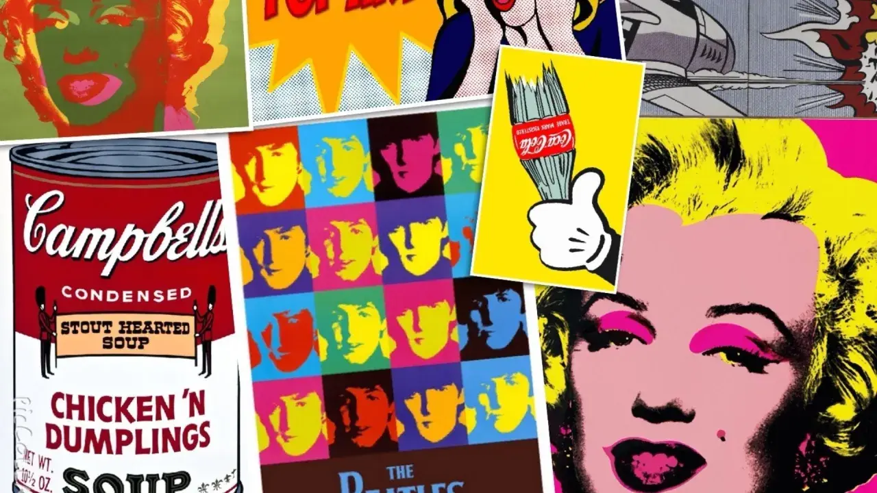
Pop art symbols are not random decoration. They turn everyday consumer goods, celebrity faces, comic-strip fragments, and brand imagery into shorthand for a culture built on repetition, media, and instant recognition. In this article, I focus on the motifs that appear most often, what they meant in the movement, and how to read them with a more informed eye.
What makes Pop Art so recognizable is its use of ordinary images as cultural shorthand
- Pop artists turned consumer goods, comics, and celebrity portraits into high-art subjects.
- The most common motifs are products, food, logos, speech bubbles, newspapers, and star imagery.
- These images usually carry irony, not simple celebration.
- Technique matters: flat color, repetition, Ben-Day dots, and screenprinting make the imagery feel mechanical.
- For collectors and conservators, source imagery, editioning, and condition change how a work reads and what it is worth.
Why Pop Art turned to ordinary things
Pop Art grew out of a visual environment that already felt crowded with signs, packaging, ads, and celebrity images. In the United States, the 1950s and 1960s were saturated with television, billboards, glossy magazines, comic books, and supermarket branding, so artists did not need to invent a new visual language from scratch. They could lift familiar material directly from daily life and make it impossible to ignore.
Tate’s overview of Pop art emphasizes how closely the movement stayed tied to recognizable products and symbols, and that is the key to its impact. A soup can, a lipstick tube, or a comic panel was already familiar; the Pop artist simply isolated it, enlarged it, repeated it, or stripped it of context until it behaved like an icon instead of a plain object.
I think that shift matters because it changed the meaning of “ordinary.” In Pop Art, the everyday object stops being background noise and starts acting like a mirror for consumer culture, media saturation, and the way modern life teaches us what to look at.
That logic becomes clearest when you look at the recurring motifs themselves, because the movement relies on a surprisingly small but powerful set of images.
The motifs that appear again and again
MoMA’s collection descriptions keep returning to television, comic books, and print advertising as source material, but the visual vocabulary is broader than that. The recurring motifs below are the ones I see most often when I read major Pop works closely.
| Motif | How it usually appears | What it tends to signal | Why it matters |
|---|---|---|---|
| Consumer goods | Soup cans, soda bottles, detergent boxes, tires, cigarette packs | Mass consumption, branding, and the visual repetition of everyday shopping | Turns packaging into an icon and asks why some objects feel culturally larger than others |
| Comic strips and speech bubbles | Panels, dialogue balloons, action lines, blown-up close-ups | Mass-produced storytelling, irony, melodrama, and emotional distance | Lichtenstein used this language to make printed entertainment look monumental |
| Celebrity portraits | Marilyn Monroe, Elvis Presley, Elizabeth Taylor, film stars, singers | Fame as commodity, image fatigue, and the replacement of personality by repetition | Warhol’s serial portraits are central because they show how celebrity becomes a reproducible surface |
| Logos and brand marks | Company labels, targets, flags, emblems, signage | Recognition before meaning, and the authority of commercial identity | These symbols make clear that Pop Art is interested in how brands shape memory |
| Food and household objects | Hamburgers, hot dogs, refrigerators, vacuum cleaners, lipstick, picnic tables | Domestic life as spectacle and the beauty of the ordinary | Oldenburg and Wesselmann used these objects to give scale and drama to the banal |
| News and headlines | Newspaper images, political figures, media fragments, publicity stills | The way mass media filters reality into repeatable visual snippets | These works often feel documentary at first, but they are really about mediation itself |
The important point is not the object alone. A soup can is not automatically Pop, and a comic strip is not automatically art. The symbol becomes powerful because of what the artist does to it: isolate it, repeat it, or give it a scale that feels almost absurd.
That brings me to the part many viewers miss on first glance, which is that these symbols are rarely neutral. They are doing argumentative work, even when the surface looks playful.
How pop art symbols work beyond decoration
The strongest Pop works rarely settle into pure celebration or pure critique. They sit in the middle, where attraction and distance keep pressing against each other. That tension is one reason the movement still feels sharp: the image looks easy to read, but the reading never stops at the surface.
Decontextualization is the simplest way to explain the move. It means removing an image from its original setting so it can function differently, and Pop artists used that move constantly. A comic frame pulled out of a magazine, or a product label repeated on canvas, no longer behaves like a tool or an ad. It becomes a statement about the systems that produced it.
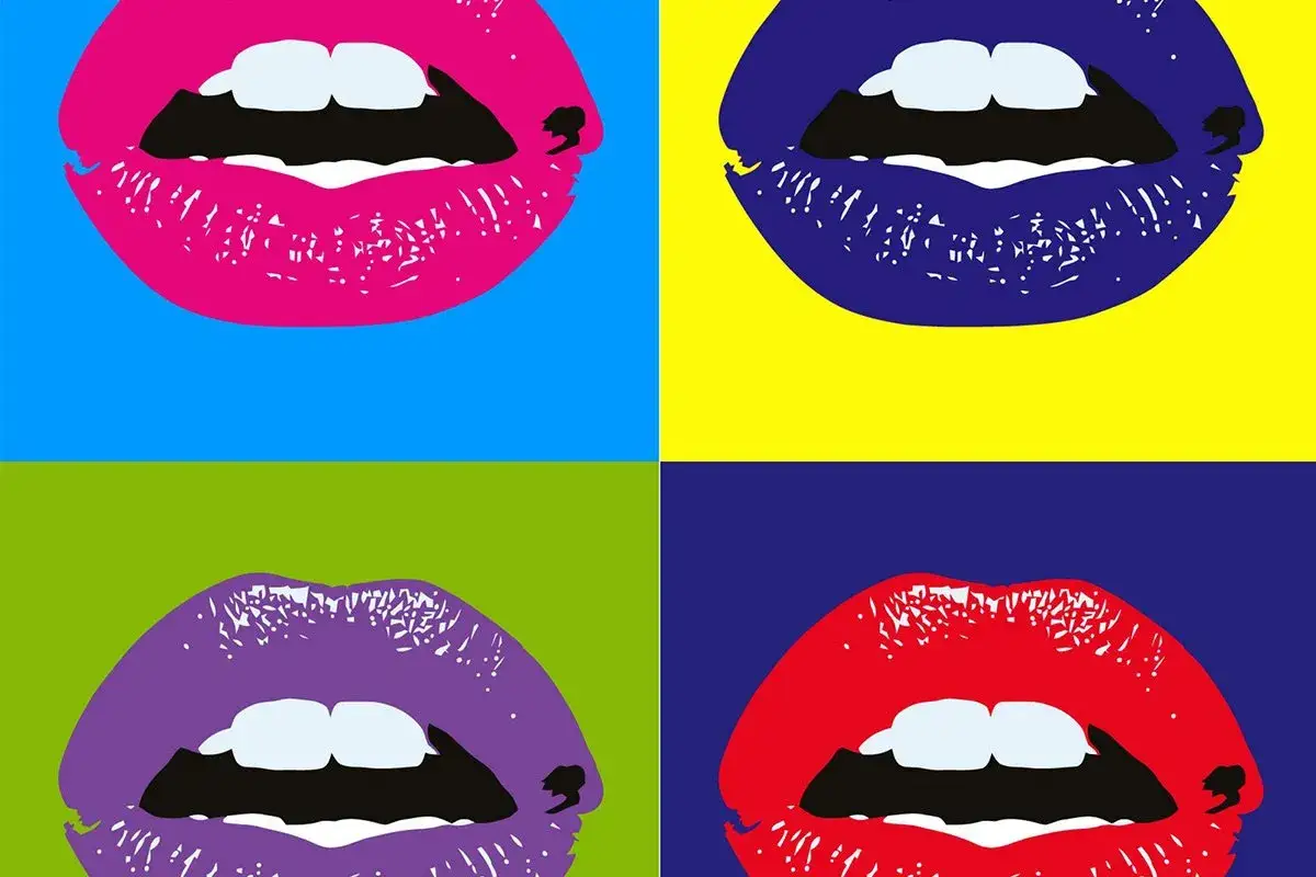
- Repetition makes an image feel mass-produced, as if it belongs to a product line rather than a single moment.
- Decontextualization strips away the original setting so the object reads as a cultural sign.
- Irony keeps the work from becoming simple advertising, even when it borrows advertising’s language.
- Serialization turns a portrait or object into a sequence, which changes how we think about individuality and authorship.
That last point is essential. A repeated Marilyn face is not just a portrait of Marilyn. It is also a comment on the fact that images of Marilyn can be made to circulate like merchandise. The person becomes a picture, and the picture becomes a commodity.
When you understand that double movement, the movement’s visual choices start to make more sense, because the style itself is built to mimic the look of reproduction.
The visual techniques that make the imagery feel Pop
The style does as much work as the subject matter. Ben-Day dots, for example, are tiny, evenly spaced dots borrowed from commercial printing; in Roy Lichtenstein’s hands, they make a hand-painted image look mechanically reproduced. Screenprinting, or silkscreen, creates a similar effect by allowing the same image to be repeated with small variations, and those variations matter because they keep the work alive rather than merely copied.
Once you start noticing technique, the language of Pop becomes much easier to spot.
- Flat color removes painterly depth and pushes attention toward the surface.
- Hard outlines make objects read like graphics rather than illusionistic forms.
- Cropping imitates magazine and comic-book framing.
- Oversized scale gives a trivial object the visual authority of a monument.
- Repetition makes the motif feel industrial, serial, and endlessly reproducible.
These techniques are not decorative extras. They are part of the meaning. A soda bottle painted in a lush, painterly way belongs to a different conversation than a soda bottle rendered with hard edges and factory-like repetition. The first may be realism; the second is almost always a comment on modern visual culture.
When I evaluate a work in this family, I usually ask a practical question next: how should I read it without flattening it into a single message?
How to read a Pop work like a curator
I usually work through five questions in the same order. That keeps me from treating every bright object as if it means the same thing.
- What is the source image? Is it advertising, a comic strip, a product package, a news photo, or a celebrity portrait?
- What changed in the translation? Check the scale, the cropping, the color, and whether the image has been repeated.
- Does the work feel affectionate, critical, or both? Pop Art often lives in the tension between attraction and distance.
- How visible is the hand? A clean mechanical surface suggests commercial logic; visible brushwork complicates that reading.
- Does the object still behave like an object? Once it is isolated and enlarged, the thing may no longer read as a product at all but as a cultural sign.
The most common mistake is assuming the symbol matters only because it is familiar. Familiarity is the starting point, not the destination. Meaning comes from how the artist edits, repeats, and stages that familiarity, and that is where the movement becomes more than colorful nostalgia.
It also helps to remember that Pop Art is not frozen in the 1960s. The imagery still feels current because the surrounding culture still behaves in a very Pop way.
Why these images still matter in museums and collections
In 2026, Pop Art feels less like a closed historical period and more like a preview of the image economy we now live in. Logos circulate instantly, celebrities are endlessly reproduced, and ordinary products still gain symbolic power through repetition and branding. That is why the movement continues to look contemporary even when the source material is decades old.
For preservation and authentication, the details around the image matter as much as the image itself. Paper stock, ink density, edition numbering, publisher marks, and the quality of the printing layers can tell you whether a work belongs to the period, whether it has been well preserved, and how faithfully the original visual effect survives. With Pop Art, a faded color or a weak impression is not just a condition issue; it can change the reading of the whole work.
That is the lasting strength of the movement’s imagery: it turns ordinary things into icons, then uses those icons to ask what modern culture values, repeats, and consumes.