The strongest Bauhaus design examples still feel modern because they treat form, materials, and use as one problem, not three. In practice, that means stripped-down buildings, furniture that shows its structure, graphics that privilege clarity, and household objects that look almost inevitable once you see them. This article breaks down the most useful examples and shows what each one teaches about the movement, especially if you care about design history, preservation, or authentication.
The Bauhaus idea behind these examples
- Bauhaus design favors function, geometric clarity, honest materials, and efficient production.
- The clearest examples come from architecture, furniture, lighting, typography, textiles, and tableware.
- Walter Gropius’s Dessau building, Marcel Breuer’s Wassily chair, and the Wagenfeld lamp are fast entry points.
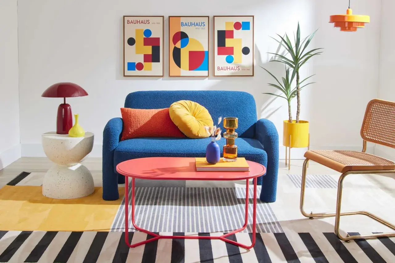
- Later revival pieces can look Bauhaus-like without sharing the same construction logic or workshop context.
- For collectors and researchers, provenance, marks, and date matter as much as visual style.
What makes a Bauhaus example feel Bauhaus
When I study a Bauhaus object, I start with a simple question: does every visible decision earn its place? If the answer is yes, the object usually belongs in the movement’s orbit. That is because Bauhaus design was never about adding a signature look; it was about reducing visual noise until structure, purpose, and material could speak plainly.
The best shorthand is this: function first, ornament last. But the movement was more disciplined than that slogan suggests. Its objects usually share five traits that make them easy to recognize once you know what to look for.
- Visible structure - the frame, joints, and support system are not disguised.
- Geometric restraint - circles, squares, rectangles, and cylinders do most of the work.
- Honest materials - steel looks like steel, glass looks like glass, wood looks like wood.
- Industrial logic - the piece feels suited to repeatable production, not only one-off craft.
- Clear hierarchy - the eye immediately knows what matters most in the composition.
The school lasted only 14 years, from 1919 to 1933, yet these principles spread far beyond Germany. Once you see them, the next step is to look at where they became most legible: architecture.

Architecture that shows the movement at full scale
Bauhaus architecture is the easiest place to see the movement’s social ambitions. A chair can be stylish; a building has to organize light, movement, work, and daily life. That is why the Dessau period matters so much. Walter Gropius’s Bauhaus building in Dessau and the nearby Masters’ Houses turn Bauhaus ideas into a living system rather than a visual gesture.
| Example | What to notice | Why it matters |
|---|---|---|
| Bauhaus building, Dessau | Glass curtain walls, asymmetrical massing, separate wings, circulation that reads in the façade | It makes the school’s working method visible instead of hiding it behind decoration |
| Masters’ Houses | Simple cubic volumes, flat roofs, repeated forms, minimal surface ornament | It tests whether modern design can still feel domestic and livable |
| Dessau-Törten housing estate | Standardized planning, restrained materials, efficient layout, social purpose | It shows that Bauhaus was also about affordability and mass housing, not only style |
What I find most revealing is that none of these buildings are minimal for the sake of being austere. They are practical diagrams of how people move, work, and live. That same logic moves directly into the furniture and lighting the school produced.
Furniture and lighting that made the style livable
This is the category most people picture first, and for good reason: Bauhaus furniture still fits comfortably into contemporary interiors. The pieces look light because they are built to be light, not because a designer wanted them to appear fashionable. Marcel Breuer and Wilhelm Wagenfeld are the names I reach for when I want to show how the movement turned utility into a modern visual language.
| Example | Designer | Why it matters |
|---|---|---|
| Club chair (model B3 / Wassily), 1927–1928 | Marcel Breuer | The tubular steel frame reduces the chair to outline and support; the sitter sees the structure instead of a bulky upholstered mass |
| Table lamp, 1923–1924 | Wilhelm Wagenfeld and Carl Jakob Jucker | It treats glass and metal as an exact system of shade, stem, and base, with no decorative excess to distract from the function |
| Armchair, 1922 | Marcel Breuer | It shows the earlier Bauhaus still testing craft-based form before the stricter steel-frame language took over |
I trust these objects because their construction is legible. If a later chair looks vaguely Bauhaus but hides its joints under styling, I become skeptical quickly. The point was never chrome for chrome’s sake; the point was an honest relationship between frame, surface, and use. From there, the movement’s communication design becomes much easier to read.
Typography and graphics that made information cleaner
The Bauhaus did not only redesign objects. It redesigned how information should look when the goal is speed, clarity, and consistency. MoMA notes that Herbert Bayer created the Universal alphabet while at the Bauhaus, and that is a good reminder that graphic design was not a side project there. It was part of the same effort to make modern life more rational and less cluttered.
The visual grammar is easy to spot once you know it:
- Sans serif letterforms that avoid historical costume.
- Lowercase-heavy typography that treats letters as functional units.
- Asymmetrical layouts that organize information by hierarchy, not symmetry.
- Photomontage and cropped photography used as information, not decoration.
- Strong white space that keeps the page breathable and legible.
The result is graphics that read quickly even at a distance. That clarity is why Bauhaus posters, catalogues, and exhibition systems still feel contemporary in the United States, where the movement later became part of the wider modernist vocabulary. The same principle of usefulness appears again in the smaller objects people handled every day.
Textiles, ceramics, and tableware that made the movement practical
The workshop objects matter because they prove Bauhaus was never only about famous chairs. The school wanted art, craft, and industry to meet in the same object, and textiles, metalwork, and tableware were the ideal test cases. The Bauhaus-Archiv describes Marianne Brandt’s tea infusers as Bauhaus classics today, which is accurate because they turn a familiar domestic object into a lesson in economy and proportion.
| Example | Workshop or designer | What it teaches |
|---|---|---|
| Marianne Brandt teapot and tea infuser forms | Metal workshop | Precision in handle placement, lid geometry, and pouring logic; the object looks resolved rather than embellished |
| Gunta Stölzl textiles | Weaving workshop | Pattern is treated as structure, not surface decoration, which makes fabric feel architectural |
| Otti Berger fabrics | Weaving workshop | Durability and industrial use become part of the design brief, not an afterthought |
These works are harder to romanticize than a famous chair, and that is exactly why they are useful. They show whether Bauhaus ideas survive when the object has to be touched, cleaned, repaired, and used every day. Once you get that, the last step is learning how to separate a real Bauhaus-era piece from a later revival.
How I separate original Bauhaus work from later revival pieces
I would not authenticate a Bauhaus object on silhouette alone. That is where a lot of viewers get fooled: a clean line and a tubular frame are not enough. The movement has been copied so often that the safest approach is to compare style clues with construction evidence.
| Check | Original Bauhaus-era work | Later Bauhaus-inspired piece |
|---|---|---|
| Date and provenance | Documented workshop, school, or early production context | Loose attribution, generic “Bauhaus style” marketing, or no supporting history |
| Materials | Period-appropriate steel, wood, glass, metal, or weaving techniques | Modern substitutes, polished finishes, or materials that were not available in the same form |
| Construction | Visible joinery, honest hardware, and traces of workshop method | Highly sanitized surfaces that mimic the look but not the making process |
| Markings | Labels, stamps, archival records, or documented chain of custody | None, or only a modern brand mark with no historical support |
| Condition | Wear that fits age and use, with conservation history that makes sense | Artificial aging or over-restoration that erases useful evidence |
If you are handling a piece in person, start with provenance, then inspect materials, then look for workshop logic in the joints and finish. That sequence keeps style from masquerading as evidence. It also protects you from confusing a good revival with a historic object, which is a mistake I see often enough to treat as a design problem in its own right.
The most reliable Bauhaus works are the ones where every decision can be defended in use. When that is true, the style stops being a look and becomes a method, and that is why these examples still matter to designers, collectors, and historians alike.