The art nouveau style is one of the clearest examples of late 19th-century design breaking away from rigid historicism. Its appeal comes from a precise visual grammar: flowing line, stylized nature, and objects that feel designed as a whole rather than decorated afterward. In the sections below, I explain how to recognize it, where it appeared, how it differs from later movements, and what matters when you are judging an original piece or a well-made revival.
Key facts to keep in mind
- Art Nouveau emerged in the 1890s and flourished until the First World War.
- Its signature features are curving lines, asymmetry, botanical forms, and a strong sense of movement.
- It appears across architecture, posters, furniture, jewelry, glass, and interiors, not just paintings.
- In the United States, Louis Comfort Tiffany’s glass and lighting are among the easiest entry points.
- It is not the same as Art Deco: Art Nouveau is more organic and lyrical, while Deco is more geometric and streamlined.
- For authentication, construction, provenance, and surface condition matter as much as the visual look.
Where the movement came from and why it mattered
Art Nouveau emerged as designers pushed back against recycled historical styles and the visual clutter of industrial mass production. They wanted a modern language that could unify architecture, interiors, furniture, graphics, and craft into one coherent design. That is why I think of it less as a single look and more as a design philosophy: structure, ornament, and function are expected to work together.
The movement took shape in the 1890s and remained influential until the First World War. It drew from nature, of course, but also from japonisme, the Western enthusiasm for Japanese art and design, as well as medieval craft traditions and regional decorative forms. Depending on the country, you may also see it called Jugendstil, Secession, Modernisme, or Stile Liberty. In the United States, the decorative side of the movement is often discussed through Tiffany’s glass and lighting, which gave the style a distinct American profile.
That broad, international spread matters because it explains why the same movement can look slightly different from Paris to Brussels to New York. Once you understand that context, the visual clues become much easier to read.
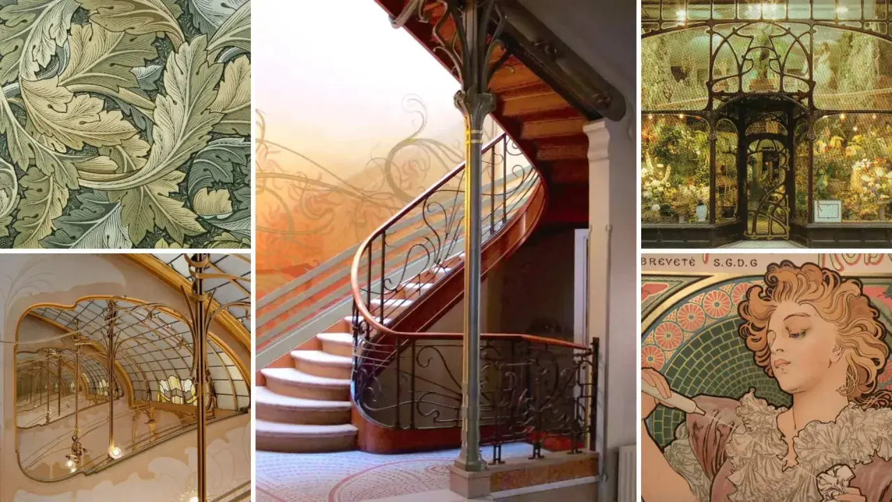
The visual language that makes it recognizable
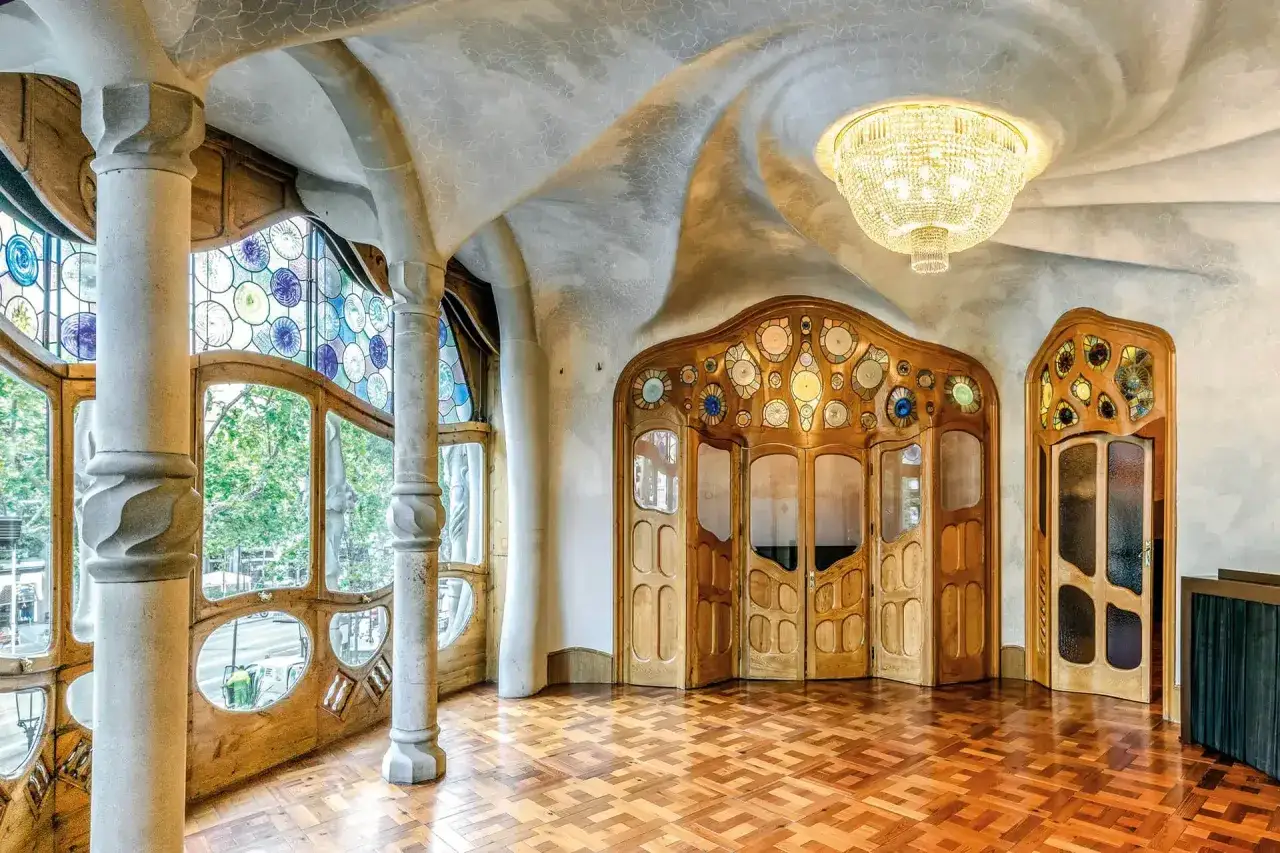
The easiest way to identify Art Nouveau is to follow the line. It usually does not sit still; it bends, loops, swells, and releases like a vine in motion. Historians often call this the whiplash line, a long S-curve that creates energy instead of symmetry. When I see that kind of controlled movement, I immediately start checking for the rest of the language around it.
Curves that move
Curvilinear forms are the backbone of the style. Corners soften, borders swell and taper, and compositions often avoid rigid balance. Even when a work is dense with ornament, it rarely feels static. The design should seem alive, almost as if it is growing across the surface.
Nature translated, not copied
The natural world is everywhere in this movement, but it is rarely reproduced literally. Flowers, leaves, insects, peacock feathers, female figures, and water plants are stylized into pattern and structure. A good Art Nouveau motif does not merely imitate a lily or a vine; it turns that motif into a decorative system.
Decoration that serves the object
Another clue is integration. In a strong example, ornament is not pasted on at the end. It shapes the edge of a poster, the rail of a staircase, the curve of a lamp base, or the silhouette of a chair. That is why the movement is often described through the idea of a total work of art, a design in which architecture, furniture, and detail all belong to the same visual sentence. Once you know that, it becomes easier to see where the style shows up most clearly in practice.
Where it shows up best in architecture, print, and objects
Art Nouveau is not confined to one medium, and that is part of its strength. It appears where design can merge utility with ornament, which is why architecture, graphic art, glass, jewelry, and furniture are such productive places to look. I usually explain it through the medium first, because the materials often tell you as much as the motif.
| Medium | Typical features | Why it matters |
|---|---|---|
| Architecture | Curved ironwork, stained glass, flowing façades, asymmetrical entrances, organic interior details | Shows the style at its most ambitious, where structure and ornament are designed together |
| Posters and graphics | Flat color, decorative borders, elegant figures, botanical halos, elongated lettering | Makes the style accessible and easy to identify, especially through the work of major poster designers |
| Glass and lighting | Iridescence, floral shades, layered color, sculptural bases, leaded construction | Very important in the United States, where Tiffany’s lamps and Favrile glass became defining examples |
| Jewelry and furniture | Sinuous metal, enamel, cabochon stones, flowing wood grain, asymmetrical forms | Shows how the movement translated ornament into intimate, wearable, or domestic objects |
For U.S. readers, Tiffany is often the fastest way into the movement because the glasswork is both decorative and technically distinctive. In Europe, the architecture and poster art can be even more central, especially when the work is tied to cafés, metro entrances, townhouses, and commercial graphics. Either way, the key is the same: the object should feel intentionally shaped by line and craft, not merely decorated with flowers. That distinction becomes even clearer when you compare it with nearby movements.
How I separate Art Nouveau from Arts and Crafts and Art Deco
People often confuse these movements because they all care about design quality and visual unity. The differences are real, though, and they matter when you are trying to date a work, identify a revival, or decide whether a piece belongs in the right historical category. I find it helps to compare them by visual logic rather than by name alone.
| Movement | General date range | Visual feel | Core idea | Quick clue |
|---|---|---|---|---|
| Art Nouveau | 1890s to 1914 | Organic, curving, sensual, highly decorative | Nature transformed into a modern design language | Look for flowing line, asymmetry, and ornamental integration |
| Arts and Crafts | 1880s onward | Handmade, grounded, often simpler and more rectilinear | Honest materials and craft labor | Look for visible construction and a quieter decorative rhythm |
| Art Deco | 1920s and 1930s | Geometric, streamlined, symmetrical, glamorous | Modernity, speed, and machine-age elegance | Look for stepped forms, zigzags, sunbursts, and hard edges |
There is overlap, especially because later designers borrowed Art Nouveau motifs and simplified them. But if the work feels more like a living line than a machine-age geometry, you are probably still in Art Nouveau territory. That same eye for material and structure is also what I use when I look at authenticity and condition.
The first things I check before calling a piece authentic
When I evaluate an object, I do not start with the decoration. I start with provenance, construction, and surface. A genuine period piece can be restored, but it should still make sense in period terms: the joinery, materials, wear, and finishing methods should all belong together. A revival piece may echo the silhouette beautifully while quietly using modern hardware, adhesives, or production shortcuts.
What usually gives a piece away
- Machine-perfect repetition where a hand-finished object would usually show slight variation.
- Modern screws, mounts, or wiring on a piece that otherwise claims a 1900-era origin.
- Patina that looks artificial or newly applied instead of accumulated over time.
- Signatures, labels, or marks that do not match the construction or the period of the object.
- Replacement parts that dominate the object’s character, especially on lamps, furniture, and glass.
Read Also: Frida Kahlo Style - Decoding Her Art & Iconic Visual Language
What restoration can and cannot tell you
Restoration is not automatically a problem. A rewired lamp or a professionally stabilized glass panel can still be a legitimate object if the core structure is period-correct and the interventions are documented. The risk is aggressive intervention that erases evidence: over-cleaned metal loses its original surface, and heavy polishing can flatten the very traces that help date the piece. In collecting and conservation, those traces are not decorative noise; they are historical data. That is why close looking matters as much as admiration.The first things I notice when a piece claims the look
When a work presents itself as Art Nouveau, I check five things almost immediately. First, does the line really move, or is it just ornamental surface fill? Second, is nature stylized into structure rather than copied as a motif? Third, do the materials support the design, or do they fight it? Fourth, does the object feel unified from top to bottom? Fifth, is there enough provenance or technical evidence to support the claim?
If those five answers line up, the object is probably doing real Art Nouveau work rather than borrowing the mood. If only one or two are present, it may still be attractive, but it is more likely a later homage. That distinction is useful not just for collectors but for anyone trying to understand why the movement still feels so distinct: it rewards close looking, and it rarely separates beauty from structure.
In practice, that is the most important thing to remember. Art Nouveau is not just a decorative flourish from the past; it is a disciplined way of turning line, craft, and nature into one visual language, and that is exactly why it still reads as fresh when it is done well.