Regency era paintings are best understood as a meeting point between portraiture, fashion, and the new public culture of art in Britain. The narrow historical Regency ran from 1811 to 1820, but art historians often use the label more broadly for work made from the late 1790s into the 1830s. In this article I look at the artists, subjects, visual cues, and preservation issues that matter most, so you can read the period with more confidence whether you are studying, collecting, or authenticating a work.
The period is really about portraiture, fashion, and the shift toward public art
- Portraiture dominates the period, especially polished images of royalty, writers, military figures, and fashionable society.
- Look for empire-waist dresses, natural curls, tailored coats, restrained poses, and a lighter neoclassical palette.
- Landscape, miniature portraiture, and satirical printmaking expand the story beyond the grand salon portrait.
- Thomas Lawrence is the key name for early 19th-century British portraiture, with Constable, Turner, Gillray, and miniaturists such as John Smart and Henry Bone filling out the picture.
- For authentication, provenance, sitter identity, materials, and condition matter more than style alone.
What Regency painting actually refers to
Regency painting is not one single style. It is a historical label for British art made during and around the Regency, when the Prince of Wales governed as Prince Regent and taste shifted toward elegance, polish, and social performance. In practice, the label often reaches beyond 1811 to 1820 because artistic change does not respect the calendar; the same visual habits can start in the late 1790s and continue into the 1830s.
What I think makes the period distinctive is the balance between refinement and immediacy. Artists wanted likeness, but they also wanted to show rank, education, sentiment, and modernity. That is why a sitter’s pose, the cut of a sleeve, the handling of a sky, or the joke inside a satirical print can matter as much as the face itself.
This is also why the period is better read as a network of genres than as a single school. Portraits lead the conversation, but landscapes, miniatures, caricatures, and exhibition pictures all help define the visual culture around them. Once you see that structure, the period becomes easier to read in detail, and the portraitists come into focus next.
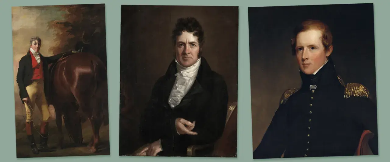
The portraitists who defined the look
I usually start with portraits because they are where Regency taste becomes easiest to see. Thomas Lawrence stands at the center of the period: he was the leading British portrait painter of the early 19th century, and his polished, flattering manner shaped how power, celebrity, and beauty were presented.
Lawrence was not working in a vacuum. He inherited Reynolds’s grand manner, kept Gainsborough’s livelier sense of movement in the background, and then pushed the style toward greater immediacy. The result is a portrait language that feels poised but not static, with animated faces, soft brushwork, and a carefully managed sense of spontaneity.
| Artist | What to notice | Why I keep returning to them |
|---|---|---|
| Sir Thomas Lawrence | Fluent brushwork, luminous faces, animated poses | He set the standard for polished early 19th-century portraiture and the public image of power. |
| Sir William Beechey | Formal balance, courtly restraint, clear likeness | He helps explain the official side of the period and the visual language of royalty. |
| John Hoppner | Soft modeling, elegant society portraits | He bridges late Georgian grace and Regency taste without losing warmth. |
| Thomas Phillips | Writers, thinkers, and public figures | He shows how the period turned intellect into celebrity. |
What matters is not just who sat for the picture but how the painter translated status into a visual grammar. The better portraits never rely on costume alone; they use posture, eye line, and paint handling to suggest intelligence or charm. That is exactly why a Lawrence portrait can still feel immediate today. From there, the more coded signs of the style become worth reading.
What gives a painting its Regency look
If I had to reduce the visual language to a few cues, I would start with clothing, carriage, and surface handling. Women’s dress usually moves toward the empire line: a high waist just under the bust, soft muslin, lighter color, and a columnlike silhouette that borrows from classical dress. Men’s fashion becomes sharply tailored but less ornate than the previous century, with cravats, dark coats, and a studied sense of restraint.
- Faces and poses are often calm, alert, and slightly idealized rather than theatrically dramatic.
- Backgrounds tend to be controlled: columns, drapery, bookcases, gardens, or a softly lit interior.
- Color is often lighter and cooler than in earlier Rococo work, although some artists push richer notes when they want drama.
- Brushwork can be polished in court portraiture or more visible in quicker exhibition paintings.
- Symbolic props such as a book, a harp, a globe, or a letter signal education and sociability.
The trap is to read these details too literally. A high waist or a white dress does not automatically make a painting Regency, because later artists reused the same silhouette in historical revival work. What matters is the full combination of date, handling, costume, sitter type, and context. That wider reading prepares us for the genre range beyond portraiture.
Landscape, miniatures, and satire widen the picture
Once you move beyond formal portraits, the period looks less uniform and more interesting. Turner and Constable were both central to the first half of the 19th century, but they pulled landscape in different directions: Turner chased atmosphere, motion, and dramatic light, while Constable built his views from careful observation and open-air sketching before finishing larger studio works. At the same time, tiny portrait miniatures and hand-colored caricatures show how intimate and political the visual culture had become.
| Form | Typical medium | Visual clues | Why it matters |
|---|---|---|---|
| Portraits | Oil on canvas | Controlled pose, fashionable dress, direct gaze | Shows status, identity, and the period’s social ideals |
| Landscapes | Oil, watercolor | Outdoor studies, weather, atmosphere, local detail | Shows the move toward observation and modern landscape painting |
| Miniatures | Watercolor on ivory, enamel on copper | Small scale, intimate finish, jewel-like surfaces | Portable art for private exchange and memory |
| Satirical prints | Etching, hand-colored print | Exaggeration, topical references, political humor | Shows how public opinion and image-making worked together |
That mix matters because it shows the Regency was not only about elite likenesses. It was also about portable images, public commentary, and the increasingly broad audience for art. The next question, especially for collectors and researchers, is how to tell a genuine period work from something that only looks the part.
How I would authenticate and preserve a Regency-period work
When I examine a claimed Regency work, I separate three questions: is it from the period, is it in the style of the period, and is it actually by the named artist? Those are not the same thing, and confusing them is the fastest way to overvalue a picture.
Start with the paper trail
Provenance, old labels, exhibition history, sitter identity, and family records can clarify a work faster than any stylistic guess. If a portrait appears without a history, I am cautious, especially when the sitter is anonymous or the signature looks too fresh.
Then inspect the object itself
Canvas weave, ground, stretcher, frame construction, and paint layers should be consistent with the claimed date. Miniatures need a different approach: watercolor on ivory or enamel on copper has its own aging pattern, and both are sensitive to light and handling.
Read Also: Feminist Art - Beyond the Canvas: What You're Missing
Use condition clues carefully
Old varnish can yellow, and some paintings have been cleaned too aggressively over the decades. That does not automatically make them suspicious, but it does mean surface appearance may no longer reflect the original color relationships. A conservation report is far more reliable than a quick visual judgment, and stable display conditions matter: controlled light, consistent temperature, and steady humidity help prevent further loss.
My practical warning is simple: do not authenticate a Regency portrait from fashion alone. The 1830s can look close enough to confuse the eye, and later revival portraits can mimic the silhouette with surprising accuracy. Once the object checks out, the last step is deciding what makes one example worth lingering over longer than another.
What makes the strongest examples linger in the mind
The best Regency works do more than document clothing or rank. They make social ambition visible without flattening the sitter into a symbol. In portraiture, that usually means the eyes and hands carry the emotional weight; in landscape, it means weather and light do the talking; in satire, it means the joke lands without losing the human target.
When I stand in front of a strong example, I look for three things: clarity of purpose, control of paint, and a reason for the image to exist beyond decoration. That is why Lawrence can feel so polished, why Constable can feel so truthful, and why a well-made caricature can still sting two centuries later. If you are studying, collecting, or conserving this period, keep those three questions in mind and the work usually becomes easier to read, easier to value, and easier to protect.
There is no need to force every Regency picture into the same mold. The period is richest when you let portraiture, landscape, miniature work, and print culture speak to one another, because that is where its real character lives.