Pop Art works because it makes everyday images impossible to ignore: a soup can, a comic face, a lipstick ad, a celebrity portrait. In its simplest form, the style relies on flat color, hard outlines, repetition, and the visual language of advertising, so the result reads fast even when the idea behind it is smart. That is the core of pop art simple: the image looks straightforward, but it is usually built to say something about mass culture, fame, and consumption.
What matters most at a glance
- Pop Art borrows from ads, comics, packaging, and celebrity culture.
- The style feels simple because it uses flat color, bold outlines, and repeated motifs.
- Warhol, Lichtenstein, Wesselmann, and Rosenquist are the clearest American reference points.
- The easiest beginner examples are one-object compositions, comic panels, and repeated portraits.
- For prints and reproductions, edition details and condition matter more than the bright surface suggests.
- To keep the look strong, reduce clutter and preserve contrast.
What Pop Art means in plain language
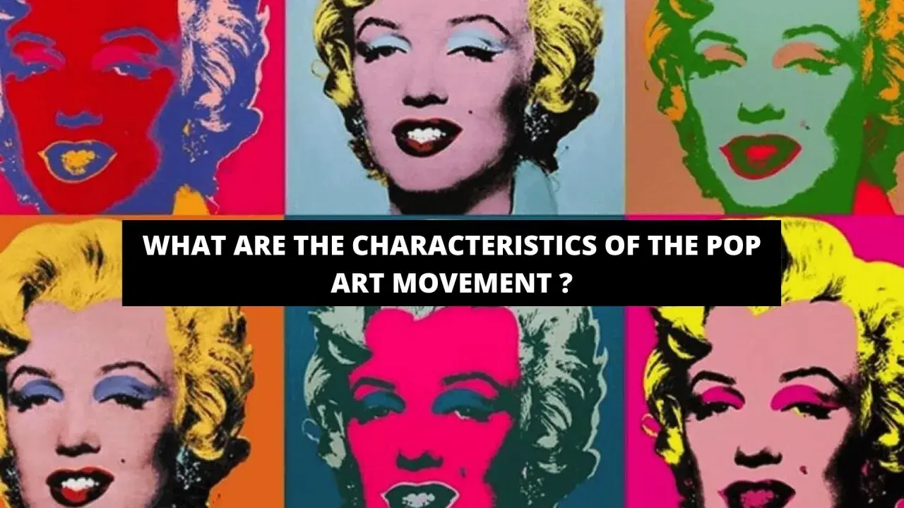
When I explain Pop Art in plain language, I describe it as art that treats the visual world of newspapers, packaging, billboards, television, and comics as legitimate subject matter. The movement emerged in the 1950s and 1960s, and in the United States it became closely associated with artists such as Andy Warhol, Roy Lichtenstein, James Rosenquist, and Tom Wesselmann. Their work did not try to hide its sources; it made them visible and often exaggerated them.
That is why the style still lands quickly. A viewer does not need a long art-historical lecture to recognize the subject. The image is already speaking the language of the supermarket, the magazine page, or the comic strip, and the artist is changing the scale, context, or repetition to make us notice what we usually ignore. Once you see that logic, the next step is spotting the visual formulas that keep the style so direct.
Why the style feels simple before it feels clever
The "simple" look is not accidental. Pop Art strips an image down to the parts that read fastest: outline, color block, repeated shape, and an instantly recognizable object or face. I usually think of it as a design system, not just a style.
| Visual feature | What you see | Why it works | Easy beginner version |
|---|---|---|---|
| Flat color | Large areas with little shading | Keeps the image bold and legible | Use 2 to 4 colors only |
| Hard outlines | Clear borders around forms | Makes shapes read like print graphics | Trace the subject with a thick black line |
| Repetition | The same image appears several times | Turns one object into a visual pattern | Repeat a face, can, or symbol 3 to 6 times |
| Commercial imagery | Ads, logos, comics, packaging | Connects art to everyday culture | Choose an object from ordinary life |
| Mechanical texture | Dots, halftones, or screenprint feel | Suggests mass production | Add a dot pattern or a printed finish |
The important thing is that these elements do not make the work shallow. They make it instantly readable, which is different. A strong Pop Art image often looks almost too easy at first glance, and that is exactly why it works. With that in mind, the clearest way to understand the movement is to look at a few examples that stay readable even for a beginner.
Simple examples worth studying first
If you want the shortest route into the style, start with works that reduce the subject to one clear visual idea. These examples are useful because they show different ways Pop Art can stay simple without becoming generic.
- Andy Warhol's Campbell's Soup Cans - the subject is an ordinary product, but repetition turns it into a statement about consumer culture and visual saturation.
- Warhol's Marilyn portraits - the face is iconic, yet the color shifts and repeated panels make the image feel mass-produced, as if celebrity itself were a printed commodity.
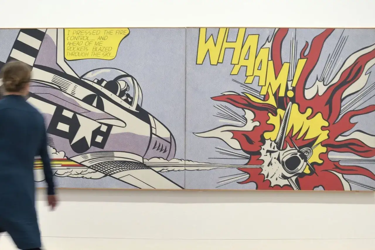
- Roy Lichtenstein's comic-inspired paintings - he enlarged comic-book moments and emphasized Ben-Day dots, speech bubbles, and dramatic framing, which gives the work a polished, graphic clarity.
- Claes Oldenburg's oversized everyday objects - a hamburger, ice cream cone, or clothespin becomes strange when the scale changes, and that size shift is the joke and the point.
- Tom Wesselmann's still lifes and nudes - these works borrow the look of advertising and magazine graphics, but they keep the composition simple enough that the color and contour do most of the talking.
What I would not miss here is the logic behind the examples: none of them depend on a complicated subject. They depend on choosing the right subject and then presenting it with visual confidence. That is why a single soup can can be more instructive than a crowded scene, and it leads directly to a practical question: what if you are looking at a Pop Art print or reproduction rather than a museum original?
How to tell a Pop Art work from a Pop-style copy
In Pop Art, reproduction is part of the story, so people sometimes confuse "printed" with "not real." That is too blunt. Some of the movement's most important works were made as screenprints, lithographs, or editioned works, and the medium is often central to the meaning.
| What you may be looking at | What it usually tells you | Why it matters |
|---|---|---|
| Signed and numbered print | An editioned work, not necessarily unique | Edition size and condition affect value and placement in the artist's output |
| Museum poster or decorative print | A later reproduction | It may capture the look, but not the material status of the original |
| Screenprint with clean, saturated color | Often consistent with Pop Art methods | Technique can be part of the work, not just a delivery system |
| Faded paper or weak color | Age, light damage, or poor storage | Condition changes both visual impact and long-term value |
When I look at these works, I ask three questions before I ask anything else: who made it, how was it produced, and what is the condition of the surface today? Those questions matter because Pop Art depends so heavily on clean edges and bright color. If those features are compromised, the work can lose part of its force even when the image is still recognizable. From there, the next step is the practical one: how to make a Pop Art-inspired piece without flattening it into decoration.
How to make a clean Pop Art-inspired piece without overcomplicating it
The safest way to keep the style strong is to begin with one object, one face, or one short phrase and strip away everything that does not help the image read immediately. I would start with a subject you can identify in one second, then build the piece around contrast rather than detail.
- Choose one subject and keep it familiar: a soda can, sneaker, phone, lipstick, banana, or portrait.
- Limit the palette to 2 to 4 colors, with one color doing most of the work.
- Use a bold contour or black outline so the shape stays readable from a distance.
- Add one repeated element, such as a row of faces, a grid of cans, or a speech bubble.
- Leave some areas plain; empty space helps the image feel intentional instead of crowded.
The most common mistake is overdesigning the piece. Too many gradients, textures, and effects usually make the work less Pop and more generic graphic art. I also see beginners add so many colors that the subject loses its punch. If the image can be understood instantly, you are probably closer to the style than if you have filled every corner. That restraint matters even more when the work is meant to live on paper or canvas for a long time, which is the last practical issue I want to cover.
What to keep in mind if you want the look to age well
Pop Art may look casual, but its strongest works depend on preservation as much as any other modern art. Bright acrylics, screenprint inks, and paper-based editions can all suffer from light exposure, humidity swings, and poor framing. If you are collecting, displaying, or archiving this kind of work, I would treat condition as part of the artwork rather than an afterthought.
- Keep works out of direct sunlight whenever possible.
- Use archival framing materials if the piece is on paper.
- Store prints flat in acid-free materials when they are not displayed.
- Watch for fading in reds, yellows, and saturated blues, which often show damage first.
- Document edition numbers, signatures, and provenance if the work is collectible.
The cleanest Pop Art still depends on the same principle as the movement itself: clarity. When the image stays bold, the colors stay honest, and the object is presented with intent, the style does exactly what it was designed to do, which is turn the everyday into something impossible to overlook.