
Horror art works because it changes how the eye reads space, flesh, and meaning. The best horror art styles do not rely on gore alone; they turn familiar forms unstable, then leave just enough ambiguity for the viewer’s imagination to do the rest. In this article, I break down the movements that shaped the genre, show how the major visual approaches differ, and explain what actually makes a frightening image hold together.
The strongest horror imagery combines distortion, symbolism, and restraint
- Fear in art usually comes from a controlled disruption of order, not from shock by itself.
- Gothic, Romantic, Symbolist, Expressionist, and Surrealist traditions each produce dread in a different way.
- Contrast matters as much as subject matter; light, shadow, and negative space often do more work than blood or gore.
- The most memorable images leave one part of the threat unresolved so the viewer completes it mentally.
- For collectors and curators, surface condition, paper tone, and pigment depth can change how horror imagery reads.
What makes a horror image unsettling
I usually think of horror as a problem of visual control. A frightening image gives the viewer a stable frame, then breaks one rule inside it. That broken rule can be anatomical, spatial, symbolic, or emotional, but it has to feel intentional; otherwise the work reads as messy instead of disturbing.
Distortion works because the brain expects coherence
When proportions tilt wrong, perspective becomes unreliable, or a figure looks almost human but not quite, the viewer spends more energy trying to resolve the image than simply looking at it. That tension is useful. In horror, I want the eye to keep searching for a correction that never quite arrives.
Contrast gives the fear a shape
Hard blacks against pale skin, a bright object in an otherwise dead field, or a single warm color in a cold palette can make a composition feel predatory. This is why so many artists lean on chiaroscuro, the strong use of light and shadow. It does not just make a scene moody; it tells the eye where danger might be hiding.
Suggestion is usually stronger than explanation
The less literal the threat, the longer it stays in the viewer’s mind. A partly seen figure, a symbolic object, or a room that feels too empty can be more effective than a fully detailed monster. I think this is where a lot of beginner horror art goes wrong: it explains too much, too early, and drains away the tension.
Once you understand these mechanics, the historical movements start to look less like separate categories and more like different answers to the same question: how do you make unease visible?
The movements that shaped the genre’s visual language
Horror did not emerge from one single style. It pulled from several art movements that already knew how to stage dread, uncertainty, and emotional excess. I find that the most useful way to read the field is to separate the style of the image from the feeling it is trying to produce.
| Movement or approach | What it usually looks like | Why it feels horrifying | Common motifs |
|---|---|---|---|
| Gothic art | Vertical forms, ruins, arches, candles, dim interiors, ornate detail | It turns sacred or grand space into something fragile, decayed, or haunted | Cathedrals, crypts, tombs, manuscripts, reliquaries |
| Romanticism | Storms, wilderness, night skies, cliffs, figures overwhelmed by nature | It frames humans as small and vulnerable against forces they cannot control | Sublime landscapes, shipwrecks, ruins, omens |
| Symbolism | Dreamlike scenes, allegorical figures, pale bodies, ritual objects | It replaces literal realism with emotional and psychological suggestion | Death, desire, femmes fatales, mythic monsters, visions |
| Expressionism | Warped forms, aggressive angles, exaggerated color, unstable space | It makes inner anxiety visible on the surface of the image | Distorted figures, city shadows, confrontational faces, stark contrasts |
| Surrealism | Impossible combinations, hyper-real detail, dream logic, uncanny pairings | It makes the familiar feel mentally wrong rather than physically violent | Sleeping figures, doubled bodies, hybrid creatures, floating objects |
The useful distinction here is simple: Gothic horror feels architectural, Romantic horror feels elemental, Symbolist horror feels poetic, Expressionist horror feels psychological, and Surrealist horror feels cognitive. That last one matters more than people expect, because Surrealist images often stay with you not because they are graphic, but because they break the rules of ordinary sense-making.
For me, this is where historical context helps. Gothic art gave horror a language of sacred decay and monumental shadow; Romanticism gave it awe and catastrophe; Symbolism gave it dream, myth, and allegory; Expressionism gave it emotional distortion; Surrealism gave it the uncanny logic of the unconscious. The modern horror image often borrows from all five at once, which is why the genre can look old, theatrical, and contemporary in the same frame.
That historical lens becomes even clearer when you look at the substyles people actually use today.
How the major horror substyles work in practice
Once the movements are in place, the genre branches into more specific visual modes. These are not always formal art movements, but they matter because they shape the way artists, illustrators, and poster designers build fear on purpose.
Gothic horror
Gothic horror depends on architecture, ritual, and decay. Think pointed arches, heavy drapery, candlelight, crypts, ironwork, and interiors that feel too tall or too narrow. The atmosphere matters more than the monster. I find this style works best when the environment itself looks compromised, as if the setting has absorbed the story’s damage.
Body horror
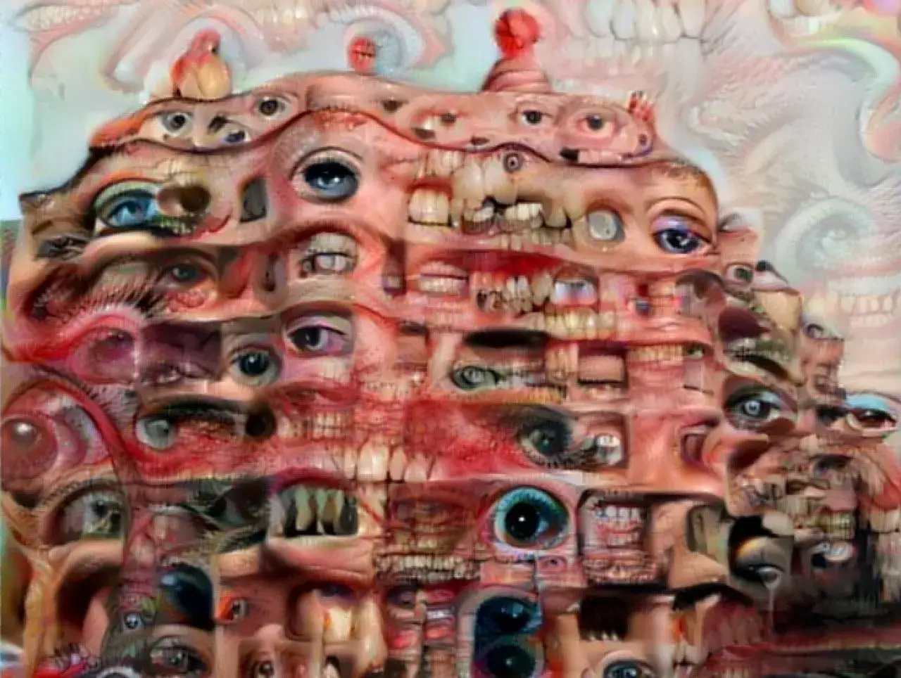
Body horror focuses on anatomical violation: mutation, merging, tearing, swelling, fragmentation, or infection. The visual challenge is to make the body look both legible and wrong. If the anatomy becomes too abstract, the effect weakens; if it is too explicit, the image can collapse into gross-out without much tension. The strongest examples keep one foot in realism.
Folk horror
Folk horror uses landscape, tradition, masks, tools, crops, animals, and communal ritual to make a place feel complicit. What I like about this approach is that the terror often comes from social memory rather than a single villain. The image feels older than the people in it, which gives it a rooted, inherited dread.
Cosmic horror
Cosmic horror is about scale and insignificance. The visual language usually leans on voids, impossible geometry, diagram-like structures, astronomical distance, or figures dwarfed by something too vast to comprehend. I rarely see this style work when artists over-explain it. The frame needs room to suggest that what matters is outside human understanding.
Read Also: Optical Illusion Art - Trick or Masterpiece?
Psychological horror
Psychological horror is often the quietest and, in practice, one of the most effective. Ordinary rooms, reflections, doubles, domestic objects, and slightly off facial expressions can do the work here. The threat is not a creature in the foreground; it is the possibility that the scene is already compromised. This is the style I would choose when I want the viewer to feel watched rather than attacked.
Each of these substyles asks the artist to emphasize a different kind of fear. Once that choice is clear, the composition becomes much easier to control.
How I build a horror composition that holds the viewer
When I look at a horror image that works, I usually see discipline before I see shock. The artist knows exactly where the eye should land, what should stay ambiguous, and how much detail is enough. That balance is doing more work than most people realize.
- Keep one focal threat. If every corner of the image competes for attention, the composition loses pressure.
- Use light as a storytelling tool. A single strong light source can carve a face, isolate a figure, or make a space feel violated.
- Limit the palette. Two or three dominant colors are often more effective than a crowded spectrum. Desaturated greens, bruised violets, ash gray, and bone white tend to carry unease well.
- Vary your edges. Hard edges pull attention; soft edges let forms disappear. Horror often needs both.
- Let negative space do some of the work. Empty areas can feel like withheld information.
- Choose texture deliberately. Grain, scratch, cracked paint, and rough paper can make an image feel older, more physical, or more unstable.
The common mistake is overloading the image with every possible scary thing: blood, teeth, claws, ruins, candles, eyes, smoke, and insects all at once. That usually reads as generic. A stronger composition usually picks one emotional register and commits to it. If the goal is dread, restraint wins. If the goal is shock, the image still needs structure so the shock lands cleanly.
This is also where medium matters. Oil painting can make horror feel ceremonial and weighty. Ink and engraving can sharpen line and contrast, which suits gothic and symbolic imagery. Digital art can push cinematic lighting and texture, but it can also become over-polished if the surface never feels tactile. I pay attention to medium because the same subject can feel noble, cheap, or genuinely uncanny depending on how it is handled.
From there, the last question is practical: which style should you choose for a given project?
Choosing the right style for a poster, painting, or collection
I would not use the same horror language for every purpose. A museum-facing work, a book cover, a gallery print, and a game concept sketch all ask for different levels of legibility, symbolism, and detail. Picking the wrong style usually creates a mismatch between form and intent.
| If the goal is | Try this style | Why it fits |
|---|---|---|
| Atmospheric fine art | Gothic, Symbolist, or Romantic | These styles support mood, symbolism, and historical depth |
| Editorial or poster design | Expressionist or Surrealist | They read fast and create immediate tension |
| Creature or character design | Body horror or Psychological horror | They make anatomy and expression carry the fear |
| Folkloric or regional storytelling | Folk horror | It roots the image in place, ritual, and local memory |
| Concept art for the unknown | Cosmic horror | It lets scale and incomprehensibility do the heavy lifting |
The decision is not only aesthetic. It is also about audience and context. A collector looking at a print may value line quality, edition state, and paper condition as much as the motif itself. A publisher may care more about immediate legibility at thumbnail size. A gallery visitor may respond to subtle surface shifts that would be lost in a digital mockup. I always tell people to choose the style that supports the job the image has to do, not the style that merely looks fashionable in the moment.
That matters even more when the work is meant to last. Horror imagery can be visually fragile, and once the surface changes, the emotion changes with it.
Why horror images age differently on the wall and on the page
The images that stay with me are usually the ones that can survive close looking. They do not depend on one loud effect; they hold together as compositions, objects, and ideas. When the fear fades, what remains is the structure underneath it.
For preservation and authentication, this is not a minor detail. Dark pigments can lose depth, paper tone can cool or yellow, and varnish can flatten the contrast that made the original work unsettling. In prints and drawings, tiny differences in impression strength, plate wear, or surface texture can change the whole reading of the piece. In horror-oriented works, the condition of the object is part of the mood, not just a technical footnote.
When I judge a horror work, I look for three things: a clear visual logic, a controlled emotional register, and enough restraint to keep the viewer engaged after the first glance. That is usually what separates a passing scare from an image that keeps its shape in memory.