Mughal miniature paintings are among the most refined court arts in South Asia: small in scale, but dense with political meaning, technical discipline, and visual intelligence. This article explains how the style developed, what to look for in the imagery, how the works were made, and how a careful eye can separate a period miniature from a later imitation or revival. I also focus on the practical side that matters to collectors, curators, and anyone handling works on paper: condition, materials, and preservation.
The style is imperial, hybrid, and best read up close
- It grew inside the Mughal court workshop system and blended Persian, Indian, and occasional European elements.
- The strongest works rely on fine line, opaque watercolor, gold, and tightly controlled composition rather than deep perspective.
- Common subjects include portraits, hunts, court rituals, animals, plants, and illustrated histories.
- Material evidence matters: paper, pigments, inscriptions, mounts, and provenance often tell you more than subject matter alone.
- Because these are works on paper, light, humidity, and handling have a direct impact on survival and value.
What makes the style feel unmistakably Mughal
The first thing I look for is control. The strongest imperial miniatures are built from crisp contour lines, opaque watercolor, gold, and a carefully planned balance between figure, ground, and ornament. They are not trying to create the illusion of a single deep space in the European sense; instead, they flatten and layer information so the viewer can read status, action, and setting in one glance.
| Feature | What you usually see | Why it matters |
|---|---|---|
| Scale | Small folio pages or album leaves meant for close viewing | The format encourages precision rather than spectacle |
| Line | Clean outlines, steady drawing, controlled facial detail | Line carries more weight than broad modeling |
| Color | Opaque, saturated pigments with touches of gold | Color separates rank, costume, and focus |
| Space | Layered settings, shallow depth, selective perspective | The page reads like a designed field, not a window |
| Subjects | Portraits, hunts, ceremonies, animals, and manuscript scenes | The imagery is political as well as decorative |
That blend of discipline and richness is why the style still feels so immediate today. Once you know the visual grammar, the next question is how that grammar was produced inside the court system.
Why imperial patronage shaped the tradition so strongly
The mature style developed inside the imperial atelier, and the court mattered because it set the terms of production. The Met traces the tradition to Akbar’s workshop, where Persian, Indian Muslim, and Hindu artists worked together on ambitious manuscript projects. That collaborative setup did more than increase output; it created a visual language that could absorb multiple traditions without collapsing into any one of them.| Ruler | What changed | Reading cue |
|---|---|---|
| Akbar | Large workshop, ambitious manuscripts, mixed influences | Look for experimentation, narrative energy, and courtly variety |
| Jahangir | Sharper portraiture and greater naturalism | Look for individualized faces, birds, flowers, and close observation |
| Shah Jahan | Formal portraits and tighter court scenes | Look for polish, symmetry, and ceremonial restraint |
| After the high imperial phase | Artists moved into regional courts | Look for Mughal methods adapted outside the imperial center |
The great imperial phase ran roughly from 1580 to 1650, and that range matters because it tells you when the visual language was being defined most intensely. The important thing is that the style did not freeze. It evolved as the court changed, and after the imperial workshop lost momentum, artists carried Mughal methods into regional courts. That explains why later works can look related without being imperial originals.
That historical shift also shapes the subject matter, because the images were never just “pretty pictures.” They were arguments about rule, taste, and order.
The scenes and symbols worth reading first
Once you stop treating a miniature as a tiny decorative image, the recurring subject matter becomes easier to decode. A portrait is rarely only a likeness; a hunt is rarely only an outdoor scene; and an imperial assembly is usually a carefully staged map of rank.
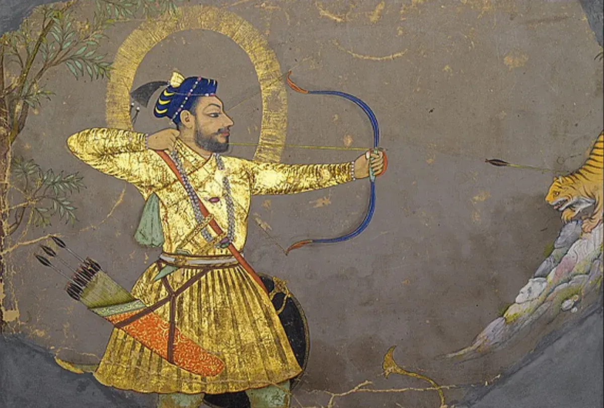
- Portraits show rank, lineage, and personal authority. In court art, a frontal or three-quarter pose is often more about political presence than psychological intimacy.
- Hunts and battles project control, mobility, and command over nature or territory. The energy is real, but it is still ordered by court taste.
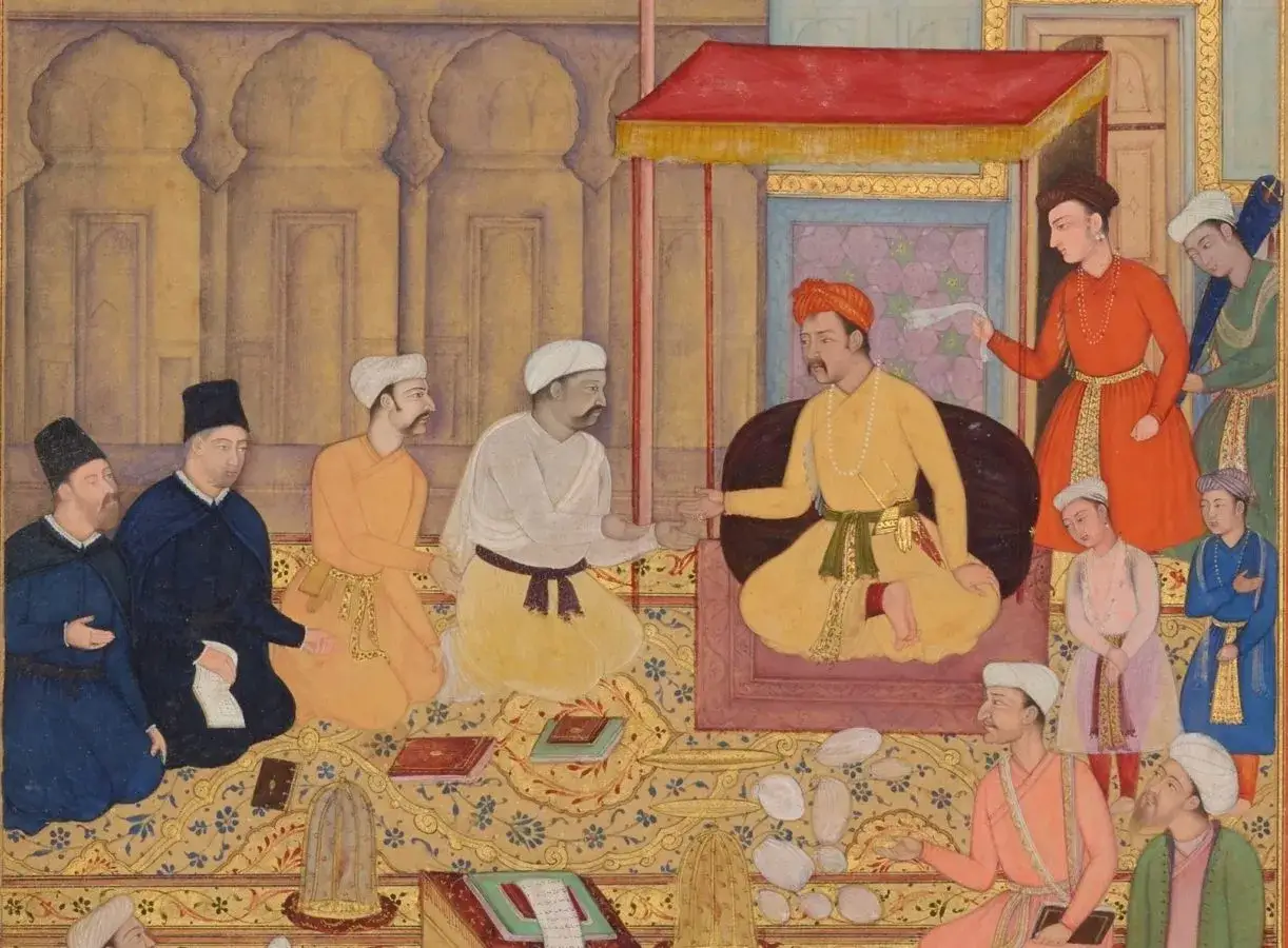
- Darbar scenes, or formal court assemblies, reveal hierarchy through placement, scale, and costume. The image tells you who matters by where they stand or sit.
- Illustrated histories such as the Akbarnama and Padshahnama turn empire into narrative. These works are not just records; they are visual arguments about legitimacy.
- Animals, plants, and birds often show the most precise observation in the whole tradition. Jahangir in particular encouraged this sharper naturalism.
- Religious or cross-cultural scenes remind you that the Mughal court was not sealed off. Christian, Hindu, Persian, and Central Asian references could all appear in the same visual world.
One subtle point matters here: single portraits were sometimes reused as templates inside larger group scenes, so a face can travel from an album leaf into a court assembly. That kind of recycling is one reason the tradition feels both inventive and highly organized. To see why, it helps to look at the workshop itself.
How the paintings were actually made
The making process was collaborative, and that is one of the biggest misconceptions outside the field. The V&A preserves Akbarnama inscriptions that distinguish the tarh, the initial design, from the ‘amal, the color work; in some cases a specialist even handled the faces. In other words, a miniature often records the labor of several artists, not one solitary hand.
- Prepare the support. Paper was burnished to create a smooth surface, and some works were built as layered folios or mounted album pages.
- Lay in the design. Black chalk, charcoal, or thin ink established the composition and underdrawing.
- Build the color. Opaque watercolor and gold were applied in controlled layers, with white used to brighten highlights and mix softer tones.
- Finish the details. Faces, textiles, foliage, and architectural accents were sharpened at the end, often by artists with specific specialties.
- Mount and preserve. Finished leaves could be inserted into albums, or combined with text pages in manuscript form, including the muraqqa, an assembled album of mounted paintings and calligraphy.
The pigments mattered as much as the drawing. Black was essential for underdrawing, while green pigments such as verdigris are now known to be especially vulnerable because they can corrode paper over time. That is one reason condition problems in Mughal leaves are not random; they often follow the chemistry of the original materials.
This process explains both the brilliance and the fragility of the works, which leads directly to the question I care about most in practice: what is original, what is later, and what has been repaired?
How I would assess authenticity, condition, and later repairs
When I evaluate a Mughal miniature, I do not start with a claim of rarity. I start with the object itself: paper, pigments, mounting, inscriptions, and provenance. A convincing image can still be a later copy, and a damaged leaf can still be a significant period work.
| What I check | What it can tell me | Red flags |
|---|---|---|
| Paper and burnish | Age, preparation, and whether the surface matches manuscript practice | Too-new paper, overly uniform sheen, or inconsistent edges |
| Pigments and gold | Likely period palette and layering habits | Fresh-looking color that sits awkwardly on the surface |
| Inscriptions and seals | Workshop attribution, ownership history, or later collecting history | Incongruent handwriting, suspiciously neat additions, or mismatched dates |
| Mounts and borders | Whether the page was remounted, trimmed, or recomposed later | Modern backing materials, uneven trimming, or border styles that do not fit the image |
| Stylistic coherence | Whether drawing, costume, architecture, and composition belong together | Mixed visual languages that suggest pastiche rather than a coherent period hand |
| Provenance | How the work moved through collections over time | Gaps with no documentation, especially when the object is presented as exceptional |
I also watch for over-restoration. A miniature can look surprisingly crisp after cleaning or retouching, but that does not automatically make it more authentic; sometimes it just means the surface has been flattened by intervention. In practice, the safest judgments come from cumulative evidence, not from a single dramatic clue.
That caution is important because the market often rewards the look of imperial refinement even when the object is later, provincial, or heavily altered. The next section is about why those distinctions still matter outside the collecting room.
Why the tradition still matters in museums and contemporary art
Mughal miniature art still matters because it sits at the intersection of style, power, and cultural exchange. It challenges any simple category of “Indian” or “Persian” art: the imperial workshop was built from many hands, and the finished image reflects that mixture openly. For museum viewers in the United States, that hybridity is useful, because it shows how court art can absorb outside influence without losing its own identity.
In U.S. museums, these leaves often do double duty: they are shown as art and used as evidence of how courts, workshops, and trade networks shaped visual culture across continents. They also help audiences understand that manuscript painting was not a minor decorative sideline. It was a serious medium of statecraft, memory, and elite taste.
It also matters because the tradition never fully ended. Regional schools adapted Mughal methods after the imperial center weakened, and later artists revived the miniature format for modern themes, including memory, politics, and identity. That living afterlife makes the style more than a historical niche; it is a working visual language with a long conservation trail.
For institutions, the implication is straightforward: cataloging, storage, and display decisions are not secondary administrative tasks. They are part of how the work survives as evidence.
What careful looking reveals that reproduction images often hide
Digital images flatten several things at once: surface texture, paper tone, gold behavior, and the tiny fault lines that tell you whether a page has been trimmed or remounted. If you are viewing an original leaf, I would pay attention to the edges first, then the burnish, then the relationship between image and border. Those details are often more revealing than the central scene.
- Edges can show trimming, later mounting, or loss that is invisible in a scan.
- Gold often reads differently in person, especially when the sheet is tilted under light.
- Paper tone can reveal age, staining, or previous exposure to unstable storage conditions.
- Surface detail helps you separate original brushwork from later retouching.
- Lighting should stay low and controlled; for paper-based works, conservation practice often keeps display levels near 50 lux.
If I had to leave one practical rule for anyone studying or handling these works, it would be this: read the image as an object, not just as an illustration. Style tells you where it belongs, materials tell you how it was made, and condition tells you what time has already taken away.