Working with ink rewards decisiveness, but the medium is more forgiving than it first appears. This guide breaks down the methods behind strong line control, tonal buildup, material choices, and the mistakes that quietly flatten a drawing. If you want pen and ink techniques that feel controlled rather than tentative, the key is to match the mark-making method to the paper, ink, and subject.
The fastest gains come from line control, value planning, and stable materials
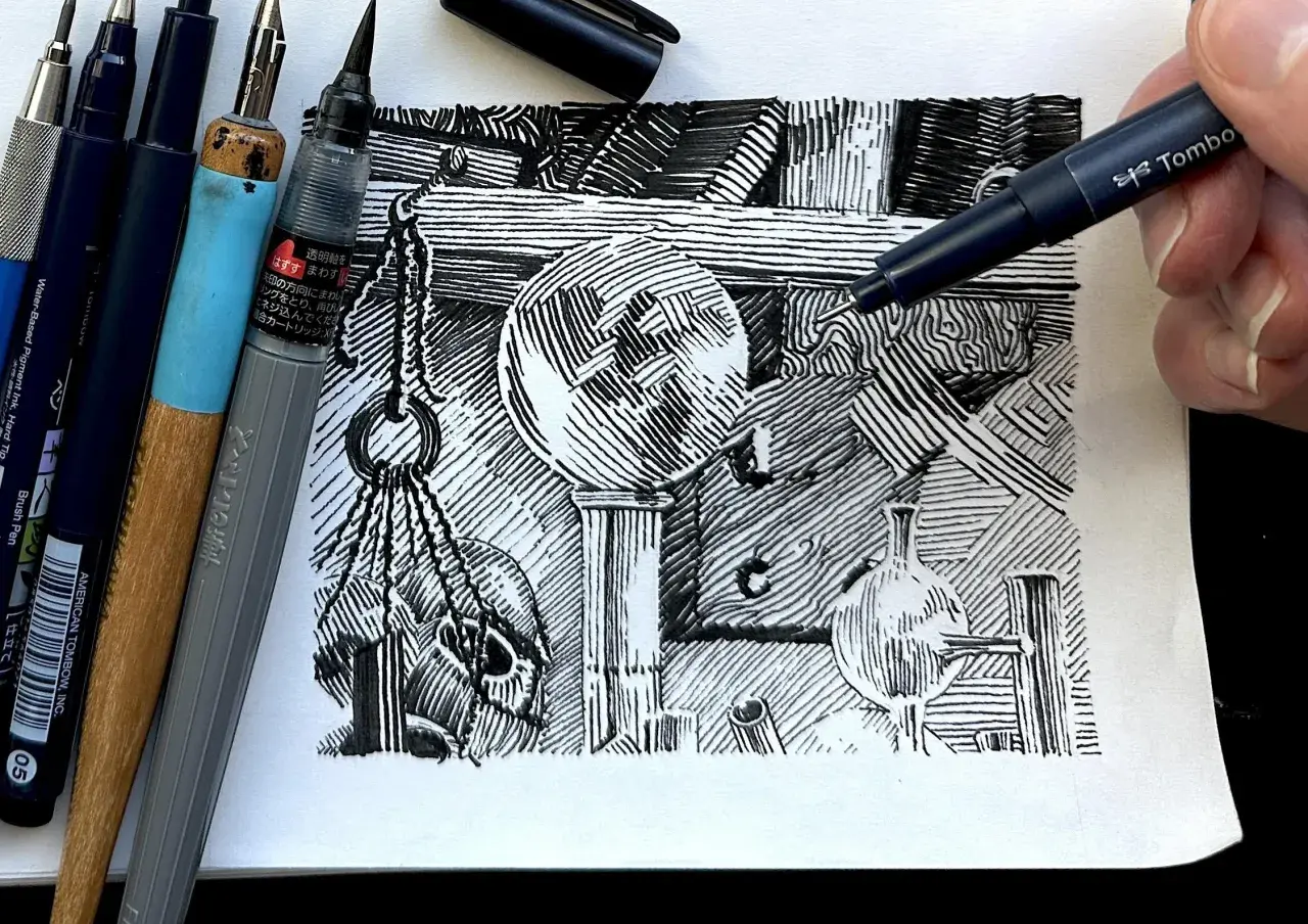
- Hatching, cross-hatching, stippling, and line weight do most of the visual heavy lifting.
- Technical pens, dip pens, brush pens, and fountain pens solve different problems, so choose by line quality rather than habit.
- Smooth, heavyweight paper gives cleaner edges; rough or absorbent paper changes the way ink behaves fast.
- A thumbnail value plan prevents the drawing from becoming busy before it becomes convincing.
- Archival pigment ink and acid-free paper are the safest default when a drawing may be sold, stored, or catalogued.
The marks that give ink drawings structure and depth
I usually think of ink as a language of pressure and spacing. The same pen can describe a rounded cheek, a rough tree trunk, or a sharp architectural edge simply by changing how the mark is repeated and how much paper is left open.
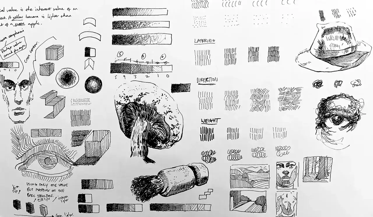
Hatching that follows form
Parallel strokes are the backbone of the medium. I keep them directional when I want the surface to feel like it belongs to the object, not just to the drawing; on a sphere, for example, the lines should arc with the volume rather than sit flat like fence slats. Even spacing gives a quieter midtone, while tighter spacing pushes the value darker without needing extra pressure.
Cross-hatching for denser shadows
Cross-hatching works when the first pass is already disciplined. I add a second layer at a different angle only where the shadow genuinely needs more weight, because piling on every direction at once can make the surface look muddy. The best cross-hatching feels organized, not tangled, and the paper still reads through the network of lines.
Stippling for controlled gradation
Stippling is slow, but it gives a softness that line-based shading cannot always match. I reach for it when I want a smoother transition on skin, fog, polished stone, or any area where a hard hatch would feel too mechanical. The risk is uniformity: if the dots are too evenly spaced, the drawing starts to look printed rather than drawn.
Read Also: Master Tone in Art - Create Depth & Mood in Your Work
Line weight, broken line, and line and wash
Line weight is one of the simplest ways to direct attention. A slightly thicker contour on the shadow side can pull a form forward, while a broken line can let highlights breathe and keep the edge from looking cut out. When the image needs softer shadow mass, I like a light line-and-wash approach because it preserves the drawing’s structure while letting the tone expand beyond the linework.
Those marks only work cleanly when the tool and paper support them, which is where material choices start to matter.
Choosing pens, nibs, ink, and paper with intention
If I am solving a practical drawing problem, I choose the tool last, not first. The right combination depends on whether I need repetitive control, expressive variation, or a surface that can survive repeated layers without feathering.
| Tool | Best use | What it does well | Trade-off |
|---|---|---|---|
| Technical pen | Detail, clean contours, architectural work | Consistent line width and predictable output; common drawing sizes run from 0.1 mm to 0.8 mm | Less expressive, and it needs regular cleaning |
| Dip pen and nib | Gesture, calligraphic variation, lively line | Wide pressure range and strong character | Slower setup and less consistency across long sessions |
| Brush pen | Bold accents, foliage, hair, fast sketching | Energetic strokes and a flexible mark | Easy to overuse, especially when the drawing needs restraint |
| Fountain pen | Travel sketching and comfortable long-form drawing | Good ergonomics and smooth flow | Ink compatibility matters, and not every model likes pigment ink |
On ink, I lean toward pigment-based formulas when permanence matters. Dye-based inks can look rich and fluid, but pigment inks are the safer choice if the drawing may be scanned, washed, framed, or stored long-term. For paper, smooth Bristol board and hot-press watercolor paper are the most forgiving starting points because they let fine lines stay crisp; I move to a little more tooth only when I want the surface texture to become part of the image. For wet layering or line and wash, I prefer heavier stock in the 180 gsm-and-up range.
Once the materials behave predictably, a disciplined sequence keeps the drawing from turning overworked.
A reliable workflow from thumbnail to finished drawing
I rarely begin with the final contour. I start with small thumbnails because ink punishes indecision later, and a quick value map tells me where the darkest darks and cleanest whites need to stay.
- Make two or three thumbnails and mark the light source before you commit to the larger drawing.
- Block the object lightly so proportion and placement are settled before the first serious ink pass.
- Place the darkest masses early; this keeps you from shading every area to the same density.
- Build midtones with hatch families that follow the form instead of sitting across it mechanically.
- Use cross-hatching only where a deeper value is truly needed.
- Save texture, edge cleanup, and focal-point accents for the end.
That order matters because every extra pass tightens the surface. If I have to choose between a slightly simpler drawing and one that has been polished into stiffness, I choose the simpler one almost every time. A clean hierarchy of values reads better than crowded detail. The fastest way to lose that hierarchy is to let a few common habits take over.
The mistakes that flatten ink work before you notice them
Most weak ink drawings are not weak because the artist lacks skill; they are weak because the page has no hierarchy. I watch for a few recurring habits whenever a drawing starts to feel busy but still unfinished.
- Using the outline as the whole structure. If every edge is equally hard, the subject loses depth. I soften some edges, break others, and let shadow shapes carry part of the form.
- Changing line weight without a plan. Thicker lines should say something: foreground, shadow side, overlap, or emphasis. Random thickening looks decorative instead of intentional.
- Shading every area at the same density. The eye needs rest. Leaving quiet paper in the right places is often more convincing than adding another layer of marks.
- Choosing paper that works against the pen. Very textured or highly absorbent paper can blur fine detail and make clean hatching difficult to maintain.
- Mixing too many mark types at once. Hatching, stippling, and brushwork can coexist, but only when one of them leads and the others stay subordinate.
When I correct those habits, the drawing usually improves more than it would from any new pen. That is why material discipline and editing matter together, which brings me to permanence.
Archival choices that matter when the drawing needs to last
For gallery work, commissions, or anything that may end up in a collection, I treat permanence as part of the technique. The line is only half the story; the paper, ink, and storage conditions determine whether the drawing still looks stable after handling, framing, or years in a flat file.
- Choose acid-free paper. It reduces the risk of discoloration and gives the work a better long-term baseline.
- Use archival pigment ink when permanence matters. It is generally the safer choice for drawings that may be exposed to light, moisture, or later conservation work.
- Test every combination on scrap. Some inks feather on certain papers even when the brand sounds premium.
- Let each layer dry fully before stacking or washing. Smearing often happens because the artist moves too fast, not because the medium failed.
- Keep material notes. I record the paper, ink, pen size, and any wash used, because that information can matter later for authentication or conservation.
Those habits are not glamorous, but they are the difference between a drawing that merely looks finished and one that remains legible as an object. Once the material side is stable, progress comes from repetition, not reinvention.
A simple practice routine that makes line control second nature
I do not think most people need more tricks. They need a repeatable drill that exposes weak control fast enough to fix it. A short session, done often, does more for ink drawing than one heroic weekend of overworking.
- Spend five minutes on straight lines, C-curves, and S-curves to warm up the wrist and shoulder.
- Spend five minutes on a hatch scale, moving from open spacing to dense value without changing the pen.
- Spend five minutes on one sphere or cylinder so you can practice contour-following strokes.
- Spend five minutes on one small texture study, such as fabric, bark, metal, or foliage.
- Once a week, finish one sketch with a clear value plan instead of chasing detail everywhere.
If I were starting again, I would keep the setup brutally simple: one waterproof black ink, one smooth board, one mid-range pen size, and one page of drills each week until the marks felt automatic. That combination gives you enough control to learn the medium without turning every session into equipment management.