Tone is what gives a drawing or painting weight, depth, and mood. When I think about creating tone in art, I break the problem into value structure, materials, and mark-making, because those three choices decide whether a subject feels flat or convincing. This matters whether you are blocking in a portrait, building atmosphere in a landscape, or trying to keep a study readable before color enters the picture.
The quickest route to stronger tone is a clear value plan
- Start with 3 to 5 value groups before you refine edges or details.
- Decide on the light source first, because tone only makes sense relative to it.
- Use graphite, charcoal, wash, or paint based on how much control and correction you need.
- Keep the darkest darks and lightest lights reserved for the places that matter most.
- Check the work in grayscale, from a distance, and with a squint test.
Tone starts with value, not color
In practice, tone is the relative lightness or darkness of a mark or color. I usually separate that decision from hue as early as possible, because color can be misleading: a bright red may look “strong,” but it can still sit in the wrong value range and flatten the form. If the value structure works, the image reads even before the color is perfect.
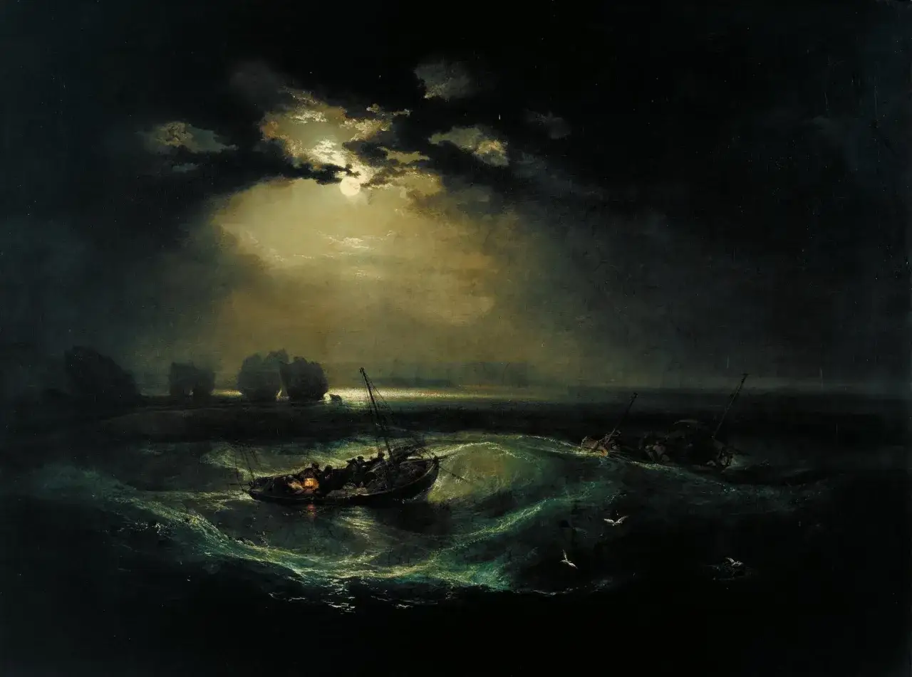
The simplest place to begin is a three-part reading of the subject: lights, mid-tones, and shadows. That is enough for a quick study and often enough for a finished work if the composition is clear. When I need more subtlety, I expand to a five-step scale: highlight, light, mid-tone, dark, and accent dark. That extra step usually helps with skin, foliage, stone, and other surfaces where the transitions matter more than the outline.
For beginners, the biggest mistake is trying to render everything at the same strength. A convincing tonal image depends on contrast hierarchy, not on putting detail everywhere. Once that principle clicks, the next step is learning how to map those values before you polish anything.
Build a tonal map before you commit to details
I almost always start with a tonal map or thumbnail study. It is a small, fast version of the final image that tells me where the major value masses live. This is where you decide whether the composition will feel airy, dramatic, soft, or compressed.
- Block in the biggest shapes first and ignore local detail.
- Mark the lightest areas as protected zones, not as empty space.
- Place the darkest darks early so the value range has a fixed anchor.
- Group mid-tones instead of scattering them into too many little patches.
- Refine edges only after the large value relationships feel stable.
That workflow is especially useful in charcoal, graphite, and ink wash because those media reward speed and correction. In a charcoal sketch, I can shift a value in seconds with a kneaded eraser or a soft pass of a stump. In paint, the same idea works as an underpainting or block-in: establish the tonal architecture first, then build the color on top. The point is not to make the study pretty; the point is to make the structure honest.
Once the map is solid, the material you choose determines how easy it is to keep that structure under control.
Choose materials that make tonal control easier
Some materials are forgiving, some are precise, and some are best when you want atmosphere more than detail. I pick the medium based on the kind of tonal adjustment I expect to make, not just on habit.
| Material | Best for | Tonal strength | Main limitation |
|---|---|---|---|
| Graphite | Controlled drawing, tight value studies, fine transitions | Precise light-to-dark range with clean edges | Can become shiny and overly polished if pushed too far |
| Charcoal | Fast studies, dramatic contrast, expressive shading | Deep darks and soft, broad transitions | Smudges easily and needs careful handling |
| Ink wash | Atmospheric scenes, transparent layering, quick tonal masses | Strong read of mid-tones and shadow shapes | Darks are harder to lift once they settle |
| Gouache | Opaque block-ins, posters, studies with flat value masses | Good for clear value steps and corrections | Can turn chalky if overmixed or overworked |
| Oil paint | Layered tonal painting, soft transitions, rich depth | Excellent for glazing and gradual value shifts | Easy to muddy the range if the first block-in is weak |
If I had to recommend one practical starting setup, it would be a 2B or 4B pencil, a stick of vine charcoal, and a sheet of medium-tooth paper. “Tooth” simply means the texture of the paper surface; a little texture gives dry media something to catch, which makes tone easier to build. For painting, a limited palette with strong value separation is usually safer than a huge color range, because too many mixtures make it harder to read the light.
Material choice does not replace judgment, but it can make good judgment easier to repeat. From there, the next question is how to use the mark itself to shape depth and mood.
Use layering, marks, and edges to shape the mood
Tone is not only about how dark something is. It is also about how a value changes, where it softens, and where the eye is allowed to rest. I usually think in terms of mark-making and edge control, because those are what separate a flat study from a living one.
- Hatching builds tone with directional lines and keeps the surface lively.
- Cross-hatching deepens shadows without needing to blend everything into a blur.
- Blending is useful for soft skin, cloud forms, or quiet transitions, but it can erase structure if you overdo it.
- Glazing in oil or acrylic deepens the value family with thin transparent layers.
- Scumbling adds a broken, lighter layer over a darker one and is useful for atmosphere, stone, or weathered surfaces.
- Dry brush creates a textured tone that works well when you want surface energy rather than smoothness.
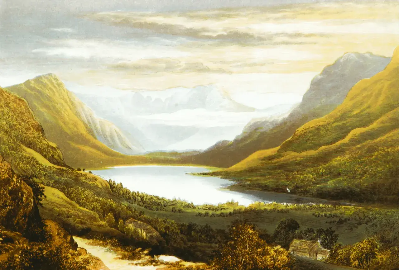
Edges matter just as much as the medium. A hard edge pulls attention; a soft edge lets a form breathe back into the background. I use hard edges sparingly around the focal point and keep peripheral forms quieter, because that keeps the tonal design from turning noisy. In a portrait, for example, the nose and eyes may need sharper value transitions than the cheek or shoulder. In a landscape, the distant tree line often benefits from softer edges and closer value spacing, which creates depth without shouting for attention.
When the marks, layers, and edges are doing the right job, the final step is checking whether the tone actually reads the way you think it does.
Check the value structure before the image gets overworked
I use a few simple checks because tone often looks better up close than it does from a normal viewing distance. The first is the squint test: if the image still reads when the details blur, the tonal structure is probably working. The second is a grayscale check, whether by photographing the work or by mentally stripping out color. The third is distance. A drawing that feels complete at arm’s length can fall apart when you step back 6 or 8 feet.
The most common tonal mistakes are predictable, which is useful because they are easy to correct once you know what to watch for:
- Too many middle values, which makes the piece feel sleepy and unresolved.
- Not enough contrast near the focal point, which leaves the eye nowhere to land.
- Over-blending, which turns forms mushy and removes the sense of structure.
- Using color to disguise poor value relationships instead of fixing the values first.
- Adding detail before the large masses are right, which usually creates a busy but weak image.
I think the safest habit is to ask one question repeatedly: does this value belong where it is? If the answer is unclear, stop and compare it with the nearest light and dark neighbors before you keep drawing or painting. That simple pause saves a lot of repair work later, and it leads naturally into the final habit that makes tone more reliable over time.
Why tonal structure stays useful long after the first pass
Strong tone does more than make an artwork look convincing on day one. It gives the image a backbone, which is one reason tonal studies remain so useful in conservation-minded practice: when surfaces age, colors shift, or varnish changes the overall look, the value structure is often what still holds the image together. That is one reason I treat tonal planning as part of craftsmanship, not as a preliminary exercise to rush through.
If I were building a first tonal study today, I would keep it simple: choose one light source, limit myself to three or five value groups, and work from the largest shapes into the smallest in a 15-minute study. Then I would test the result in grayscale and leave a few areas deliberately unresolved so the brightest and darkest passages have room to breathe. That restraint usually creates a more authoritative reading than trying to explain every surface at once.
Once that approach becomes routine, tone stops feeling like a mystery and starts behaving like a tool you can actually trust.