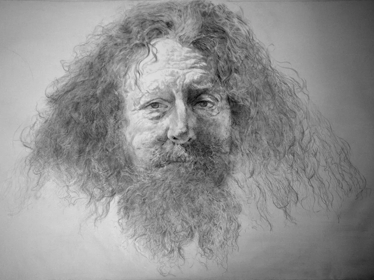
A silver drawing can look spare at first, but it is rarely simple. The medium sits at the intersection of line, surface, and time: silverpoint behaves one way, silver ink another, and both demand choices that affect appearance, longevity, and authenticity. This article breaks down the materials, the working process, the visual results, and the preservation clues that matter when a sheet needs to be understood, collected, or conserved.
The essentials behind silver lines
- Silverpoint is a dry metalpoint method; silver ink is a liquid medium, and they age very differently.
- The support matters as much as the mark, because the ground controls adhesion, sheen, and line quality.
- Silverpoint usually leaves a fine, precise line that can tarnish toward warm brown over time.
- Silver inks can be beautiful, but their binder, pigment load, and paper compatibility determine whether they stay stable.
- For preservation and authentication, conservators look at line behavior, ground structure, oxidation, and signs of later retouching.
What these silver lines actually are
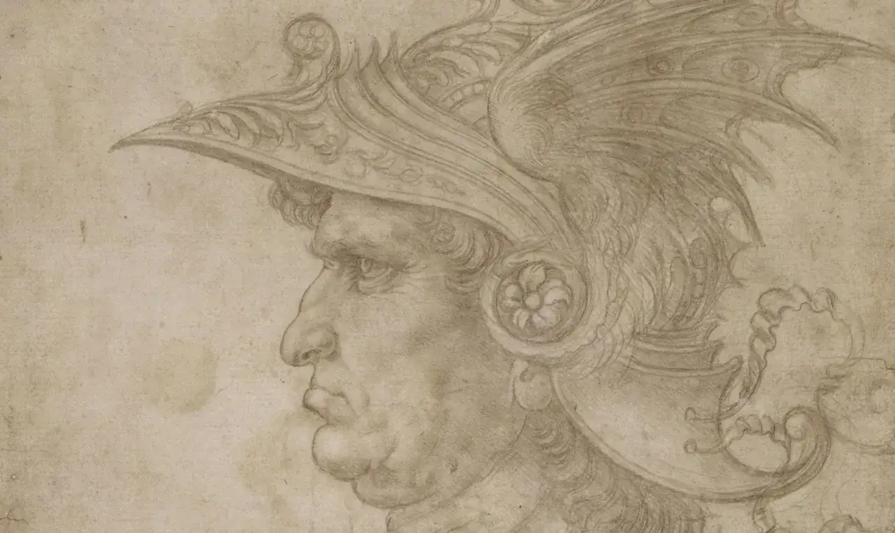
I treat this medium as two related but distinct practices. Silverpoint is a metalpoint technique: a silver stylus is drawn across a prepared abrasive surface, and the mark is created by tiny traces of metal left behind on the support. The Metropolitan Museum of Art describes metalpoint in that practical sense, and that is the best way to understand why the line is so fine, controlled, and difficult to alter once it has been laid down.
Silver ink works differently. It is a liquid medium carried by brush or dip pen, usually built around a metallic silver appearance or a silver-bearing formulation. Some versions are made for strong visual effect rather than long-term permanence, so I read the label carefully and think about the binder, the paper, and how the surface will handle the load before I trust the shine. In other words, the two media share a visual family name, but they do not behave like cousins so much as like different tools.
The National Gallery of Art notes that metalpoint is valued partly because the silver line can be very subtle and partly because the medium rewards precise handling. That combination is exactly why it still attracts artists, collectors, and conservators alike. The next question is what actually makes the mark work in the first place.
Materials that control the mark
The surface does most of the work here. A silver drawing setup is often less about the bottle price and more about the prepared surface, the stylus, and the ground. If the support is wrong, the line will feel weak, scratchy, or unstable no matter how skilled the hand behind it is.
| Component | Silverpoint | Silver ink | Why it matters |
|---|---|---|---|
| Surface | Needs a slightly abrasive, prepared ground | Needs paper that can take wet media without buckling or feathering | The wrong paper ruins consistency fast |
| Mark-making tool | Silver stylus or wire in a holder | Brush or dip pen | Tool choice shapes the line more than pressure does |
| Line behavior | Fine, controlled, usually pale at first and warmer over time | Can be opaque, translucent, or metallic depending on the formula | Appearance changes with chemistry and paper absorbency |
| Archival risk | Abrasion, humidity sensitivity in traditional grounds, handling wear | Smudging, poor adhesion, settling of metallic particles, fading in weak formulas | Storage and framing should match the medium, not the image subject |
For a practical budget check, Winsor & Newton lists a 14 ml bottle of metallic silver ink at about $8.39 USD. That is useful mostly because it shows the ink itself is not usually the expensive part; the real cost comes from getting the support, ground, and working habits right.
Traditional silverpoint grounds often rely on a glue-and-chalk or gesso-like layer, while modern versions may use acrylic grounds designed for drawing. In either case, the goal is the same: enough bite for the metal to register, but not so much texture that the line becomes ragged. Once that surface is right, the artist can move from setup to actual drawing decisions.
How to build a clean workflow
The medium rewards discipline more than speed. I would begin with a test strip, because a tiny sample tells you more than any supplier description can. If the surface grabs too hard, the line will look broken. If it is too smooth, the metal will barely appear. That first test saves more work than almost any other step.
- Prepare a small corner or separate swatch and test the ground before committing to the final sheet.
- Map the composition lightly, because silverpoint leaves little room for erasing and silver ink can soak into paper faster than expected.
- Work from broad structure to detail, especially if the final image depends on contour, proportion, or perspective.
- Use repeated hatching rather than heavy pressure when building darker passages in metalpoint.
- Let silver ink dry fully before layering or revising, since wet metallic marks can smear or pool in ways that are hard to correct.
- Keep the workspace clean; dust on the ground changes the line and can create false texture that looks like age damage later.
One thing beginners often miss is that silverpoint is not a pressure medium in the way graphite is. You do not force darks out of it. You accumulate them through direction, repetition, and control. Silver ink, by contrast, asks for restraint in the opposite direction: too much liquid and the mark loses clarity, too little and the metallic effect becomes uneven.
I also think it helps to plan for the final surface from the start. If the drawing is meant to remain visible and stable, the artist should know whether the work will be framed under glazing, stored flat, or handled often. That practical question leads directly to how conservators read the sheet later.
How conservators read the surface
When I look at a silverpoint or silver-ink sheet in a conservation context, I am not only reading the image. I am reading the line, the ground, the wear pattern, and the chemistry of aging. Silverpoint usually leaves a line that sits inside the prepared surface rather than floating on top of it, and that difference is one of the first clues experts look for under magnification.
There are a few telltale behaviors that matter:
- Silverpoint lines often look dry, narrow, and extremely consistent, with little variation in width compared with graphite.
- The tone usually shifts over time, often toward a warmer brown or golden cast as the metal tarnishes.
- Wear at the edges of the drawing can reveal handling, framing issues, or past abrasion.
- Silver ink may show gloss, pooling, feathering, or tide marks that metalpoint never produces.
- Later retouching can stand out if the added marks do not match the age, oxidation, or penetration of the original media.
For contested works, scientific tools matter. Conservators may use X-ray fluorescence or related noninvasive methods to identify metals without sampling the sheet. That is useful because a surface that looks like silverpoint from a distance may turn out to be graphite, leadpoint, or a later metallic ink once it is examined closely.
I am always cautious with sheets that look too even, too fresh, or too convenient for their supposed date. A genuinely old metalpoint sheet usually has a physical logic to it: the line should behave like something that was made against a real ground, not printed on top of one. That is why the medium still matters so much in historical attribution.
Why the medium still matters in contemporary art
Silverpoint never really disappeared; it simply became a specialist language. Leonardo used metalpoint for close observation, and Dürer’s early self-portrait shows how expressive that restrained line can be when the hand is confident. Contemporary artists have kept proving the same point. Susan Schwalb, for example, has built highly resolved abstract compositions in silverpoint, which is a reminder that the medium is not only for Renaissance likenesses and preparatory studies.
| Best use case | Why it works | Where it can struggle |
|---|---|---|
| Portrait studies | Excellent for contour, proportion, and subtle modeling | Broad dark passages take patience |
| Botanical subjects | Ideal for fine structure, veins, and layered observation | Loose, painterly effects are harder to achieve |
| Architecture and perspective studies | Strong for measured line and precise geometry | Can feel too restrained for atmospheric depth |
| Decorative or high-contrast work | Silver ink can add sheen, emphasis, and sharper visual drama | Some formulas are less durable than the image suggests |
That comparison is useful because it keeps the choice honest. If the image depends on exact contour and the quiet accumulation of tone, silverpoint is the better fit. If the image needs reflective accents, calligraphic flair, or larger areas of metallic presence, silver ink may serve better. The trick is not to romanticize either one.
For artists and institutions alike, the medium still earns its place because it teaches discipline. Every line is a decision, and every decision remains visible. That makes the work beautiful, but it also makes it vulnerable, which is where collection care comes in.
What I would record before a sheet ever leaves the studio
If I were cataloguing or buying one of these works, I would document the support, the ground, the tool, and the surface condition before I wrote a single sentence about the subject matter. Those technical details are not administrative filler; they determine how the work should be stored, handled, and interpreted over time.
My practical checklist is simple: frame under conservation glazing, keep a spacer between the art and the glass, avoid damp storage, and never let a silverpoint surface rub against anything textured. For works on paper, stable conditions matter more than dramatic intervention. If a sheet is shipped, it should travel flat, rigid, and protected from vibration.
I would also label the medium precisely. “Drawing” is too vague for preservation records when the difference between silverpoint, silver ink, graphite, and metal-bearing washes can affect treatment and attribution. A good record should note whether the line is embedded in a prepared ground, whether the ink is metallic or merely silver-toned, and whether any later additions are visible under close inspection.
In the end, that is what makes this field interesting to me: the image is only half the story. The surface tells the rest, and if you understand how the line was made, you are already much closer to preserving it correctly.