
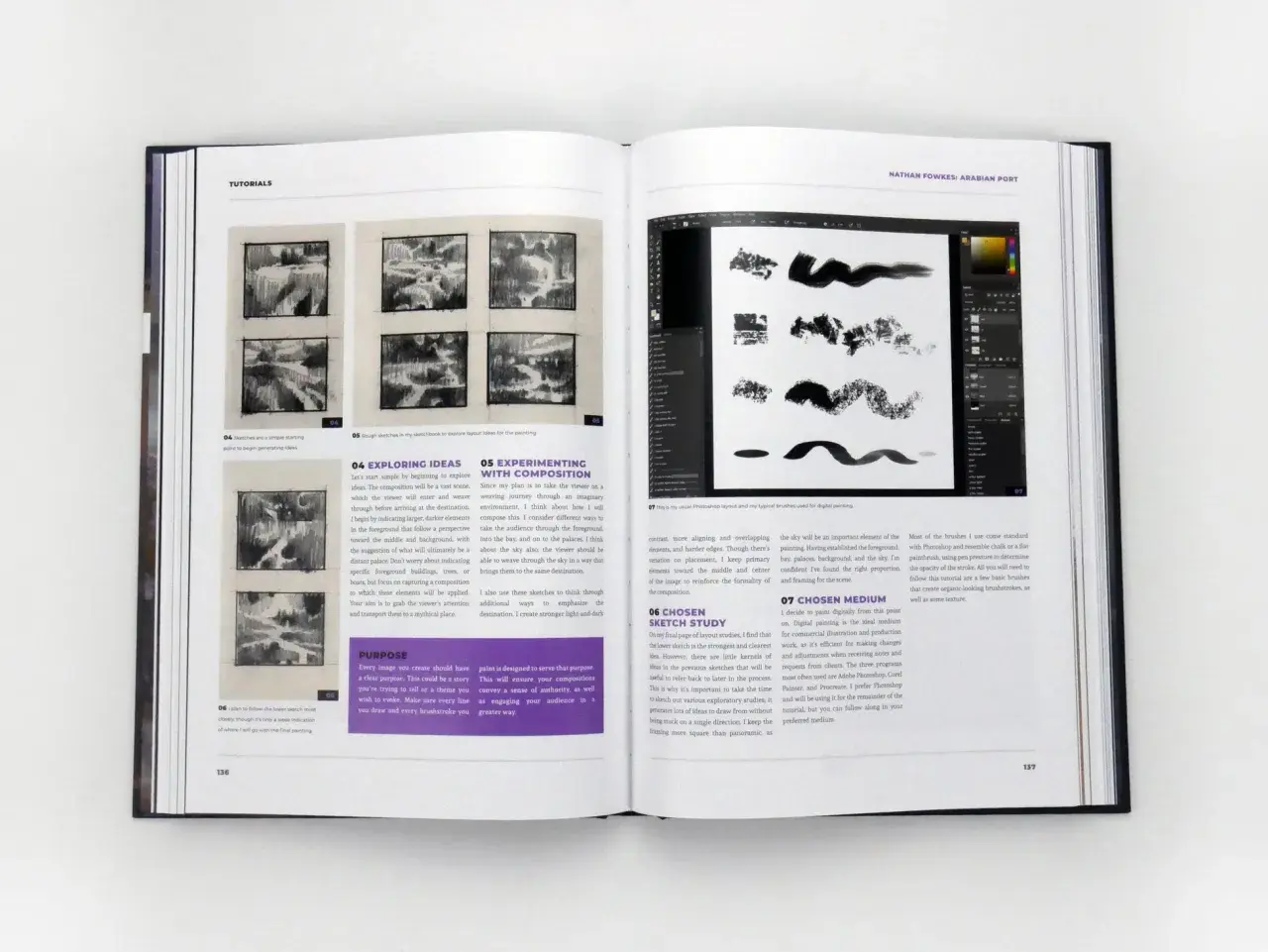
Good composition is not decoration. It is the structure that decides what the viewer notices first, what feels stable, and what feels unresolved. In this guide, I break down composition in art, the visual tools that matter most, how materials and technique change the result, and how to judge whether a layout actually supports the subject.
The essentials of strong composition
- Composition is the arrangement of visual elements so the eye moves with purpose.
- Balance, focal point, rhythm, scale, and negative space do most of the heavy lifting.
- Classic structures like centered, triangular, diagonal, and asymmetrical layouts each create different effects.
- Materials matter: brushwork, drawing media, collage, and surface size all change how a composition reads.
- The best test is simple: if the subject is strong but the layout feels confused, the composition still needs work.
What composition actually does in a work of art
I think of composition as the part of an artwork that organizes attention. The subject may be interesting, but the arrangement decides whether the viewer can read it quickly, linger on the right details, and feel the intended mood. Tate's plain definition is useful here: composition is the arrangement of elements in relation to one another and to the viewer.
That means composition is not just where things go. It controls hierarchy, pace, tension, and calm. A portrait can feel intimate because the face is large and close to the frame, or distant because the figure is pushed back into space. A still life can feel orderly with even spacing, or unstable if objects lean toward an edge. The artist is always making decisions about relationship, not just placement.
When composition works, the viewer rarely notices the mechanics first. They feel the result. That is why composition matters in both traditional painting and more contemporary work: it quietly carries the meaning. Next, it helps to look at the building blocks that create that effect.
The building blocks I watch first
Strong composition usually comes from a small set of visual decisions that reinforce each other. I do not treat these as rigid rules, but I do check them before I trust a layout.
- Balance - visual weight distributed in a way that feels intentional, whether symmetrical or not.
- Focal point - the place where the eye lands first and returns.
- Contrast - differences in value, color, texture, or scale that create emphasis.
- Rhythm - repeated shapes, marks, or intervals that move the eye through the work.
- Scale and proportion - the size relationships that make elements feel believable or surprising.
- Negative space - the empty or quiet areas that give the subject room to breathe.
The most common mistake is assuming every element should matter equally. It should not. A strong composition usually has a dominant idea and supporting parts. If every corner competes, the eye gets tired. If everything is centered and evenly weighted, the image can feel static even when the subject is lively. That is why these building blocks need a clear structure behind them.
Once those basics are in place, the next question is not what the elements are, but how they are arranged into a readable shape.
Common compositional structures and when they work
Most artists eventually return to a handful of structures because they solve different problems well. I find it more useful to think in terms of effect than in terms of labels.
| Structure | What it tends to do | Best use | Common risk |
|---|---|---|---|
| Centered | Feels stable, direct, and formal | Icons, portraits, objects meant to read as important | Can become static if nothing else creates tension |
| Triangular or pyramidal | Feels grounded and classical | Groupings, portraits, still lifes, narrative scenes | Can look overly safe if every edge is predictable |
| Diagonal | Creates motion and urgency | Action, travel, conflict, change | Can feel chaotic if there is no anchor |
| Asymmetrical | Feels modern and alive | Contemporary painting, design-heavy layouts, landscapes | Can tip visually if the weights are not carefully judged |
| All-over | Spreads attention across the surface | Pattern, abstraction, immersive surfaces | May lose hierarchy if everything is equally active |
These structures are not mutually exclusive. A painting can be asymmetrical overall and still have a triangular focal arrangement inside it. That flexibility is part of the real craft. The best artists borrow from structure without sounding mechanical, which is why composition stays relevant whether the work is realistic, abstract, or somewhere in between. From there, materials start to matter more than many beginners expect.
How materials and technique change the layout
Composition is not independent of materials. The same design reads differently in oil, watercolor, graphite, collage, or digital paint because each medium handles edges, opacity, texture, and correction differently.
In oil painting, slower drying time makes it easier to adjust relationships between masses, soften transitions, and rework placement. In watercolor, transparent layers and limited lifting force you to commit sooner, so the composition has to be clearer at the sketch stage. Graphite and charcoal reward value planning, because light and dark shapes can carry the entire structure before color enters. Collage often builds composition from fragments, which means overlap, cut edges, and surface texture become part of the visual logic rather than just decoration.Support and scale also change the reading. A small panel invites dense detail and tighter spacing. A large canvas needs bigger shapes, stronger value separation, and more disciplined empty space, or it starts to feel busy from a distance. Even the ground color matters: a warm underpainting can alter how cool passages advance, while a neutral ground can keep the structure cleaner. In practice, materials are not just tools for finishing a piece; they help decide what kind of composition is even possible.
That is why I never separate technique from structure. Once you understand how the medium behaves, you can plan the image more honestly, and that leads naturally to the next step: testing the composition before it is fully committed.
A practical way to test a composition before you commit
When I am judging a layout, I prefer a short sequence rather than vague instinct. It keeps the process honest.
- Start with 3 to 6 thumbnails and vary the placement of the main subject.
- Reduce the image to two or three value groups so the light-dark structure becomes obvious.
- Check the edges of the frame and ask what the viewer sees first, second, and last.
- Turn the sketch upside down or view it in a mirror to catch accidental balance problems.
- Remove one element if the image feels crowded; simplification usually reveals whether the core idea is strong enough.
- Test the composition in grayscale if color is doing too much work.
Those steps sound simple, but they expose most structural problems fast. A thumbnail often looks fine until you compare it with a smaller, darker version and realize the eye has no clear destination. Another common issue is over-explaining the scene. Artists sometimes add detail where they actually need spacing, silence, or a stronger silhouette. The fastest improvement usually comes from editing, not adding.
If you are working from reference, I would also crop aggressively. Cropping changes meaning. It can turn a generic scene into something tense, intimate, or ceremonial simply by shifting the relationships at the border. Once you start using crop as a compositional tool, the next challenge becomes avoiding the traps that flatten a piece.
The mistakes that flatten even a strong subject
Most weak compositions are not caused by bad subject matter. They are caused by unclear relationships.
- Too many equal focal points, which leaves the eye without a clear route.
- Objects spaced at the same interval, which makes the surface feel mechanical.
- Centering everything by default, even when the subject would benefit from tension.
- Ignoring the frame edges, which allows important shapes to drift out of the picture without purpose.
- Overworking detail in the wrong area, which competes with the main idea.
- Forcing symmetry where asymmetry would feel more natural.
I also see artists confuse complexity with strength. A composition can be simple and still feel sophisticated if the value pattern is disciplined and the spacing is confident. In fact, some of the most memorable works are memorable because they know what to leave out. That restraint becomes even more important in conservation and authentication, where the original structure of a work can tell you as much as its surface finish.
Why composition still matters in preservation and authentication
For museums, conservators, and dealers, composition is more than an aesthetic issue. It can be evidence. The original placement of figures, the balance of masses, the spacing of margins, and even pentimenti, those visible changes an artist made during the process, can help distinguish an original work from a later copy or a heavily altered object.
Overpainting, trimming, relining, or aggressive restoration can disturb that structure. A work may still be beautiful, but the compositional logic can become harder to read. If the edge has been cropped, a figure may suddenly feel cramped. If a dark passage has been cleaned too harshly, the value hierarchy can shift and the focal point may weaken. In practice, that is one reason specialists pay close attention to how a piece holds together as a whole, not just to the subject matter or the signature.
From an editorial point of view, this is where composition becomes especially interesting. It is both visible design and historical record. Once you know how to read it, you can see why some works feel inevitable and others feel assembled. The final step is learning how to judge that feeling without overcomplicating it.
The test I trust when a piece feels almost finished
When I want a quick but reliable read, I ask three questions: does the eye know where to go, does the spacing support the subject, and does every major shape earn its place? If the answer is yes, the composition is probably doing its job. If the answer is no, the image needs another pass, even if the rendering is excellent.
That test is useful because it keeps the focus on structure rather than decoration. Good composition does not shout. It organizes. It gives the subject a clear voice, makes the surface readable, and leaves enough tension for the viewer to stay engaged. If you remember only one thing, make it this: strong imagery is usually the result of deliberate relationships, not just attractive elements.
Once you start checking those relationships consistently, composition becomes less mysterious and much more controllable.
