An oyster shell drawing works best when the artist treats the shell as a study in edge, weight, and reflected light rather than as a simple coastal prop. The subject can feel elegant, rough, symbolic, or strictly observational, depending on how the form is handled. In this article I look at why the motif matters, how artists have handled it in museum works, how to build the drawing, and what to check if you are evaluating the sheet as an artwork.
The most useful takeaways before you start looking closely
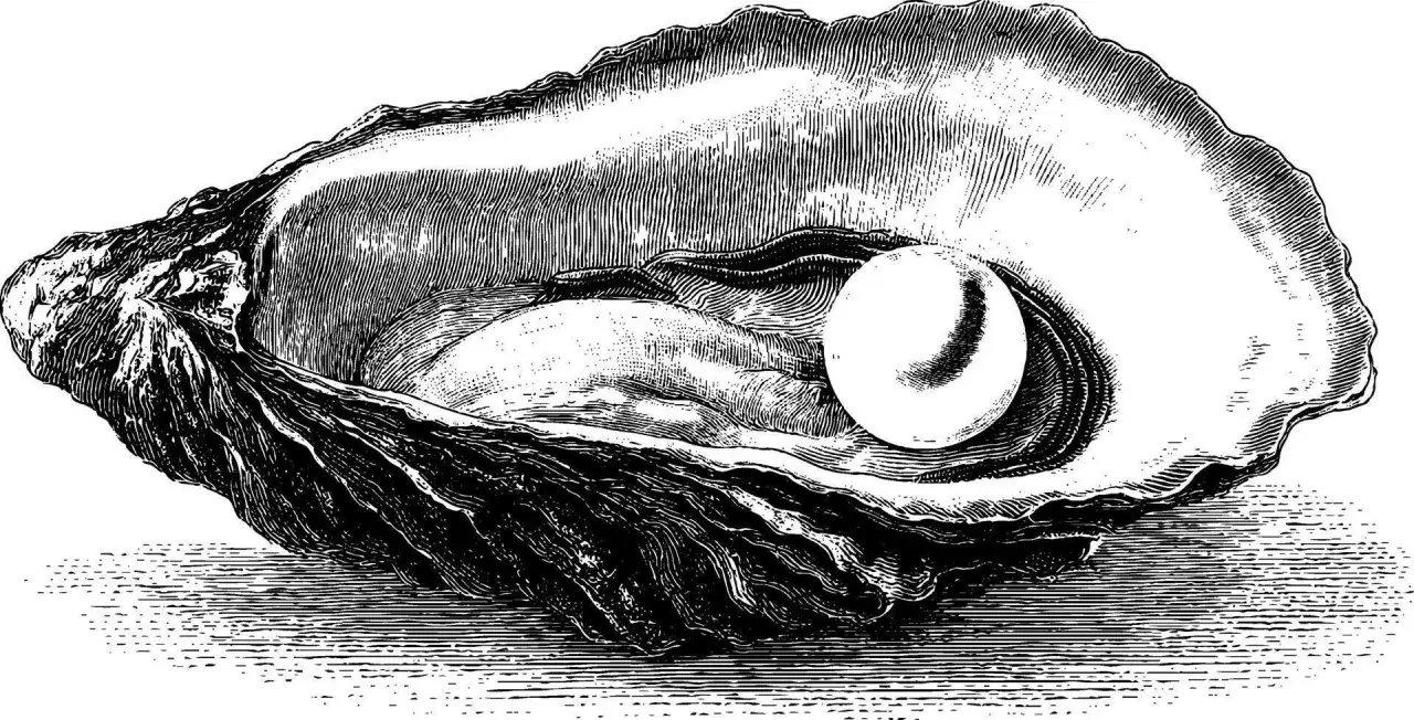
- The shell works because it combines hard structure with soft, pearly reflection.
- Historic examples show the motif can be poetic, narrative, or purely observational.
- A convincing study starts with silhouette and planes, not texture.
- Graphite and ink are the most forgiving media for line control; watercolor asks for sturdier paper.
- For preservation or authentication, paper tone, foxing, pressure marks, and medium behavior matter more than the subject itself.
Why the oyster shell keeps attracting artists
I keep coming back to this subject for one reason: it looks simple until you try to draw it. The outer skin is irregular, the interior catches light in a pale, almost metallic way, and the broken edge forces you to make decisions instead of hiding behind symmetry. That combination gives the artist a compact but demanding problem, which is exactly why it has survived as a favorite study object.
There is also a long art-historical thread behind it. Oysters and shells have appeared in still life, printmaking, and decorative art as signs of abundance, transience, seaside trade, and sensory pleasure. In a Dutch-style tabletop scene, the shell can sit next to bread, wine, or silver and quietly shift the mood toward vanitas; in a more modern drawing, it can become a pure exercise in contour, shadow, and surface. I think that range is the real appeal: one object, several readings, none of them accidental.
Once you see that, the next question becomes practical: what do artists actually do with the form so it feels alive on the page?
What museum examples reveal about the motif
One of the clearest ways to understand the shell as a subject is to look at how different artists simplify it. The National Gallery of Art’s Oyster with Pearl by Jacques Callot turns the shell into a small but important interruption inside a coastal scene. What matters there is not just the object itself, but the way the shell anchors the entire image with a single open curve and a bright interior. It is a lesson in economy: a few lines can carry a lot of visual weight.
The Met’s The Willow Shell by Chōbunsai Eishi takes the idea in a very different direction. The work is shell-themed, but the artist seems willing to invent a shell variety for poetic effect, which is a useful reminder that artists do not always document nature literally. Sometimes the shell becomes a visual pun, a metaphor, or a decorative device. That flexibility matters if you are drawing, because it gives you permission to choose between faithful description and expressive interpretation.
A third reference point is Philip Dawe’s The Oyster Woman, after Henry Morland. Here the opened shell becomes part of a human scene, lit by a lantern and held at the edge of everyday trade. The shell is no longer just a form study; it is a narrative object that carries light, labor, and appetite at once. For me, that is the most useful museum lesson of all: the shell can be tiny and still command the whole composition.
Those examples point to the same conclusion from different angles. The subject works when the artist understands how much can be said with line alone, which is where the drawing process begins.
How I would build the drawing from the shell outward
I usually start with the big shape first and the texture last. If the outer contour is wrong, no amount of hatching will rescue the image. The broken rim, the hinge, and the bowl-like interior need to land before I think about ridges or surface scratches.
Start with the silhouette
Block in the widest point, the main tilt, and the lowest edge in one pass. I prefer a light graphite line, usually HB or 2H, because it lets me adjust the proportions without committing too early. The shell should feel asymmetrical but controlled; if it looks too perfect, it probably looks artificial.
Separate planes before texture
Next I divide the shell into a few simple planes: the outer rough skin, the inner cavity, the lip, and the cast shadow beneath it. That division is more important than individual grooves. A shell reads as convincing when the viewer can tell where one surface turns away from the light and another surface catches it.
Let the highlights do some of the work
The inner surface usually has the strongest light, but it should not be blanked out. I like to leave the brightest area untouched and build the surrounding tone around it. On rough edges, a few broken marks are usually better than a fully polished outline. The more perfect the edge becomes, the less like a shell it often feels.
Read Also: Famous Medical Paintings - Beyond Illness, Art & Healing
Finish with the cast shadow
The cast shadow is what places the shell in space. Without it, the object can float. I keep the shadow soft near the shell and slightly darker as it moves away, which helps the viewer read weight and direction of light. That final step is often what turns a decent study into a believable one.
Once the structure is right, the choice of medium determines how much texture, softness, or brilliance the page can actually hold.
Which medium serves the subject best
The medium should match the kind of shell you want to show. If your goal is crisp observation, graphite or ink usually wins. If you want the inner sheen and the damp, pale color of nacre, watercolor or gouache can be more effective, provided the paper is strong enough to take the moisture.
| Medium | What it does well | Main limitation | Best use |
|---|---|---|---|
| Graphite | Precise contour, soft modeling, subtle gradations | Can look muddy if overblended | Observational studies and preparatory drawings |
| Ink | Clean structure, confident line, strong texture contrast | Corrections are difficult | Linear studies, print-like handling, archival clarity |
| Charcoal | Deep shadows and atmospheric softness | Can lose the shell’s hard edge | Moody still lifes and large-format studies |
| Watercolor or gouache | Pearly interiors, translucent shifts, coastal color | Paper buckling and overworking | Finished illustration or color study |
For paper, I prefer 90-140 lb stock depending on the medium. Dry media are comfortable on smoother surfaces, while wet media behave better on heavier paper with enough tooth to hold repeated corrections. If I want the drawing to feel historically grounded, I will often limit the palette and avoid over-rendering every pore of the shell. A little restraint goes a long way here.
There is a second reason the medium choice matters: once the sheet becomes an object in its own right, condition and handling start to matter as much as image quality.
How to judge the work as an artwork, not just a study
When I evaluate a shell drawing, I do not begin with the subject. I begin with the paper, the marks, and the logic of the medium. A drawing on laid paper with visible chain lines behaves differently from a later machine-made sheet, and a graphite study with deliberate pressure marks tells a different story from an image that has been heavily erased or smudged into softness. Those details do not prove authorship by themselves, but they tell you whether the work is internally consistent.
Condition also changes how the drawing reads. Foxing, which appears as small brown spots, can be part of an old sheet’s life, while mat burn or uneven yellowing often points to poor storage rather than artistic intent. If the shell’s highlights have been scraped away, you should ask whether that was original handling or later damage. I would also look at the cast shadow: if it does not match the direction of the main light, something in the sheet may have been reworked or misunderstood.
- Look for a coherent relationship between line pressure and paper surface.
- Check whether highlights were reserved from the start or added later.
- Compare the shadow shape to the shell’s actual weight and tilt.
- Watch for medium-specific behavior, such as graphite sheen, ink feathering, or watercolor tide marks.
- Do not date the drawing from the subject alone; the shell tells you about observation, not the sheet’s age.
That kind of reading is especially useful if you are collecting, cataloging, or simply trying to understand whether a work feels honest. The final question is less technical and more aesthetic: what does this subject teach once the first observation is done?
What the shell teaches after the first pass
A good shell study teaches discipline. It asks for enough detail to preserve character, but not so much that the form turns stiff. It also rewards patience: the rough exterior should stay rough, the inner surface should keep its quiet glow, and the surrounding space should stay open enough for the shell to breathe. That balance is usually what separates a decorative drawing from one that feels looked at rather than guessed at.
If I were revisiting the subject myself, I would give the shell one more pass under the same light, tighten the silhouette only where it improves the form, and stop before every pitted mark becomes overexplained. That restraint is the real lesson. A shell drawing can be small, but when it is handled well, it carries the full discipline of close looking with almost no narrative at all.
For anyone building a portfolio, teaching a class, or assessing a work on paper, this subject is worth returning to because it exposes weak observation immediately and rewards careful control just as quickly. That is why it keeps showing up in artists’ studies, and why it remains useful long after the first sketch is finished.