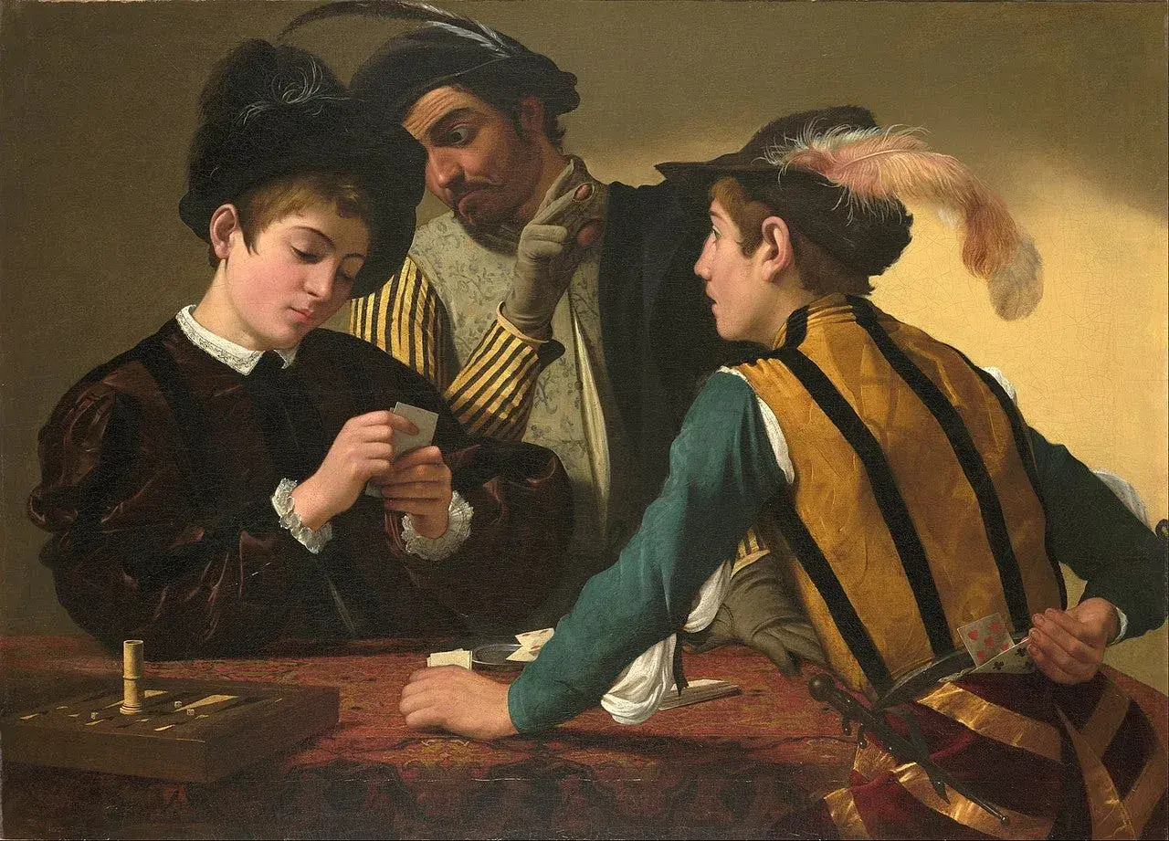
The fortune teller painting is a deceptively simple scene: someone pays to hear a future, and the real story turns out to be distraction, theft, and social theater. The best-known version is Georges de La Tour’s baroque canvas, but the subject also appears in Caravaggio and other painters, which is why the title can point to more than one work. In this article, I break down what the painting shows, how to read its composition, and why attribution and provenance matter if you want the image to make sense.
What to know before you look closely
- The most familiar version is Georges de La Tour’s, probably painted in the 1630s and now associated with the Metropolitan Museum of Art.
- The scene is not really about prophecy; it is about deception, attention, and the way a crowd can exploit a single distraction.
- The same subject appears in Caravaggio and Bartolomeo Manfredi, so the title alone does not identify a single artwork.
- For authentication, the record of ownership, inscriptions, and technical evidence matter more than a label that simply says “The Fortune Teller.”
- The hands, side glances, and costume details carry most of the meaning, so this is not a painting to read only from the center outward.
What the scene is really about
When I look at this painting, I do not read it as a simple fortune-telling episode. I read it as a trap that is already in motion. A young man offers payment for a reading, the fortune teller takes the coin, and while his attention is fixed on his future, accomplices work the real con behind him. That structure matters because it turns a familiar social image into a small drama about distraction, vanity, and misplaced trust.
The Metropolitan Museum’s entry makes the same basic point: the composition is built from darting eyes and busy hands, with the central exchange functioning like bait. The visual joke is that the viewer is supposed to miss what the sitter misses. In that sense, the painting is less about clairvoyance than about how easily people can be steered when they want reassurance. Once you see that, the next question is how the artist makes the deception feel so convincing.
How the image pulls your eye away from the obvious
La Tour’s strength is control. He stages the figures so the eye keeps circling: coin, hand, face, sleeve, another hand, another face. The surface looks orderly, even calm, but the narrative is unstable. That tension is what gives the work its charge. The richly painted fabrics are not decorative filler; they slow the eye down just long enough for the hidden action to register.
This is also a good example of genre painting, meaning a scene from everyday life rather than a biblical, mythological, or historical subject. Genre scenes often look casual, but the best ones are carefully engineered. Here, the visual language is subtle: posture suggests confidence, glances suggest coordination, and costume suggests social status. Even without dramatic gesture, the painting feels crowded with intention. That is why close viewing changes it so much.
I would also point out the role of tone and surface. The controlled light keeps faces legible without flattening the fabric or background, and that restraint makes the theft harder to notice at first glance. In reproduction, some of that subtlety disappears; in person, the layered handling of cloth, skin, and shadow is what makes the scene feel alive. That careful staging is one reason artists kept returning to this subject.
Why painters kept returning to fortune tellers
The fortune-teller motif gave painters a compact way to show several things at once. It allowed them to paint conversation, fashion, social difference, and hidden action in a single frame. It also let them work with moral ambiguity. The viewer can read the scene as a warning about gullibility, but it can just as easily be read as a commentary on performance: everyone in the picture is acting, and everyone is trying to extract something from someone else.
There is another reason the subject persisted, and I think it is important not to soften it. Many early modern fortune-teller scenes rely on stereotypes, especially when they depict Roma figures through the prejudices of the period. That does not make the paintings worthless; it makes them historically revealing. The images show both the appeal of exoticized imagery and the social anxieties that came with it. For a modern reader, that context matters as much as the narrative twist.
What makes the best examples endure is that they do not stop at stereotype. They build atmosphere, tension, and visual intelligence around it. The subject becomes a test of how well a painter can balance storytelling with restraint. That leads naturally to the question most people eventually ask: which version are they actually looking at?
How the major versions differ
The title is reused often enough that it helps to compare the main versions instead of assuming they all mean the same thing. I usually separate them by mood first, then by composition, because that is the fastest way to understand what each painter is doing.
| Artist | Approximate date | Visual tone | What stands out | Why it matters |
|---|---|---|---|---|
| Caravaggio | Mid-1590s | Immediate and theatrical | The palm reading and the theft happen at the same time | It helped establish the subject as a vivid Baroque scene of deception |
| Bartolomeo Manfredi | 1616 to 1617 | Darker and rougher | The atmosphere feels seedy, with life-size figures pulled into our space | It pushes the scene toward a more pessimistic reading of human relationships |
| Georges de La Tour | Probably the 1630s | Quiet on the surface, layered underneath | The deception unfolds through stillness, costume, and side glances | It is the version many museum visitors now encounter first, and it rewards slow looking |
The practical lesson is simple: the title does not guarantee a single author, date, or even a single moral tone. Caravaggio’s version is sharper and more immediate; Manfredi’s feels bleaker; La Tour’s is the most composed and, in my view, the most deceptive in its calm. Once you start comparing them, the title becomes less important than the way each painter organizes attention. That comparison also explains why attribution and provenance deserve real scrutiny.
Why attribution and provenance matter here
With a title like this, the first mistake is to assume the label tells you everything. It usually does not. Provenance is the ownership history of an artwork, and it is one of the first things I check when the same subject appears in multiple versions. A strong provenance can help separate an original from a later copy, a workshop version, or a work merely inspired by the same theme.
That is especially relevant for La Tour’s painting, which was rediscovered in the mid-twentieth century and has been discussed through the lens of attribution ever since. The museum record notes an inscription tied to the town where the artist lived, which supports the attribution, but inscription alone is never the whole story. In practice, scholars also look at technical evidence, the quality of the paint handling, and how the picture fits within a catalogue raisonné, which is the scholarly inventory of an artist’s known works.
If I were evaluating an image like this for collection, research, or conservation purposes, I would want three things immediately: ownership history, any inscriptions or signatures, and technical examination such as infrared imaging or pigment analysis. Those details do not replace connoisseurship, but they keep it honest. And because the title is so widely reused, they are what stop a generic “fortune teller” scene from being mistaken for the specific work people actually mean.
What careful looking reveals now
At the Met, the painting is on view at Fifth Avenue, and that is the right setting for it: this is a work that needs distance first, then closeness. From across the room, you notice the stable arrangement of figures and the polished harmony of the composition. Up close, the whole meaning shifts into the hands, the eyes, and the seams of the clothing. That change in scale is the real experience of the painting.
If I were teaching someone how to read it, I would start with four things. First, check the direction of every gaze. Second, look at which hands are active and which are passively held out. Third, notice how the costumes separate the central figures from the edges of the scene. Fourth, ask whether the painting is telling you a fortune or distracting you from the real action. In this case, the answer is usually the second one.
That is why this image still works in 2026: it is not just an old story about prediction, but a precise study of how people misread what is in front of them. Once you see that, the fortune teller stops being the subject and becomes the cover for something sharper.