Gothic romanticism art sits where medieval architecture, shadowy symbolism, and Romantic emotion meet: ruins, moonlight, storms, haunted interiors, and the sense that beauty should unsettle you a little. I treat it as a visual language rather than a rigid school, because that is how most viewers encounter it in paintings, prints, architecture, and decorative objects. This article explains what defines the style, how to recognize it, and what matters when you preserve or assess a work.
The core idea in one pass
- It blends Gothic form with Romantic feeling, so mood matters as much as subject.
- Look for vertical lines, ruins, night skies, storm weather, solitary figures, and symbolic thresholds.
- Henry Fuseli, William Blake, Caspar David Friedrich, Eugène Delacroix, and J. M. W. Turner show different sides of the style.
- Do not confuse medieval Gothic, Gothic Revival, and dark Romanticism; each label points to something different.
- For collectors and conservators, provenance and material evidence matter because atmospheric works are easy to imitate.
What this style is really doing
At its core, the style is built on tension. Gothic contributes structure, height, and a sense of enclosed mystery; Romanticism contributes inward feeling, longing, and the sublime, which is the experience of beauty mixed with awe or even fear. That is why the same work can feel devotional, eerie, and emotionally intimate at once.
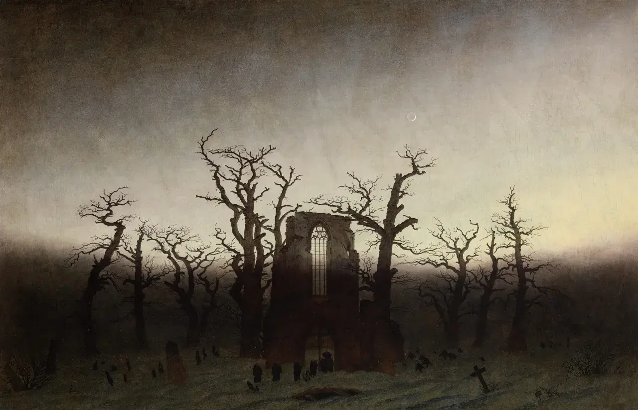
Historically, the overlap is strongest from the late 18th century through the mid-19th century, especially in Britain, France, Germany, and later the United States. In painting, the result is often psychological rather than literal: a ruined abbey is rarely just a ruined abbey; it becomes memory, loss, or a stage for transcendence.
I find this distinction useful because it prevents the style from being reduced to “spooky.” The best works do not merely borrow Gothic props; they turn them into emotional architecture. Once that is clear, the visual cues become much easier to read.
The visual language that makes it recognizable
Atmosphere does most of the work
The first thing I look at is the air around the subject. Fog, dusk, moonlight, smoke, rain, and storm clouds are not decorative extras here; they are the emotional engine. Strong chiaroscuro, the sharp contrast between light and dark, often pushes a scene away from plain description and toward suspense.
That is why these works feel so immediate. A figure lit by a cold moon or lost in a storm does not need a long narrative explanation. The weather itself carries the emotional charge.
Ruins, cathedrals, and thresholds
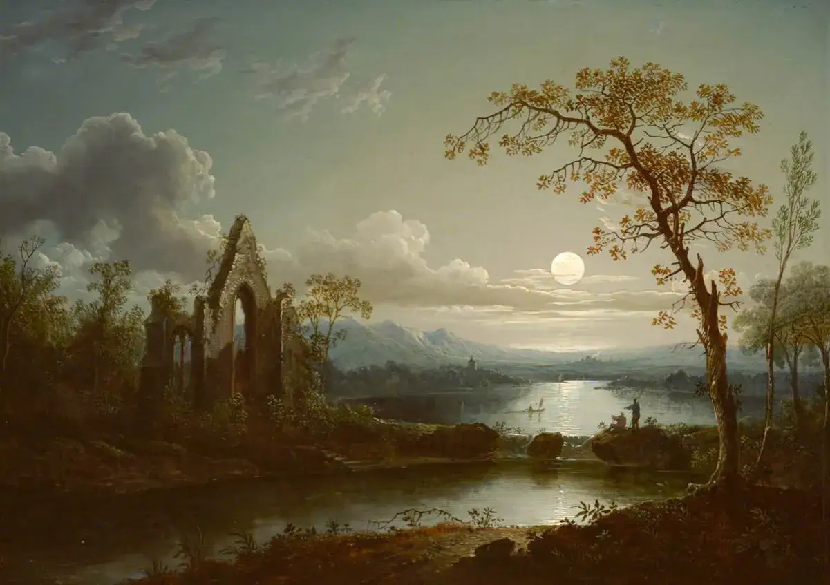
Architecture matters because it gives the eye a place to move and the imagination a place to project. Pointed arches, tracery, towers, cloisters, crypts, bridges, and stairways all create thresholds, which is one of the most important ideas in the style. Thresholds suggest crossing, memory, and passage between visible and hidden worlds.
Ruins are especially potent because they make time visible. A broken abbey or a weathered chapel can stand for history, mortality, faith, or the collapse of human certainty. In the strongest works, the building is never just a setting; it is part of the argument.
Read Also: Botero's Art Style - Beyond "Fatness" - Uncover Its True Meaning
Color and handling carry the mood
The palette is usually restrained but not flat. Deep blues, greens, browns, blacks, and silvered grays often dominate, with the occasional red or gold accent sharpening the drama. In oil painting, loose handling can make the scene feel unstable; in printmaking and drawing, line and contrast often do the same work more economically.
Iconography matters too. Iconography is the system of recurring symbols a work uses, and in this style those symbols are rarely random. The moon may signal longing, the raven may suggest omen or memory, and a lone figure seen from behind can turn a landscape into a private thought.
Once you train your eye to see atmosphere, thresholds, and symbolic detail together, the style stops looking vague and starts looking highly specific. That leads naturally to the artists who gave it lasting form.
Artists and works that show the range
This is a broad tradition, so I would not force every artist into one box. Still, a few reference points show the range especially well, and they help separate genuine depth from shallow imitation.
| Artist or maker | Representative work | Why it matters |
|---|---|---|
| Henry Fuseli | The Nightmare (1781) | Turns private dread into theatrical image-making; it is one of the clearest early examples of psychological Gothic-Romantic intensity. |
| William Blake | The Great Red Dragon series, c. 1805-1810 | Combines visionary religion, apocalyptic imagery, and hand-driven line to create a uniquely charged visual world. |
| Caspar David Friedrich | Wanderer above the Sea of Fog, c. 1818 | Uses solitude and vast landscape to make contemplation itself the subject; the mood is meditative rather than theatrical. |
| Eugène Delacroix | Death of Sardanapalus, 1827-1828 | Shows how color, movement, and emotional excess can produce a Gothic-Romantic sense of collapse and desire. |
| J. M. W. Turner | Storm and shipwreck paintings, especially the 1840s | Lets weather and motion overwhelm human scale, which is one of the most durable Romantic strategies. |
| A. W. N. Pugin and Charles Barry | Gothic Revival buildings and interiors | Carry the medieval vocabulary into architecture and design, showing how the mood traveled beyond painting. |
The common thread is not subject alone. What matters is how each artist turns subject into feeling. In the United States, I most often see that same vocabulary in museum paintings, church interiors, campus buildings, and decorative objects, where a pointed arch or a stormy sky can carry as much emotional weight as a figure.
That overlap is exactly why the labels around this field need careful sorting.
How to separate related labels without oversimplifying
People often use Gothic, Gothic Revival, Romanticism, and dark Romanticism as if they were interchangeable. They are not. If I want to describe a work accurately, I separate them by period, subject, and emotional tone.
| Label | What it mainly refers to | Typical visual markers | Common confusion |
|---|---|---|---|
| Gothic art | Medieval art and architecture from roughly the 12th to 16th centuries | Pointed arches, stained glass, tracery, verticality, sacred space | Confused with 19th-century revival or with dark mood alone |
| Gothic Revival | 18th- and 19th-century revival of medieval Gothic forms in architecture and decorative arts | Medieval motifs reused in new buildings, furniture, and ornament | Confused with original medieval Gothic |
| Romanticism | A broader artistic movement centered on emotion, imagination, nature, history, and the sublime | Storms, solitude, dramatic landscapes, historical scenes, inward feeling | Reduced to “dark art” only |
| Dark Romanticism | The eerie, haunted, or psychologically troubled edge within Romanticism | Nightmares, guilt, the uncanny, ruin, prophecy, death | Treated as a fully separate school everywhere |
My rule of thumb is simple: if the work copies medieval form, I think Gothic Revival; if it uses the past to heighten feeling, I think Romantic; if it leans into guilt, dread, or the uncanny, it moves toward dark Romanticism. That distinction is not academic hair-splitting. It changes how you interpret the object and how you date it.
Those interpretive differences become practical the moment a work enters a collection, a conservation studio, or an authentication review.
What preservation and authentication require
For a site focused on fine art preservation, history, and authentication, this is where the conversation gets concrete. Atmospheric art is easy to admire and easy to misread. It is also easy to damage, because the very effects that make it compelling can be altered by cleaning, fading, lining, overpainting, or poor storage.
- Medium matters. Oil, watercolor, ink, chalk, and printmaking age differently, and each one can change the mood in a different way.
- Provenance matters. Exhibition labels, dealer records, collection notes, and old photographs can confirm whether the look is period-appropriate or the result of later revival.
- Condition matters. Dark varnish, yellowed paper, and surface grime can either mute or exaggerate the Gothic effect.
- Materials matter. Pigments, paper stocks, canvases, stretcher construction, and hardware should make sense for the claimed date.
- Craft matters. In decorative arts, joinery, carving depth, wear patterns, and tool marks often tell you more than ornament alone.
I would be cautious around any “Gothic” object whose mood feels stronger than its evidence. A convincing atmosphere can be manufactured later; correct materials and period structure are harder to fake. That is especially important with Gothic Revival furniture, frames, and architectural fragments, where the style has been copied so often that surface impression alone is not enough.
For conservators, another issue is balance. Cleaning a dark Romantic painting too aggressively can flatten the contrast that gives it force, while leaving unstable varnish in place can distort the color and obscure the intended depth. The right decision depends on the work’s medium, condition, and documented history, which is why close examination always comes before intervention.
Once those practical issues are clear, the final step is not to chase every dark motif but to ask whether the atmosphere is actually earned by the object itself.
How to tell when the atmosphere is earned
When I read a work in this tradition, I ask three questions. Does the Gothic element support structure, symbolism, or just decoration? Does the Romantic feeling come from nature, memory, or psychology rather than from generic drama? And does the work still hold together if you strip away the surface effects?
The strongest examples answer yes to all three. They make architecture feel emotional, and they make emotion feel architectural. That is why the best Gothic-Romantic works stay memorable long after the specific subject fades: they give form to longing, fear, reverence, and solitude without collapsing into cliché.
If you keep that standard in mind, the style becomes much easier to read in museums, private collections, and restoration records alike. The real test is not whether a work looks dark; it is whether the darkness has been built with intelligence, restraint, and control.