Abstraction can feel deceptively simple until you try to explain why one painting feels balanced, another uneasy, and a third almost musical. This article breaks down a few essential abstract art examples, the movements behind them, and the visual clues that make each work worth studying. I also look at how to read these works without forcing a literal subject onto them.
The fastest way to read abstraction is to look for structure, not subject
- Abstract art replaces direct depiction with shape, color, rhythm, scale, and surface.
- The clearest examples come from several key movements, including Suprematism, De Stijl, Abstract Expressionism, Color Field painting, and hard-edge painting.
- Hilma af Klint, Kandinsky, Mondrian, Malevich, Pollock, Rothko, and Krasner each show a different logic of abstraction.
- Titles help, but composition usually tells you more than the title does.
- For collectors and curators, condition, provenance, and materials matter as much as visual style.
Start with the examples that shaped the language of abstraction
When readers ask me for abstract art examples, I start with works that show different visual logic. A painting can be geometric, gestural, meditative, or all-over, and those differences are not cosmetic; they change how the work feels and how it is read. The point is not to memorize names, but to see how each artist solves the same problem in a different way.
| Artist or work | What you notice first | Why it matters |
|---|---|---|
| Hilma af Klint | Spirals, symbols, layered color, and diagram-like forms | Her work shows that abstraction can be spiritual and system-based, not only geometric. |
| Wassily Kandinsky | Floating color, active line, and musical-looking rhythm | He helps define abstraction as an orchestration of feeling rather than a picture of an object. |
| Piet Mondrian | Grids, primary colors, black lines, and strict balance | He proves that restraint can produce tension, not just calm. |
| Kazimir Malevich | Hard geometry and sparse, near-empty fields | His Suprematist works push painting toward pure form and away from representation. |
| Jackson Pollock | Drips, splashes, and an all-over surface | His canvases record movement, speed, and decision-making in real time. |
| Mark Rothko | Large hovering rectangles with soft edges and deep color | He shows how scale and color alone can create a quiet, concentrated emotional field. |
Those works are useful because they make the category visible. Once you can tell a geometric grid from a gestural field, you are ready to see how the major movements divide the same territory in different ways.
See the main movements as different answers to the same problem
Abstract art is not one style. It is a cluster of responses to a basic question: how do you make a convincing work without representing the visible world? In the United States, Abstract Expressionism is the most famous answer, and MoMA treats it as a distinctly American style. At the same time, the broader history is older and less tidy than many textbook timelines suggest, which is why Tate’s historical note on Hilma af Klint remains so useful.
| Movement | Visual signature | What to look for |
|---|---|---|
| Geometric abstraction | Clean forms, measured spacing, and clear edges | Order, proportion, and the tension between simplicity and precision |
| Suprematism | Floating shapes and reduced compositions | How little is needed to create a complete visual statement |
| De Stijl | Orthogonal structure, primary color, black line | Balance, rigidity, and the discipline of a limited visual grammar |
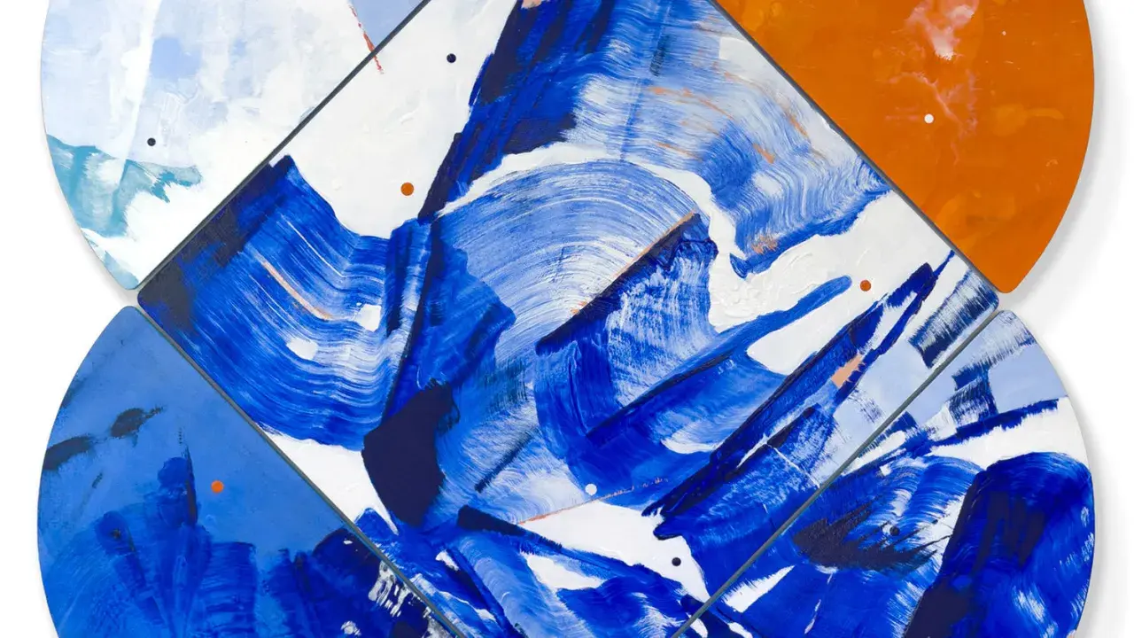
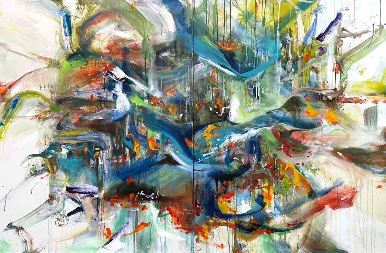
| Abstract Expressionism | Gesture, speed, staining, and scale | Brushwork, bodily movement, and the emotional force of the surface |
| Color Field painting | Large zones of color with softened boundaries | Atmosphere, saturation, and how color changes at viewing distance |
| Hard-edge painting | Flat color with sharply defined borders | How exact lines and edges control visual tension |
Once you know which family a work belongs to, the next step is much simpler: read the canvas as a set of choices, not as a riddle waiting for a hidden object.
Read the painting as an arrangement of choices
I usually tell people to spend the first minute looking at four things: composition, color temperature, mark-making, and scale. Those are often more revealing than whatever title is attached to the work. A good abstract painting is rarely about one isolated trick; it is about how the parts keep each other in balance.
- Composition tells you where the eye lands first and how it moves after that.
- Color sets the mood, but it also creates structure through contrast, repetition, and temperature shifts.
- Mark-making shows whether the artist worked by brush, drip, stain, scrape, tape, or layering.
- Surface matters because matte, glossy, rough, and translucent finishes all change how the work behaves in light.
- Scale changes the meaning of the work; a Rothko-sized canvas does something very different from a small study on paper.
I also pay attention to titles, but only after the visual reading starts. A title can open a door, yet the work itself usually tells you more about rhythm, pressure, and restraint. That habit also keeps you from the most common misreads, which are easy to make when a painting refuses to look like anything familiar.
Common misreads that flatten good abstraction
People often dismiss abstract art as random, but the stronger works are usually highly controlled. The real mistake is not that viewers lack imagination; it is that they assume meaning must arrive through an object, a landscape, or a figure. In abstraction, the subject has shifted from things to relationships.
- “It is random.” Most strong abstract work has clear internal logic, even when the surface looks loose.
- “It is just decoration.” Decoration can be beautiful, but abstraction often aims for pressure, scale, or conflict rather than simple ornament.
- “All abstraction is the same.” A Mondrian grid, a Pollock drip field, and a Rothko color block do very different jobs.
- “The title should explain everything.” Many titles are cues, not answers.
- “If it looks easy, it must be easy to make.” The cleanest surfaces are often the hardest to get right.
This distinction matters in practice too. A work that seems simple can still depend on exact spacing, drying time, edge control, or a highly specific paint mixture, and those are the details that often separate intention from imitation. That is where preservation and authentication become essential rather than secondary.
Why abstraction is harder to preserve and authenticate than it first appears
This is the part that often gets ignored in casual discussions, but it matters enormously for fine art preservation and authentication. Abstract works often depend on small material decisions: exact pigment mixtures, tape lines, pours, stains, layered glazes, or the pressure of a brush loaded with more paint than the eye can casually track. If you change one of those details, you can alter the work’s visual logic.
- Support tells you whether the work was meant to flex, absorb, or stay rigid.
- Edges are critical in hard-edge and geometric works, where a line that is off by only a few millimeters can weaken the whole composition.
- Surface behavior reveals whether the artist used stain, impasto, masking, or repeated layering.
- Provenance and exhibition history help separate a real work from a convincing imitation.
- Studio documentation such as photos, sketches, and invoices can be decisive when the visual evidence is not enough.
From a conservation standpoint, abstraction can be unforgiving because even a well-intended repair may become visible faster than it would in figurative painting. A flat red field, for example, can make a retouch obvious where a more complex image would hide it. That is why I end by looking not at what the work depicts, but at what still holds together after the first impression fades.
What I would look for first in a strong abstract work
What stops me first is usually a sense of necessity. The spacing feels right, the palette is disciplined, or the surface carries enough friction to keep the eye active. The best abstraction keeps rewarding return visits because its decisions stay legible at different distances and on different days.
If you remember one thing, make it this: abstraction is not the absence of content; it is content reorganized through color, form, rhythm, and material. That is why the strongest works remain vivid long after the first glance has passed, and why the best way to study them is still the simplest one: look carefully, then look again.