
Tone in art is one of the fastest ways to make a painting feel convincing, atmospheric, or strangely flat. I usually read value before color because tonal relationships tell me where the light sits, how forms turn, and whether the composition has enough structure to hold the viewer’s eye. This article breaks down what tone means, how artists use it across materials, and how to judge it more accurately in both studio work and gallery viewing.
What matters most about tonal value
- Tone usually means value in visual art: the relative lightness or darkness of a color.
- Strong tonal planning can make a work read clearly even before color starts doing heavy lifting.
- Materials matter: graphite, charcoal, watercolor, oil, acrylic, pastel, and digital tools each handle value differently.
- Light, surface sheen, and varnish can change how tone is perceived, sometimes dramatically.
- A weak value structure is one of the quickest ways to make a piece feel shallow or unfinished.
- In conservation and authentication, tone has to be judged under controlled light, not by memory alone.
What tone means when I look at a painting
In most studio settings, tone and value are treated as the same thing: the lightness or darkness of a color. Some artists use tone more loosely to describe a color that has been muted, warmed, cooled, or otherwise adjusted, but when I want precision, I say value. That distinction matters because a red, a blue, and a green can sit at very different points on the value scale even when they feel equally “strong” to the eye.
I also separate global tone from local tone. Global tone is the overall value mood of the work, such as bright and open or compressed and shadow-heavy. Local tone is the value behavior of a specific area: a face, a cloud bank, a reflective bowl, or a dark doorway inside an otherwise light composition. Once you start reading both levels at once, the painting becomes much easier to understand.
A useful rule: if color is the voice, tone is the structure under it. When the structure is clear, color can be expressive without becoming confusing. That is the reason tonal thinking comes before finishing details in my own process, and it leads directly into how tone shapes the viewer’s experience.
How tonal value changes what a viewer feels
Tone does three jobs at once. It gives form, it directs attention, and it sets emotional temperature. A painting with a wide tonal range can feel dramatic and dimensional; a painting with a narrow range can feel quiet, misty, restrained, or, if mishandled, simply flat.
| Visual effect | What strong tone does | What weak tone tends to do |
|---|---|---|
| Form and volume | Creates believable light, shadow, and turn on faces, hands, fabric, and objects | Makes forms look pasted on or cut out |
| Mood and atmosphere | Sets a clear emotional register, from bright openness to dense drama | Can feel indecisive or emotionally neutral when the range is too timid |
| Space and depth | Helps foreground, middle ground, and background separate cleanly | Collapses space when every area shares the same contrast level |
When I look at a painting that feels alive, I usually find that its value structure is doing more work than the viewer first realizes. The darks are not just dark, the lights are not just light, and the midtones are doing the quiet job of connecting everything between them. That balance is what makes a scene feel inhabited instead of merely described.
The practical takeaway is simple: if the tonal hierarchy is clear, the image can survive even with a limited palette. If the hierarchy is unclear, no amount of color variety fully repairs it. That is why the material you choose matters so much.
How different materials carry tone
Different media make tonal work easier or harder in different ways. Some invite soft transitions and deep darks; others reward speed, transparency, or precise layering. I think of the medium as changing the route, not the destination: the goal is always a readable value structure.
| Medium | Tonal strengths | Limits | Best use |
|---|---|---|---|
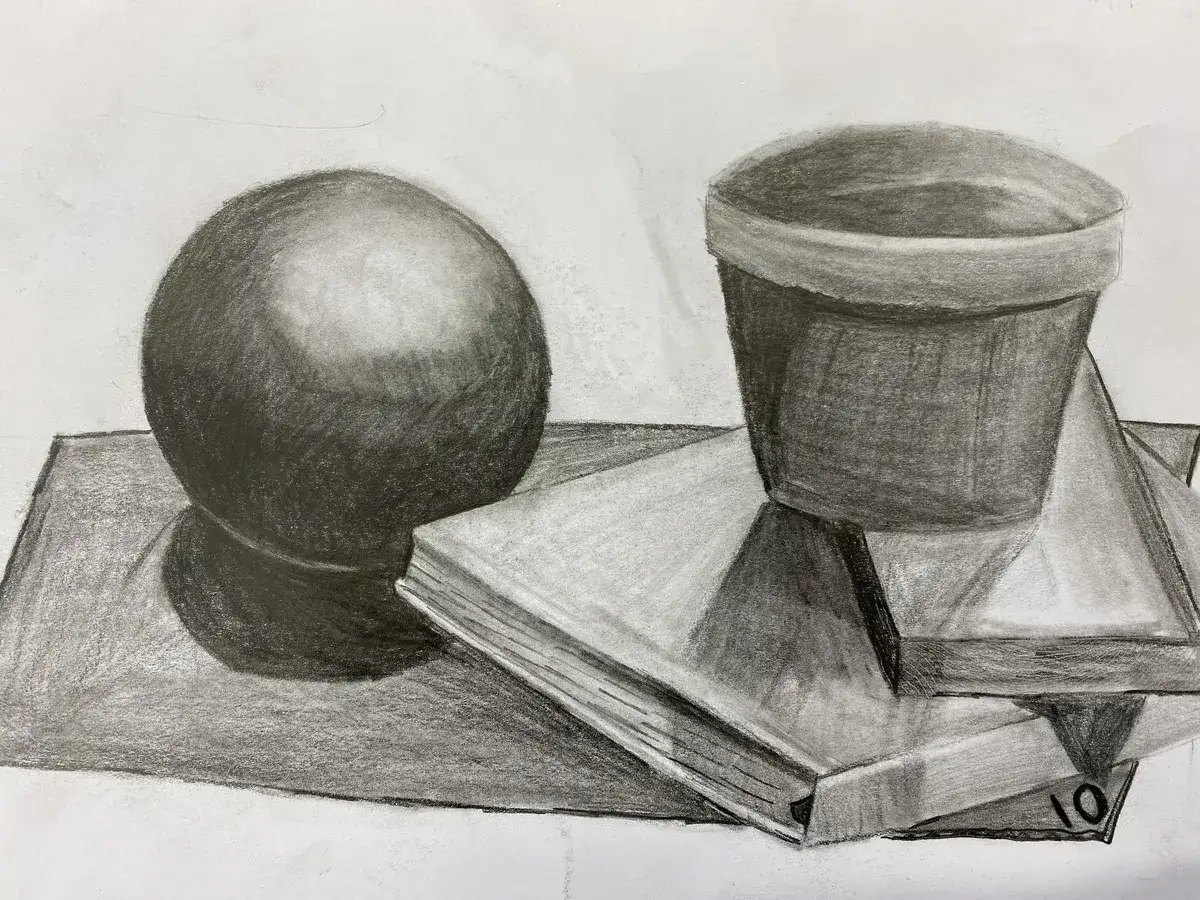
| Graphite | Excellent for controlled midtones and gradual shifts | Can look shiny or compressed if overworked | Studies, portraits, observational drawing |
| Charcoal | Strong darks, soft edges, fast blocking of value masses | Smudges easily and can lose detail quickly | Gesture drawings, dramatic studies, value sketches |
| Ink and wash | Clean contrasts and elegant value simplification | Less forgiving once darks are placed | Architectural sketching, expressive studies, line-value hybrids |
| Watercolor | Luminous lights and transparent layering | Darks are harder to recover and corrections are limited | Airy scenes, atmospheric studies, controlled layering |
| Oil | Wide value range, slow blending, rich darks | Can turn muddy if values are mixed carelessly | Portraits, classical painting, extended blending |
| Acrylic | Fast layering and decisive value steps | Dries quickly, so soft transitions need planning | Bold shapes, graphic compositions, layered color studies |
| Pastel | Vibrant lights and direct value placement | Can flatten if the paper tooth is filled too soon | Color-rich studies with strong value control |
| Digital painting | Easy correction, value checking, layer flexibility | Tempting to hide weak structure behind effects | Concept work, planning, fast revision, tonal exploration |
For beginners, charcoal and graphite are still the cleanest teachers because they separate value from color so clearly. For painters, oil gives the most forgiving tonal range, while acrylic demands faster decisions and better planning. Digital tools can be excellent for value studies, but they also make it too easy to keep adjusting instead of solving the underlying structure.
The medium changes the texture of the value conversation, but it does not change the fundamentals. Once the eye understands tonal relationships, the next challenge is seeing them accurately under real light.
How I judge tone under real light
Tone is never completely independent of lighting, surface sheen, or viewing distance. A glossy highlight can look like a true light value when it is really just reflection, and a warm bulb can make a balanced painting feel heavier than it actually is. I never trust a tonal read until I have checked it in more than one condition.
- Squint first. Squinting collapses detail and lets you see the large value masses without getting distracted by edges, textures, or color.
- Check a grayscale version. A desaturated photo is not perfect, but it quickly reveals whether the value structure still works.
- Start with three zones. I often separate a subject into light, middle, and dark before I worry about finer steps.
- Watch for glare. On glossy paper, varnished paint, or satin acrylic, a highlight can fake a value jump that does not really exist.
- Compare under neutral light. If possible, use consistent daylight-balanced viewing conditions so your judgment does not swing with warm indoor bulbs.
I also like to think in terms of a 5-step or 9-step value scale when I am teaching. A 5-step scale is fast and practical for blocking in structure; a 9-step scale is better when I need to separate close values that would otherwise blend together. The point is not to memorize a chart. The point is to give the eye a reference so it stops guessing.
Once you get used to checking tone this way, you start noticing the same mistakes again and again. Most of them are avoidable, and the fixes are straightforward.
Common tonal mistakes that flatten a work
The biggest tonal problems are rarely dramatic. They usually come from hesitation, not from a lack of skill. I see the same handful of issues over and over, especially in work where the color is strong but the value structure is weak.
- Too many middle values make the image feel soft in a bad way. The solution is to push the lights and darks farther apart before refining the middle range.
- Shadows that are all equally dark erase hierarchy. Real shadows still contain differences, reflected light, and edge variation.
- Highlights added too early can make the surface look decorative instead of structurally sound. I place the light only after the larger value map works.
- Ignoring the background leaves the subject without a clear read. The background often needs to support the subject, not compete with it.
- Overblending can turn firm form into visual mush. A little edge variety usually does more than endless smoothing.
- Relying on color to do the value work hides weak design. A vivid hue can distract the eye, but it does not fix a broken tonal arrangement.
- Using one dark formula for everything can deaden the piece. Darks need variety in temperature, transparency, and chroma as well as in depth.
The fastest correction is usually simplification. If a work feels flat, I reduce the scene to a few tonal masses and ask whether the eye can still travel through them. If the answer is no, I know the problem is structure, not finish.
That structural reading becomes especially important when the work enters a conservation context, because tone can change as a painting ages or is restored.
Why tone matters in conservation and authentication
This is where tonal analysis stops being purely aesthetic and becomes part of evidence. A painting’s value balance can shift because of yellowed varnish, surface grime, inpainting, abrasion, or lighting conditions in the room. A work that once looked crisp and cool may appear warmer, darker, or more muted simply because the surface has aged.
That matters for conservation because restorers need to know what belongs to the artist’s original intent and what is the result of later change. It also matters for authentication because tonal handling is part of an artist’s hand. The rhythm of lights and darks, the way shadows are simplified, and the way transitions are controlled can all support an attribution, but tone alone is never enough on its own.
I would be cautious about any judgment made from a single photograph or a room with uncontrolled lighting. A cleaned painting may suddenly reveal cooler passages, sharper contrast, and a different spatial reading than the same work under old varnish or dim amber light. That is not a trivial shift; it can change how the entire composition is understood.
For anyone working in fine art preservation, history, or authentication, the lesson is practical: tonal reading has to be paired with condition, material analysis, and proper viewing standards. Without that context, the eye can mistake aging for intent.
The tonal habits I would keep when finishing a piece
When I am closing out a study or a finished painting, I check the same small set of things every time. I want the value hierarchy to be obvious, the light source to be consistent, and the focal area to have enough contrast to matter without breaking the rest of the image.
- Lock in the darkest dark before you lose the chance to place it decisively.
- Preserve one clean light so the painting has a true point of visual rest.
- Keep backgrounds quieter than the subject when you want depth and focus.
- Step back often, because a value problem that is invisible at arm’s length usually appears at distance.
- Check the piece in grayscale before calling it done, especially if the color is doing heavy aesthetic work.
That is why tone in art matters so much: it gives a work its architecture, keeps it legible when color is subtle, and helps you judge what survives even when the surface ages or the room light changes.