A strong covered bridge drawing works because it is part architecture, part landscape, and part memory. The bridge has to feel structurally plausible, but it also needs atmosphere: weathered wood, a believable span over water, and a viewpoint that gives the scene depth. In this article, I focus on the details that make the structure convincing, the quickest way to block in the scene, and the medium choices that change the mood of the final artwork.
What matters most in a bridge sketch
- Start with perspective and the roof line before you worry about wood grain.
- Let the opening, trusses, and shadow shapes do more work than tiny details.
- Use water, foliage, and broken edges to keep the scene from looking stiff.
- Pencil and ink emphasize structure; wash and digital tools add atmosphere.
- Archival bridge records help when you want the result to look specific rather than generic.
Why covered bridges keep pulling artists back
Covered bridges are one of those subjects that never stay purely architectural. They sit at the edge of landscape painting, rural memory, and regional history, which is why they feel so adaptable in a sketchbook or a finished illustration. The National Park Service even describes the Knox Covered Bridge as a scenic icon, and that is exactly the appeal: the structure reads as a landmark, but it also creates a frame inside the scene, almost like a stage set for light, water, and weather.
I think that framing effect is what makes the motif so durable for artists. You get a clear silhouette, a strong horizontal mass, a tunnel-like interior, and a natural excuse to organize the rest of the page around reflection, foliage, and sky. A bridge of this kind can feel nostalgic without becoming sentimental, which is a hard balance and a useful one. From here, the question is not whether the subject is interesting, but how to make it look real on paper.
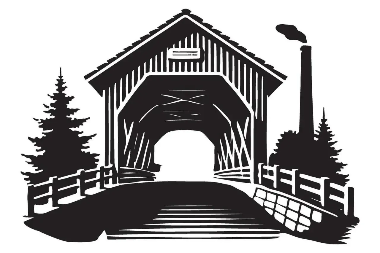
The structural details that make the drawing believable
If the proportions are off, the whole image starts to read like scenery instead of a structure. I usually begin with the roof ridge, the road deck, and the opening of the portal, because those three shapes lock the perspective in place. After that, I place the truss rhythm, the siding, and the support posts. A covered bridge does not need every bolt drawn in, but it does need a consistent logic.
| Element | What to watch | Why it matters |
|---|---|---|
| Roof line | Keep the pitch consistent with the vanishing point | It tells the viewer the bridge is actually built in space |
| Portal opening | Make the opening large enough to show depth | It creates a tunnel effect and keeps the scene from flattening |
| Truss pattern | Repeat diagonals and verticals with discipline | Regular spacing makes the bridge feel engineered, not improvised |
| Weathered boards | Vary line weight and edge damage | Small irregularities suggest age and use |
| Foundation and creek line | Anchor the bridge to the bank, water, or stonework | Without that contact, the bridge appears to float |
One useful habit is to pause before detailing and ask whether the bridge belongs to the slope, the road, and the river. If those three relationships are believable, the rest of the sketch becomes much easier to finish. That structural check also sets up the actual drawing process, where the first pass should stay loose and controlled rather than polished.
A practical way to block in the scene
When I sketch a bridge like this, I treat the first pass as construction, not illustration. The goal is to place the big forms in the right order so I can refine them later without fighting the page.
- Draw the horizon line and decide where the viewer stands.
- Mark the bridge as a simple box or long prism before adding roof and walls.
- Place the far opening first, then build the near side toward it.
- Insert the major structural bands, posts, and truss diagonals.
- Block in the creek, bank, and tree masses as large value shapes.
- Refine the shadows, then reserve the smallest marks for texture and weathering.
That order matters because the eye reads perspective before it reads detail. If the bridge sits correctly in space, a few strong cast shadows and a calm value structure will carry the drawing farther than a dense web of timid lines. For a simple classroom-style study, this can be enough; for a finished artwork, the next decision is the medium itself.
Which medium suits the mood you want
The same bridge can feel academic, romantic, or sharply contemporary depending on the material you use. I choose the medium after I decide whether the emphasis is on line, texture, or atmosphere. A hard-pencil study can feel measured and archival, while watercolor immediately pushes the scene toward weather and time of day.
| Medium | Best for | Strengths | Limits |
|---|---|---|---|
| Graphite | Structural studies and value control | Easy to revise, good for truss detail, strong on tone | Can look flat if every edge is treated the same |
| Ink | Clear illustration and architectural rhythm | Sharp line quality, strong contrast, good reproduction | Less forgiving once the line is down |
| Watercolor | Atmospheric landscapes and seasonal scenes | Light, reflection, and mist come naturally | Perspective mistakes show quickly if the underdrawing is weak |
| Gouache | Opaque, poster-like finish | Good for selective highlights and cloudy skies | Can turn chalky if overworked |
| Digital | Flexible editorial or concept-art style | Fast corrections, layered texture, easy color testing | Texture can feel generic if brushes are chosen carelessly |
For a portfolio piece, I like graphite under ink wash or a restrained digital painting with visible linework. That combination keeps the bridge legible while leaving room for mood, which is usually where these scenes become memorable.
How archival references sharpen the result
Historic bridge records are more useful than many artists expect. Measured drawings, field photographs, and survey notes help confirm the proportions of the roof, the depth of the portal, and the logic of the truss system. The Library of Congress HABS and HAER material is especially helpful here because it preserves measured documentation rather than just a scenic image, which means you can check how the parts actually relate before you stylize them.
When I use archival references, I am not trying to copy them line for line. I am looking for three things: the bridge type, the scale, and the weathering pattern. A lattice truss does not read the same as a Burr truss; a reconstructed bridge may have cleaner siding than an older surviving span; a bridge in winter needs different shadow behavior than one in thick summer foliage. Those distinctions keep the drawing from drifting into a generic rural postcard.
- Check whether the bridge is single-span or part of a longer crossing.
- Look for the truss geometry before adding decorative wood texture.
- Match the condition of the bridge to the setting, especially if the structure is restored.
- Keep regional details consistent, including railings, roof profile, and portal shape.
That attention to context is what makes a sketch feel researched rather than assembled. It also gives you a better chance of avoiding the mistakes that usually flatten the image.
Common mistakes that flatten the scene
A convincing drawing needs air around it, a believable road approach, and enough value contrast to separate the roof, walls, and interior shadow. I see the same few problems again and again, and they are all fixable.
| Mistake | What it does | Better choice |
|---|---|---|
| Making both banks equally busy | Competes with the bridge for attention | Keep one side quieter so the eye has a place to rest |
| Using identical line weight everywhere | Removes depth | Reserve heavier lines for the nearest edges and shadow core |
| Over-detailing the boards too early | Creates clutter before structure is set | Finish the big forms first, texture last |
| Ignoring reflections | Makes the creek feel detached | Break the reflection with ripple pattern and dark supports |
| Leaving no scale cue | Makes the bridge size ambiguous | Add a path, fence, figure, or tree trunk for reference |
The point is not to make everything busy. The point is to make the bridge feel grounded in a lived landscape. Once that works, you can decide whether the final piece should read as a study, an illustration, or a more personal artwork.
A bridge scene that holds up as art
What stays with me in the best bridge drawings is usually not the amount of detail, but the confidence of the structure and the calmness of the composition. A few well-placed shadows, a clean roof line, and a thoughtful relationship between water and wood are enough to carry the entire piece. If you want the image to feel less like a copied view and more like a finished artwork, give the bridge a reason to exist in the landscape: a turn in the road, a low evening light, a winter bank, or a river that changes the way the form reads.
For a stronger next version, I would redraw the same bridge three times: once as a plain line study, once as a value sketch, and once in full color or wash. That sequence exposes weak perspective quickly and usually produces a better final result than chasing polish too early. In other words, the drawing improves when the structure is trusted first and decorated second.