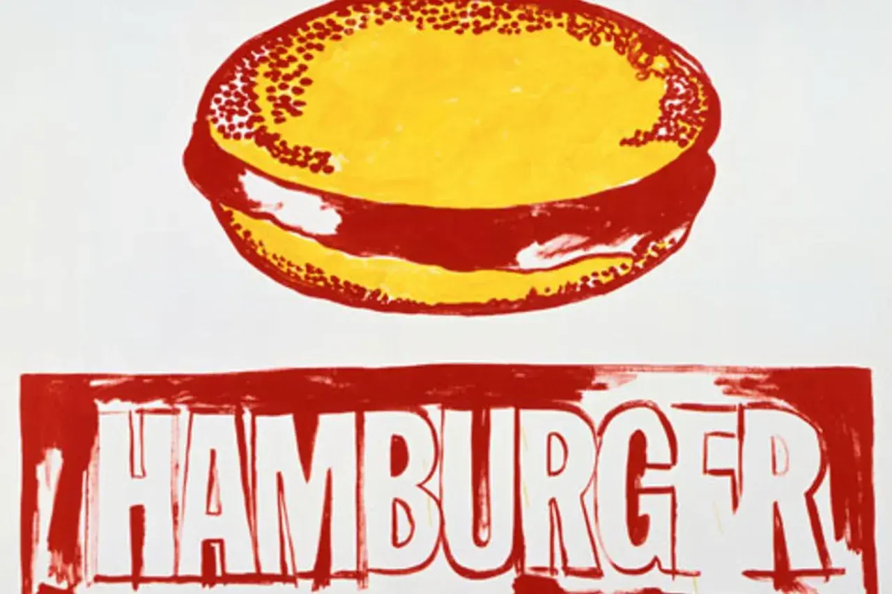
The Andy Warhol hamburger image is one of the clearest examples of how he turned ordinary American food into an art-world sign. It matters because the work is not just about a burger; it is about advertising language, repetition, branding, and the way mass culture becomes visually unforgettable. Here I break down what the artwork is, why Warhol returned to the motif, how to read it as Pop Art, and what to check if you are evaluating a related print or canvas.
The essentials behind Warhol’s burger images
- Warhol revisited the hamburger motif in the mid-1980s, long after the first wave of his Pop imagery.
- The works usually rely on a stripped-down, ad-like look: flat color, bold outline, and simplified text.
- Some versions are unique canvases, while others are related variants with different background or ink colors.
- The image can be read as Americana, consumer culture, and, in some interpretations, a Cold War-era tension between appetite and anxiety.
- For collectors, provenance, medium, surface condition, and catalogue-raisonné status matter more than a seller’s label.
What the artwork actually is
The hamburger motif appears in Warhol’s later practice as a compact, repeated image rather than a single fixed masterpiece. One related version is dated 1985-86 by Tate, and other 1986 examples are recorded as small, unique acrylic-and-silkscreen canvases, around 10 by 12 inches, which tells you a lot about the scale of the idea: this is not a monumental history painting, but a tightly controlled pop sign.
What makes the work interesting is the way Warhol reduces the subject to essentials. In some versions the hamburger is silkscreened in black on a white ground; in others, he experiments with different background and text colors while keeping the basic two-tone structure. The image often feels more like a traced advertisement than a painted still life, and that is the point. He is not trying to make the burger look appetizing in a conventional sense. He is turning it into a graphic object that can be repeated, re-framed, and re-read.
I read that shift as central to the work’s meaning. Warhol does not ask us to admire the burger as food; he asks us to notice how quickly we recognize it as culture. That distinction leads straight into why he kept coming back to the motif.
Why Warhol kept returning to hamburgers
Warhol was drawn to subjects that already lived inside the public imagination. A hamburger is simple, cheap, immediate, and unmistakably American. It is also a branded object, even when no brand name appears. That makes it ideal Warhol material: it carries desire, familiarity, and repetition before the artist even touches it.
There is also a quiet contradiction at the center of the motif. A hamburger is ordinary, but in Warhol’s hands it becomes iconic. That is one of his most consistent strategies. He takes things that feel too common to deserve attention and shows how much symbolic weight they already carry. The burger becomes a shorthand for consumer life, but also for the way consumer life is packaged, sold, and absorbed into identity.
Some readings go further and see a second layer in the visual structure itself. The radiating lines and rounded bun can suggest a kind of explosive bloom, which gives the work an uneasy edge beneath its commercial surface. I would treat that as an interpretation rather than a single fixed meaning, but it is a useful one. Warhol rarely locked an image down to one message. He preferred a sign that could stay readable while remaining ambiguous. That ambiguity is exactly what makes the image feel so alive.
How to read the image as Pop Art
Warhol’s burger works because it behaves like Pop Art should: it copies the visual logic of mass culture and returns it to us with just enough distance to make us notice it. The image is familiar, but it is also drained of the usual sensory cues. You do not smell it, taste it, or even fully see its texture. You see its brandability.
- Flattening turns the burger into a graphic sign instead of a realistic object.
- Repetition makes the image feel mass-produced, even when the actual work is unique.
- Typography matters as much as the food itself, because the words behave like an ad headline.
- High contrast strips away detail and leaves only the most recognizable outline.
- Ambiguity keeps the work from becoming mere illustration; it remains open to interpretation.
That is why the piece still reads cleanly even if you know almost nothing about Warhol. The image is designed to land fast, then stay in your head. Once that mechanism is clear, the next useful comparison is with another famous Pop Art burger that looks similar at first glance but behaves very differently.
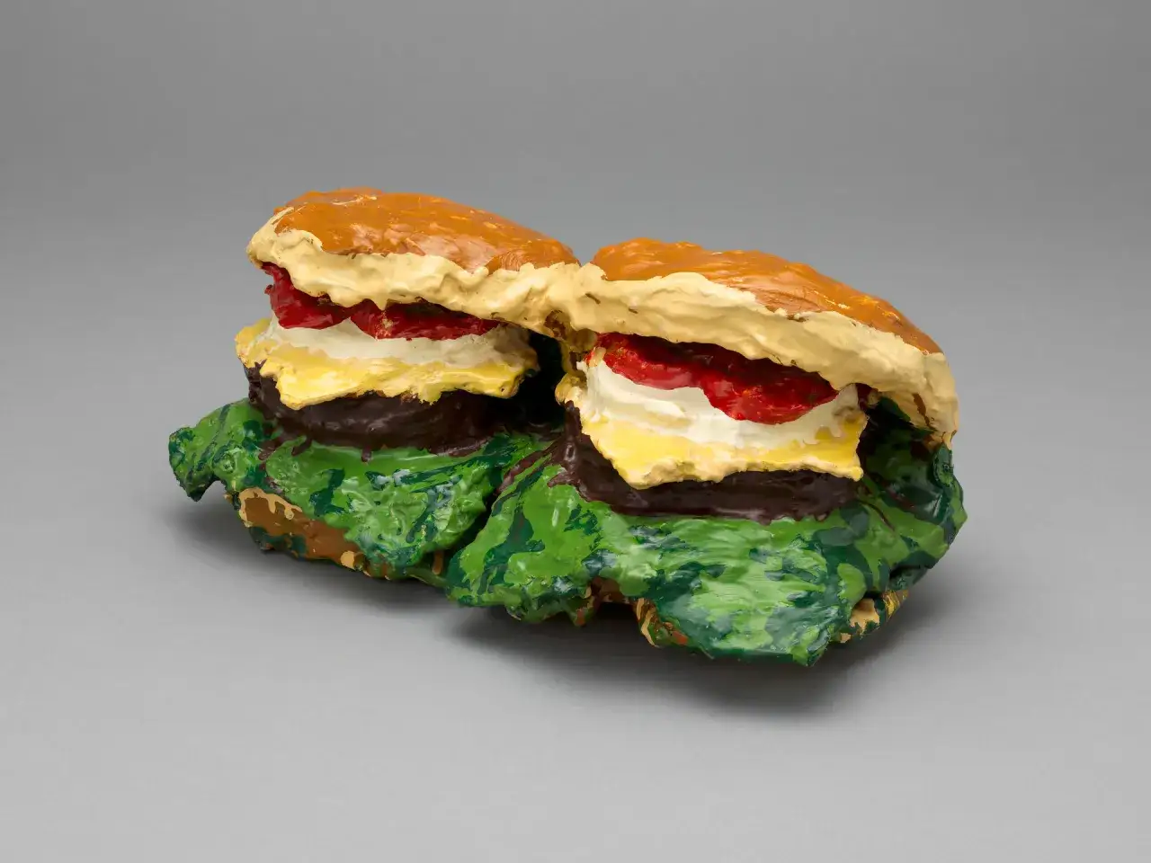
Why Warhol’s burger is not Claes Oldenburg’s burger
People sometimes mix up Warhol’s hamburger imagery with Claes Oldenburg’s burger sculptures because both artists used food as a Pop Art subject. The resemblance ends there. Oldenburg’s burger works are sculptural, physical, and often cartoonishly oversized. Warhol’s are flatter, cooler, and more media-driven. One turns food into an object; the other turns it into a sign.
| Artist | Medium | Visual effect | What it emphasizes |
|---|---|---|---|
| Andy Warhol | Silkscreen-based painting or print on canvas | Flat, commercial, repeatable | Brand language, circulation, and the look of advertising |
| Claes Oldenburg | Sculpture and soft sculpture | Bulky, tactile, often absurdly large | Physical presence, play, and the body’s relationship to consumer goods |
That difference matters because it changes the way the viewer reads the subject. Oldenburg makes the burger strangely monumental; Warhol makes it administratively familiar, almost like something copied from a menu, a flyer, or a shop sign. If you are trying to identify a Warhol burger work, that print-like logic is the first clue.
What collectors should check before buying one
The practical side of this subject is not glamorous, but it is where mistakes happen. The Andy Warhol Foundation says the Authentication Board ceased operations in 2011 and no longer exists, and it does not offer opinions or certificates of authenticity. That means buyers have to lean harder on documentation, scholarship, and physical examination than they would with a work backed by a live authentication panel.
| What to verify | Why it matters | Common red flag |
|---|---|---|
| Provenance | Shows the ownership history and helps establish continuity | Gaps with no explanation or a story that changes over time |
| Catalogue-raisiné status | Connects the work to documented scholarship | No mention anywhere, despite a claim that it is “important” or “rare” |
| Medium and support | Warhol works differ sharply between paper, canvas, print, and later variants | Materials that do not fit the claimed date or technique |
| Surface condition | Warhol’s inks, screen layers, and painted grounds can show fading or abrasion | Overcleaning, retouching, or heavy restoration that changes the look |
| Dimensions and version | Small differences can separate a unique canvas from a later edition or related work | Vague measurements or a seller who cannot explain the variant |
| Signatures and stamps | Helpful, but never enough on their own | A signature presented as proof without any broader documentation |
My rule is simple: with Warhol, the paper trail is as important as the image. A convincing-looking burger is not enough. If the work is real, the documentation should help tell the same story as the surface, the medium, and the date. If those parts disagree, slow down.
What the motif still says in 2026
The hamburger still works because it has not lost its cultural power. If anything, it has become more legible. Fast food, logo culture, packaged imagery, and social-media repetition have made Warhol’s visual instincts feel less historical, not more. He understood that a common object can become a national symbol simply by being seen often enough.
That is also why the image remains useful for preservation and art-history conversations. A work this simple can be misread as trivial, when in fact it is doing a great deal of work: compressing advertising, identity, and consumer desire into one instantly recognizable form. For conservators and collectors, the apparent simplicity is deceptive. A flat-looking Warhol can hide complicated questions about print quality, later color shifts, surface wear, and the ethics of restoration.
In the end, the strongest way to understand Warhol’s burger is to stop treating it like a food picture. It is a media object first, a cultural symbol second, and a painting only in the narrow technical sense. That is why it still feels sharp in 2026: it is not just about a hamburger, but about how modern life turns ordinary things into images that refuse to go away.