Blue lapis sits at an unusual intersection of geology and art: it is at once a stone, a pigment source, and a shorthand for a very specific kind of deep, atmospheric blue. In practice, the subject breaks into three questions I care about most: what the material actually is, how artists have used it, and how to tell a valuable specimen from a convincing substitute. If you understand those three pieces, the stone becomes much easier to judge, preserve, and use well.
The essentials that matter before you use it
- Lapis lazuli is not a single mineral; it is a rock built mainly from lazurite, calcite, and pyrite.
- The blue that artists wanted most came from ultramarine, the pigment made by separating the blue fraction from crushed lapis.
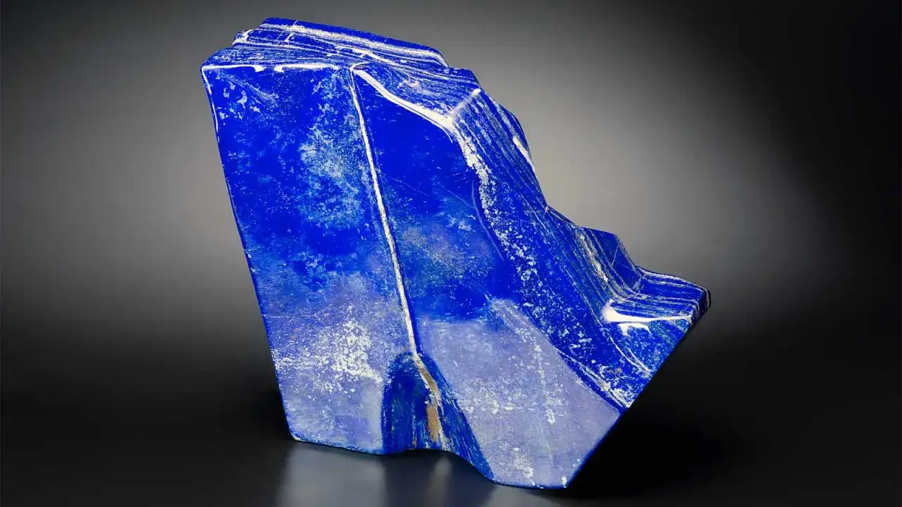
- High-quality material usually has a deep, even blue with limited white calcite and fine, sparing pyrite flecks.
- Natural ultramarine is historically important, but synthetic ultramarine gives a similar color with far greater consistency and lower cost.
- For conservation, the stone needs gentle handling; the pigment is stable, but the binder, varnish, and support still matter.
What lapis lazuli actually is
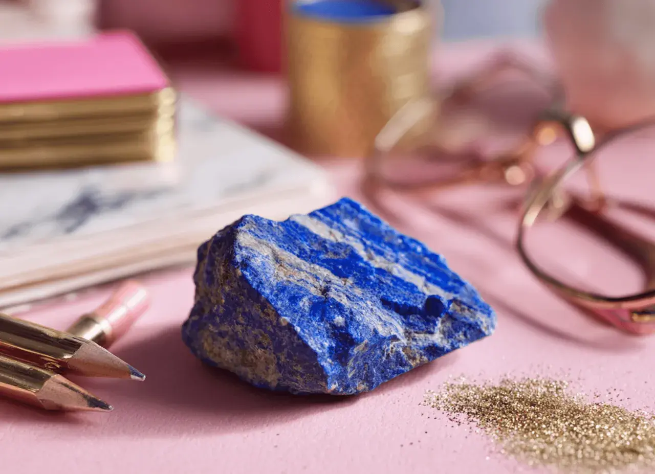
I always start with the material itself, because that is where most confusion begins. GIA describes lapis lazuli as a rock made mainly of lazurite, calcite, and pyrite, and that is the right mental model for anyone working with it in art. The blue comes from lazurite; the white veining comes from calcite; the metallic flecks come from pyrite. Those three ingredients explain most of what you see, from the richest royal-blue specimens to the paler stones that are better suited to decorative accents than to serious pigment work.
That composite structure also explains why lapis behaves differently from harder, single-crystal gems. It is usually around 5 to 6 on the Mohs scale, which is enough to polish well but not enough to treat casually. In a studio or collection setting, I think of it as a beautiful but modestly durable material: strong enough for beads, inlay, seals, and small objects, but still vulnerable to scratches, acids, and careless cleaning. That combination of beauty and fragility is part of its appeal, and it is also why proper handling matters from the first touch onward.
Once you understand that lapis is a rock rather than a pure mineral, the historical story makes more sense too, because artists were never chasing a generic blue. They were chasing the most intense fraction of a very particular stone, which is what leads naturally into its long artistic career.
Why artists prized it for centuries
The reason lapis became legendary is simple: the blue was extraordinary. When the stone was ground and processed into natural ultramarine, artists got a color that was brilliant, stable, and visually unlike most earth-derived blues. The National Gallery notes that historic ultramarine could be worth more than gold, and that level of expense changed how artists used it. It was not just a pigment; it was a signal of status, patronage, and intention.
That is why you see it so often in the most symbolically charged passages of European painting, especially in robes, skies, and sacred imagery. Mary’s mantle is the classic example, but the broader pattern is more interesting: painters used the pigment where they wanted the eye to stop. In many Renaissance and Baroque works, lapis-derived blue did not just describe fabric or sky; it elevated the entire passage. The color itself carried meaning, and the cost made that meaning visible.
The shift in the 19th century changed the economics but not the reputation. Once synthetic ultramarine became available, artists could get a comparable blue without the rarity of the stone, and that widened its use dramatically. Even so, the natural material still matters because it has a particular irregularity, a slight mineral depth, that some restorations and historically informed reconstructions still require.
| Material | What it gives you | Main limitation | Best use |
|---|---|---|---|
| Natural ultramarine | Deep, slightly granular blue with historical authenticity | Expensive and variable from batch to batch | Museum-grade reconstructions, conservation matching, premium work |
| Synthetic ultramarine | Very similar blue with strong consistency | Lacks the geological individuality of the stone | Most contemporary painting and decorative work |
| Cobalt blue | Cleaner, cooler, more opaque coverage | Less luminous in transparent layers | Direct passages, skies, and areas needing body color |
For me, that table captures the real decision. If the goal is historical accuracy, natural ultramarine still has a distinct place. If the goal is dependable studio performance, synthetic ultramarine is usually the smarter choice. The next question is how that blue actually behaves once it enters paint, plaster, or an inlaid surface.
How it behaves in paint and decorative work
In paint, ultramarine works best when the artist respects its transparency. It is not a heavy, opaque blue that will simply cover whatever sits underneath. Instead, it rewards layering, glazing, and careful mixing. In oil, it can produce luminous darks and convincing sky tones; in egg tempera or watercolor, it keeps a clean brilliance but may show more of its grain. That grain is not a defect. Used well, it gives a surface a quiet vibration that flat synthetic color sometimes lacks.
I usually advise people to think of it as a color for depth rather than force. If you mix it heavily with a white, you get elegant, atmospheric blues. If you push it with too many opaque earth pigments, you can flatten the very quality that makes it interesting. That is why it appears so often in passages where artists want blue to breathe rather than dominate. In decorative arts, the same logic applies: lapis fragments, inlay, and polished accents work best when they are allowed to read as precious details instead of trying to function like a structural material.The most common mistake I see is expecting one material to do everything. Natural ultramarine is superb in glazes and subtle color transitions, but it is not the right answer when you need heavy opacity, low cost, or an exact modern match across many objects. Knowing that boundary saves time, money, and a great deal of frustration.
How to judge quality and spot look-alikes
When I evaluate lapis, I do not start with price or origin stories. I start with what the surface actually shows. The best material usually presents a deep, even blue with limited white calcite and small, well-distributed pyrite flecks. A little pyrite can be attractive, especially in jewelry and decorative objects, but heavy white veining usually lowers the value of both the stone and the pigment yield. If the blue is flat, overly uniform, or oddly saturated, I become cautious and ask whether I am looking at a dyed imitation or a different blue stone altogether.
That is where the look-alikes matter. Sodalite is the one I see most often in confusion with lapis: it can look similar at first glance, but the texture and overall character are different, and it usually lacks the classic balance of blue body color, calcite, and pyrite that gives lapis its identity. Dyed howlite and other treated materials can also imitate the look, especially in small objects where the eye only catches color. In paintings, the problem shifts a little: synthetic ultramarine, cobalt blue, and other later pigments can visually approximate historic blues, but chronology, layering, and context often reveal more than color alone.
For authentication, I trust the microscope before I trust the label. Visual inspection tells me a lot, but lab work tells me what the eye cannot. Raman spectroscopy and related methods are especially useful when the goal is to distinguish natural from synthetic ultramarine or to check whether a blue passage fits the date and materials of the work. In other words, the surface may look right while the material story is wrong, and that gap is exactly where misidentification usually happens.
Conservation and handling that protect both stone and artwork
Lapis needs gentle treatment, whether it sits in a drawer, a ring, or a framed object. It should not be cleaned with ultrasonic machines, steam, harsh solvents, or abrasive cloths. A soft damp cloth is usually enough for light surface dirt, and even then I prefer the lightest possible approach. Because the stone can be porous and contains calcite, acidic cleaners and aggressive polishing can leave it duller than it started.
In a museum or studio context, the distinction between the stone and the paint made from it is important. The pigment ultramarine is famously stable, but the artwork around it may not be. Bindings can yellow, varnishes can craze, and supports can move. So if a blue passage looks tired, the answer is rarely to attack the color itself. More often, the issue lies in surface grime, old restoration, or the aging of surrounding materials.
That is one reason I am careful with any object that combines lapis, gilding, or other fragile finishes. A confident cleaning plan should preserve texture, not erase it. With this material, the wrong intervention can flatten the very history that makes it valuable.
What I check before I bring it into a project
When I decide whether lapis belongs in a project, I ask a short set of practical questions. Do I need historical fidelity, or do I need repeatable color? Do I want mineral character, or do I want optical cleanliness? Will the material be seen up close, where its texture matters, or at a distance, where consistency matters more?
I usually reach for natural lapis-derived blue when the story depends on authenticity, provenance, or a specifically historic look. I reach for synthetic ultramarine when I need the same color family without the cost or variability of the stone. If I need stronger opacity or a cooler, more forceful blue, I consider another pigment altogether rather than forcing lapis to do a job it was never ideal for.
In that sense, the material teaches a useful lesson: the best choice is not always the rarest one. Blue lapis is most compelling when its mineral origin, visual depth, and conservation needs are all treated as part of the same decision, because that is what separates a pretty blue from a well-chosen one.