The short answer to what color is umber is this: a dark, earthy brown with a muted, low-chroma character. In practice, it is never just one brown; raw umber leans cooler and slightly green-gray, while burnt umber shifts warmer and redder. That difference matters in painting, conservation, and close reading of historical palettes, because umber is as much a working pigment as it is a color name.
Umber is a dark earth brown, but raw and burnt versions behave very differently
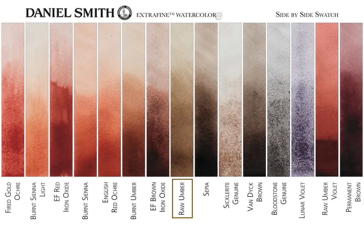
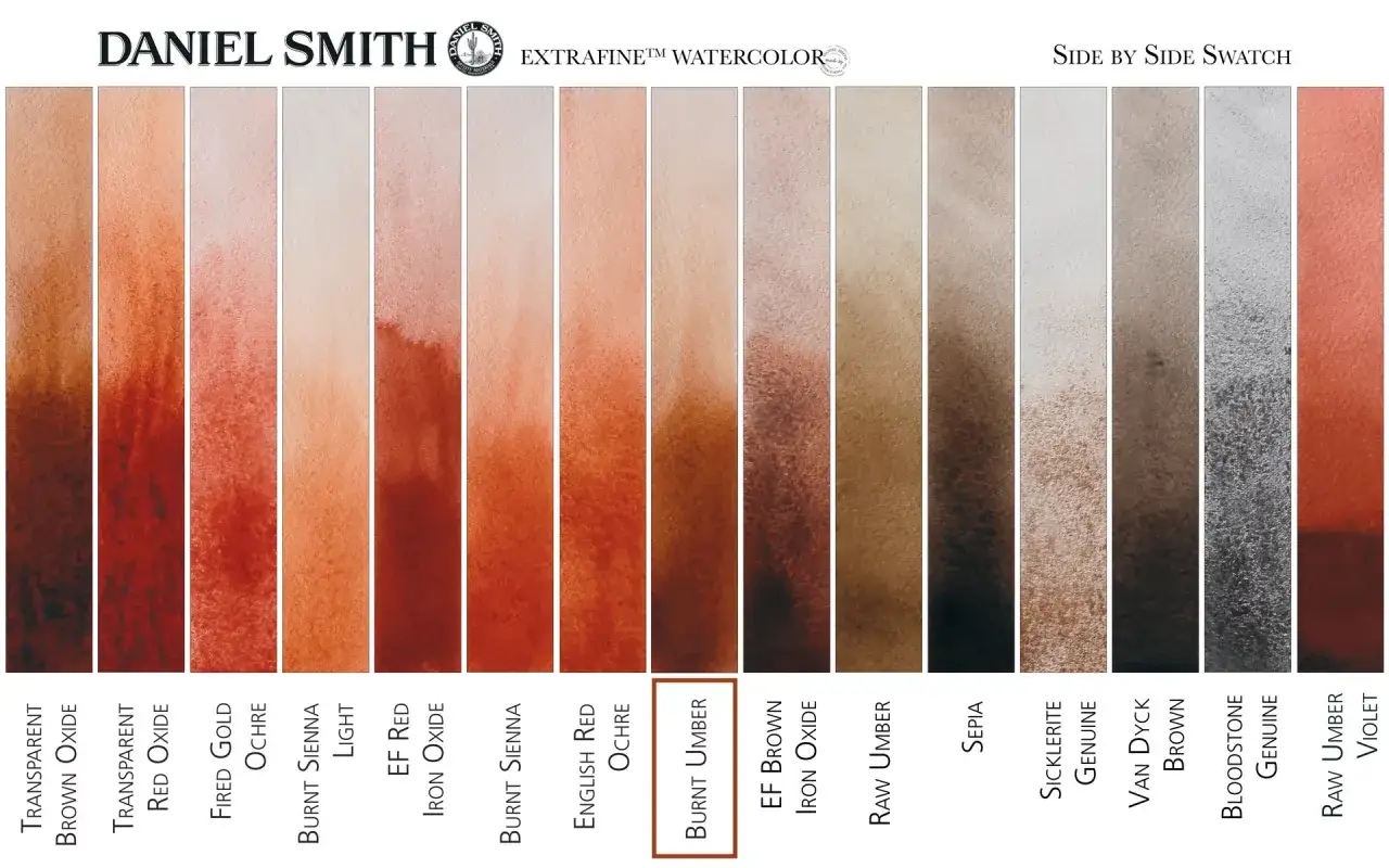
- Raw umber is usually cooler, duller, and a little green-gray.
- Burnt umber is warmer, deeper, and more red-brown.
- The pigment matters in underpainting, shadow work, and neutral mixing.
- A true single-pigment umber is often labeled PBr7, though blends also exist.
- For conservation and authentication, the pigment code and layer context matter more than the color name alone.
Umber reads as a subdued brown, not a bright one
When I look at umber on a palette, I think of soil, bark, leather, and dry wood before I think of chocolate or caramel. It has low saturation, which means the color feels restrained instead of loud, and that restraint is exactly why painters keep it around.
Raw umber usually sits on the cooler side of brown. Burnt umber moves toward a darker, warmer reddish brown. Either way, the pigment tends to feel grounded, opaque, and slightly muted, which gives it real value in shadows, hair, fabric folds, and weathered surfaces.
If you want a quick visual test, compare it with a warm orange-brown. Umber is typically less golden, less orange, and more subdued. That muted quality sets up the raw-versus-burnt split that matters next.
Raw umber and burnt umber are not the same pigment story
The word burnt is literal here: the raw earth pigment is heated, or calcined, which changes its appearance and often its working properties. I find this distinction important because many painters talk about “umber” as if it were a single brown, but the two versions solve different problems.
| Version | Visual bias | Typical feel | Best use | Watch for |
|---|---|---|---|---|
| Raw umber | Cooler, slightly green-gray, earthy brown | Muted and dry | Shadow mapping, neutral mixes, underpainting | Can look flat if the layer is too thin or the light is harsh |
| Burnt umber | Warmer, redder, deeper brown | Richer, but still subdued | Warm shadows, flesh accents, wood, glaze support | Can push a painting too red if it sits next to very warm siennas |
That table is the fast answer, but the material reason matters too. Heating changes the pigment’s character, so burnt umber usually feels more open and warm, while raw umber keeps the cooler, earthier edge. For anyone working from life or restoring an older surface, that difference is not cosmetic; it changes how value and temperature are read at a glance.
Umber sits between sienna, sepia, and black, but it is not interchangeable with them
People often group these darks together, and I understand why. They all live in the same broad world of earth colors and all can produce shadows. But they do not behave the same way on canvas, paper, or a conserved surface.
| Color | General look | How it differs from umber | Common pitfall |
|---|---|---|---|
| Burnt sienna | Warmer, more orange-red brown | Usually lighter and more openly warm than burnt umber | Can overpower a restrained shadow structure |
| Raw sienna | Yellow-brown earth | More golden and lighter than raw umber | Can read as ochre instead of shadow brown |
| Sepia | Deep neutral brown often used as a drawing tone | More of a tonal description than a single historical pigment family in modern use | Assuming the label guarantees one specific pigment behavior |
| Black | Near-neutral dark | Higher contrast, less warmth, less color life in mixes | Shadows can become dead or chalky when overmixed with white |
My rule of thumb is simple: if I want a dark that still preserves color life, I reach for umber before black. If I want a warmer, more sunlit brown, sienna usually gets me there faster. That decision point becomes even more practical once you look at how artists actually use umber on the surface.
Why painters keep it in the underpainting stage
Umber survives in modern studios because it is not just a color, it is a structure tool. In underpainting, imprimatura, and quick tonal studies, it helps establish value relationships before the painting gets complicated by full color.
Here is where I rely on it most:
- Underpainting, where a first layer maps light and shadow before local color goes in.
- Imprimatura, a thin tinted ground that removes the shock of a blank white support.
- Shadow design, because umber gives depth without the severe look of straight black.
- Glazing support, especially when a transparent warm layer needs a stable dark base underneath.
- Neutralizing bright passages, when a passage needs to be subdued without turning muddy.
In oil painting, umber is especially useful because earth pigments tend to be predictable and dependable. That reliability matters in layered work: if a dark underlayer dries in a controlled way, the painter can build on it without fighting the paint film later. In conservation terms, that predictability is one reason umber appears so often in older studios and still reads as a traditional material choice today.
I also think umber does something black often cannot do: it keeps shadow color alive. A brown shadow can still feel like wood, fabric, skin, or stone. A black shadow can collapse those distinctions if the hand is not careful. That leads naturally to the question of what the label is really telling you.
What the paint label tells you about authenticity and handling
If I were checking a tube for a serious painting or conservation study, I would not stop at the color name. I would look for the pigment code, because the code tells me whether the paint is likely a true earth pigment, a calcined version, or a blended imitation.
PBr7 is the key code you will often see for umber. In professional ranges, that usually signals a brown earth pigment associated with umber rather than a generic brown mix. That said, brands do not all formulate the same way, so two tubes with similar names can still dry and mix differently.
From a materials perspective, here is what matters most:
- Single-pigment paints are easier to predict in mixing and conservation documentation.
- Blend formulas can look like umber but may contain iron oxides, blacks, or other browns that change opacity and tinting strength.
- Earth pigments are usually valued for stability and a soft, natural handling feel.
- Historical context matters, because a brown underlayer in an old painting tells you more when you know whether it was used as a local earth pigment or a later commercial substitute.
For authentication work, I never treat the pigment name as proof by itself. I look at where the color sits in the paint structure, how it was layered, and whether its behavior matches the period materials around it. That is the difference between a useful clue and an unsupported assumption, and it is also why the practical choice of umber depends on the job at hand.
Choosing the right umber comes down to temperature, not just darkness
If I am building a palette from scratch, I choose raw umber when I want a cooler, quieter brown for shadow structure and neutral mixing. I choose burnt umber when I want a warmer dark that can support flesh, wood, earth, and aged varnish without turning the passage flat.
For most painters, the smartest move is not to treat one as better. Keep both if your work depends on control, because they solve different problems. Raw umber helps me pull color back; burnt umber helps me give shadow warmth without losing depth.
Used well, umber is less about a single answer and more about a family of dependable browns that make painting behave. If you are comparing tubes, start with the pigment code, then decide whether you need the cooler discipline of raw umber or the warmer depth of burnt umber.