Fine art portrait photography is where likeness, mood, and concept carry equal weight. The strongest portraits do not simply document a face; they arrange light, gesture, clothing, and print quality into a deliberate visual statement. In this article I break down what separates the genre from standard portrait work, how to plan and light a session, what retouching and printing should actually do, and how pricing and collecting tend to work in the U.S.
The essentials at a glance
- Intent matters more than polish. A portrait can be technically perfect and still feel empty if it has no clear emotional center.
- Light and framing do most of the storytelling. Directional light, controlled backgrounds, and disciplined crop choices shape the mood fast.
- Archival materials are part of the work. Pigment inks, cotton paper, and proper framing affect longevity as much as aesthetics.
- U.S. pricing is usually split into parts. Session fees, prints, framing, and licensing are often charged separately.
- Strong portfolios feel consistent. You want to see repeatable control of expression, tone, and print quality, not just one lucky image.
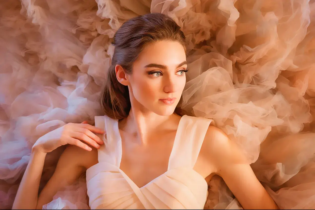
What separates a portrait from a work of art
Not every polished portrait belongs in the fine-art category. Adobe's distinction is useful here: a headshot can be excellent, but if its main job is utility, it is still a different kind of image. Fine-art portraiture is built around intent, which means the subject, the light, and the framing all support a mood, an idea, or a story rather than just a flattering likeness.
I usually ask one blunt question when I edit or commission this kind of work: what is the image trying to say about this person that a normal session would not say? If I cannot answer that in one sentence, the portrait often feels generic no matter how expensive the camera was. Once that intention is clear, the next step is making the visual choices line up with it.
That is why the genre borrows so much from painting, cinema, and theater. The portrait may still be recognizable as a real person, but it is also shaped to carry atmosphere, symbolism, or a strong emotional read. When that balance works, the image feels authored rather than merely captured, and that is the line I keep looking for.
Lighting and composition that make the image feel intentional
Lighting is the fastest way to move a portrait away from ordinary. I often start with one dominant source, such as window light, a large softbox, or a carefully placed reflector, because a single readable light pattern gives the face structure. Loop lighting is a safe starting point because it flatters most faces, Rembrandt lighting adds a stronger sense of depth, and split lighting pushes the image toward tension and drama.
Composition matters just as much. An 85mm to 135mm lens usually keeps features natural in tight portraits, while a 35mm or 50mm lens can work better when the environment is part of the story. I use tighter crops when I want intimacy and more negative space when I want the subject to feel reflective or isolated. If the background is busy enough to compete with the expression, the frame is doing too much work.
I also pay attention to the edges of the frame. A hand cut in the wrong place, a bright object behind the head, or a background tone that is slightly too close to skin tone can weaken the whole image. In portraits like these, the viewer should never have to hunt for the subject. Once the light and framing are stable, planning the session becomes much easier.
How I plan a session so the result feels authored, not accidental
I plan these sessions around a concept, not a checklist. The most useful starting point is usually three adjectives, such as quiet, ceremonial, or restrained. Those words then guide wardrobe, backdrop, makeup, pace, and editing decisions so the final portrait feels unified instead of improvised.
- Set the concept first. Decide whether the portrait should feel intimate, regal, severe, dreamy, or narrative before you touch a camera.
- Limit the palette. One dominant color and one supporting texture are usually enough. Busy wardrobe choices tend to dilute the expression.
- Direct shapes before details. I ask for posture, shoulder angle, chin position, and hand placement before I worry about tiny corrections.
- Leave room for pauses. The best frame is often the one between poses, when the subject has stopped performing for a second.
- Give emotional direction in plain language. One cue at a time works better than a long list of pose instructions.
Comfort matters more than people expect. If a subject feels rushed, over-directed, or self-conscious, the portrait usually shows it. I prefer a slower pace with a few clear adjustments rather than a relentless stream of corrections. That kind of calm is not just kinder; it produces better facial expression and more believable body language. Once the session is designed well, the finishing stage has something solid to work with.
Retouching and print choices that preserve the mood
I treat retouching as finishing, not disguise. Skin texture should stay believable, hair should still separate from the background, and color grading should support the concept rather than overwrite it. A little dodge and burn can shape the face beautifully; too much smoothing turns a portrait into plastic and strips out the very character that makes it worth keeping.
The print is not an afterthought in this genre. If the work is meant to live on a wall, I want the final surface to feel like an object, not just a snapshot on good paper. That is why pigment inks, archival papers, and controlled color workflows matter so much. A giclée print is essentially a high-resolution pigment-ink print on archival paper, and that distinction is important when longevity and collectability matter.
| Choice | What it gives you | Tradeoff |
|---|---|---|
| Pigment ink on cotton rag | Rich tonal depth, a matte or textured surface, and strong archival potential | Usually costs more and can feel less glossy than a standard photo print |
| Luster or glossy photo paper | Higher apparent saturation and a more familiar photographic finish | Can feel less tactile and less like a gallery object |
| Framed archival print with UV glazing | The most complete presentation for display and sale | Highest total cost and a little more complexity in shipping and handling |
For wall portraits, I usually lean toward matte or softly textured paper because it reads more like an art object and less like a commercial print. A practical rule of thumb for print-only pricing is roughly $1 per square inch before matting and framing, so an 11x14 print starts around $154 and a 16x20 print around $320. That is not a universal law, but it is a useful benchmark when you are deciding how much the physical work should cost.
Once the image exists as a print, pricing becomes much easier to judge. That is the bridge to the next question: what should you actually expect to pay, or charge, in the U.S. market?
What this usually costs in the United States
In the United States, portrait pricing is usually split into parts rather than sold as one all-in number. VSCO's pricing guide places portrait sessions around $150 to $350 per hour or per session, with print packages often landing between $250 and $1,500. For fine-art work, that separation makes sense because the session, the editing, the print, and the framing are each doing a different job.
| Cost component | Common U.S. range | What moves the price |
|---|---|---|
| Session fee | $150 to $350 | Experience, studio time, location work, and pre-production |
| Print package | $250 to $1,500 | Print size, paper choice, number of images, and whether framing is included |
| Standalone art print | About $1 per square inch as a starting point | Edition size, paper, signature, and presentation |
| Framing | $100 to $600+ | Frame material, glazing, mounting, and custom finishing |
I would treat those numbers as a floor, not a ceiling. A portrait intended for gallery display, a limited edition, or a custom framed piece can easily move well beyond the entry-level range. The important thing is transparency: clients should know whether they are paying for the sitting, the files, the print rights, or the final physical artwork. If that is unclear, the quote will always feel slippery.
Once you know how the work is priced, the next challenge is deciding whether a photographer is actually making the kind of images you want.
How I judge a portfolio before I book or buy
The fastest way to judge a portfolio is not to look for the strongest single image; it is to look for consistency. Does the photographer control skin tone, expression, and shadow from one portrait to the next? Do the images feel like a coherent body of work, or just a collection of lucky moments? I also check what happens at the edges of the frame, because careless hands, clipped hair, and messy backgrounds are usually where weak work shows itself first.
- Ask what paper and lab are used. The print is part of the artwork, not just the delivery method.
- Ask whether editions are limited. If there is an edition size, it should be stated clearly.
- Ask about color proofing. A good workflow should account for how the image will look on paper, not only on a monitor.
- Ask what ownership you get. Files, print rights, and commercial usage are separate questions.
- Look for repeatability. The portfolio should prove control, not luck.
This is where a preservation-minded site like Muses-et-Art.org has a real advantage in the conversation. When the subject is art rather than a one-off photo session, provenance, editioning, and materials matter. A photographer who can explain those choices clearly is usually thinking like a maker, not just a service provider. That mindset becomes even more important when the goal is for the portrait to hold up over time.
What helps a portrait hold value over time
The portraits that age best usually share a few traits: a clear silhouette, a restrained palette, a believable expression, and a print process built for longevity. Trendy effects can be fun, but they often date the work quickly. A portrait that is emotionally specific without being dependent on a fleeting style usually keeps its power far longer.
If I am making or buying the work, I want the record to be as disciplined as the image itself. At minimum, I keep the date, edition size if there is one, paper type, printer, and any relevant release or ownership notes. For display, I keep the practical rules simple: avoid direct sun, use UV-filtering glazing when framing, store unframed prints flat in sleeves, and keep humidity roughly in the 40 to 50 percent range. Those habits do not sound glamorous, but they protect both the surface and the story attached to the print.
The most durable portraits are usually the ones where every choice supports the same idea. When the concept, the light, the retouching, and the paper all point in the same direction, the result feels complete. That is the standard I use, and it is the one I would want if I were commissioning work for a private collection or building a body of art meant to last.