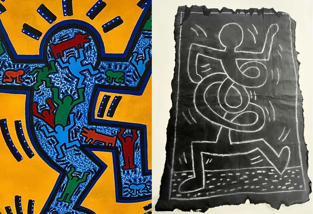
Keith Haring’s subway art is one of the clearest examples of a public work designed for speed, reach, and everyday encounter. In the early 1980s, he used white chalk on unused black advertising panels in New York City stations, turning waiting time into a live exhibition space. This article explains how the drawings were made, why they mattered, what the recurring symbols mean, and what preservation and authentication issues surround the surviving works.
The subway series was public, temporary, and deliberately legible
- Haring made the subway drawings between 1980 and 1985 in New York City stations.
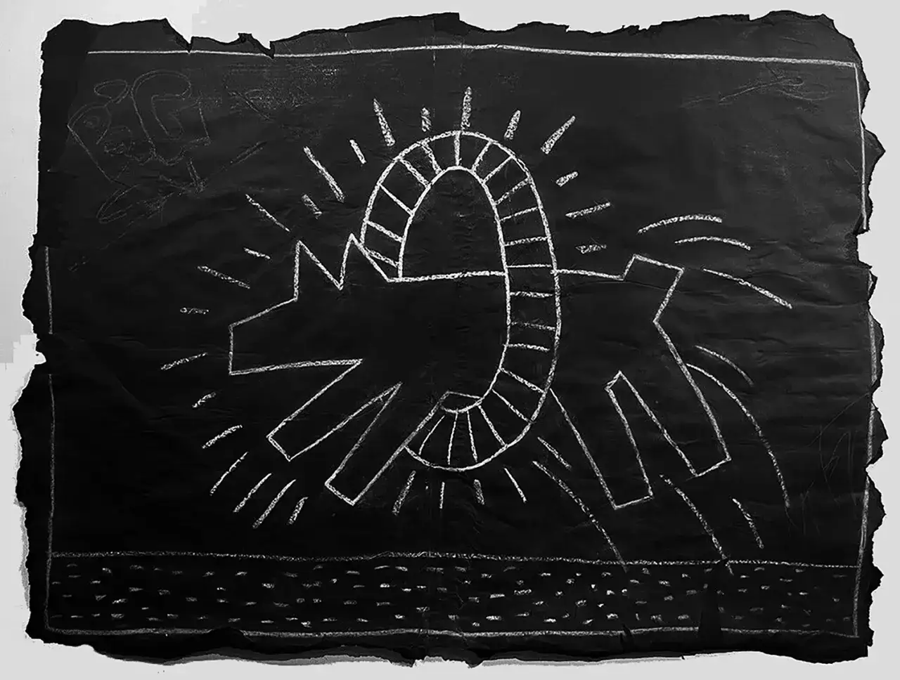
- He worked with white chalk on black paper panels that covered advertising spaces.
- The works were meant to be seen by commuters, not just gallery visitors.
- Many drawings lasted only days or weeks before being covered or removed.
- Surviving examples are rare, and provenance matters as much as style.
How Haring turned station panels into a gallery
Haring did not treat the subway as a backdrop; he treated it as the point. He later described noticing a blank panel in Times Square, going aboveground to buy chalk, and then using subway waits as working time. That detail matters because it shows the logic of the whole project: the station was not a compromise, it was the medium.
I read that choice as both democratic and tactical. The subway delivered a huge, mixed audience, and it removed the social barrier that often sits between art and the public. Someone waiting for a train did not need a museum ticket, prior knowledge, or even much time. The drawing had to earn attention immediately.
The material setup helped. Black paper panels gave him a dense field with strong contrast, so the white chalk could cut through the noise of the station. The work was also ephemeral by design: new advertisements were installed, panels were replaced, and the image could disappear almost as quickly as it appeared. That pressure pushed him toward clarity and invention, which leads directly to the visual language of the series.
Why the imagery read so fast in a moving station
The genius of the subway drawings is compression. Haring had only a few seconds to communicate, so he built a visual alphabet that commuters could recognize from a distance, in motion, and under bad lighting. Thick outlines, simplified bodies, and repeated symbols gave the work instant readability.
| Motif | What it often signals | Why it worked underground |
|---|---|---|
| Radiant baby | Innocence, energy, possibility | Its silhouette is memorable even in peripheral vision. |
| Barking dog | Power, noise, alertness | The shape is bold enough to register in a crowded station. |
| Dancing figures | Community, rhythm, movement | The repeated line work matches the pace of commuter flow. |
| Flying saucers and pyramids | Pop culture, myth, modern anxiety | They add a narrative hook without slowing the composition down. |
I do not read those symbols as a fixed code. I read them more like a portable alphabet that Haring could recombine quickly. That flexibility is part of why the drawings feel alive rather than formulaic. Once you understand the vocabulary, the harder question becomes what survives when the wall itself disappears.
What survives after the wall is covered
Most of the original works were never meant to last. They were exposed to the ordinary churn of the station: a new ad pasted over the old panel, a staff member replacing paper, a drawing worn away by time, or a collector removing a panel before it vanished. The result is a body of work that exists in two forms at once: as a public event and as scattered surviving objects.
That makes the archive uneven. There is no complete station-by-station record of every drawing, and no reliable way to reconstruct the full body of work from memory alone. Some images are documented by photographs, some by later exhibition records, and some only by fragments of testimony. In practical terms, that means any surviving drawing should be treated as both an artwork and a historical object with a specific chain of custody.
For curators and researchers, this is where the series becomes more than a street-art story. It is a case study in how public art can be lost, detached, reframed, and then re-enter the art world under entirely different conditions. That is exactly why preservation and authentication become such serious issues.
How preservation and authentication get complicated
The most important conservation fact is simple: these works were never built for permanence. Chalk on paper is fragile, and the station environment was never controlled for humidity, vibration, or handling. Once a drawing leaves the subway, its condition history starts to matter immediately.
What I would ask, in order, is whether the work has period documentation, whether its provenance is traceable, and whether its material condition matches a 1980s chalk-on-paper object. Style alone is not enough. A convincing line can still sit on a later support, and a good-looking surface can hide restoration or replacement.
| What to verify | Why it matters |
|---|---|
| Period documentation | Photos, exhibition records, and early collection notes support attribution. |
| Provenance chain | A clear ownership history is often the strongest evidence once a drawing leaves the station. |
| Material condition | Chalk loss, paper brittleness, mounting, and restoration affect both meaning and value. |
| Expert comparison | Line quality, scale, and iconography should be compared with documented examples, not guessed from memory. |
There is also a market reality that many people miss. The Haring Foundation dissolved its authentication board in 2012, and subway drawings were not treated like standard studio works even before that. So anyone claiming certainty should be able to explain the evidence, not just the enthusiasm. Once the object moves from public wall to private collection, the market and museum world start to shape its afterlife.
Why the series still matters to museums and collectors
What I find most revealing is the tension between the original public intent and the current collector reality. These drawings were made to be seen quickly by everyone, yet the surviving examples are now scarce, heavily discussed, and sometimes auctioned as high-value objects. In late 2024, a group of 31 drawings sold at Sotheby’s for $9.2 million, which tells you how much demand there is for the best-documented survivors.
That market interest does not erase the public meaning. If anything, it sharpens it. The subway project shows why Haring mattered in the first place: he collapsed the distance between art and daily life. He made an image language that could speak to a teenager, a commuter, a gallery visitor, and a curator without changing its core structure.
For museums, the challenge is to present those works without flattening their origin story. For collectors, the challenge is to understand that rarity is not just about price; it is about documentation, condition, and historical context. That practical lens is the best way to read the series today.
What I would check before treating one as a meaningful Haring work
If you encounter Keith Haring subway art today, the context matters as much as the image itself. I would start with the support, then move to provenance, then to period documentation and condition. A strong attribution usually has more than one layer of support, especially when the work began life as an ephemeral station drawing.
- Look for evidence that the support dates to the period of the subway series.
- Ask whether there is early photography or exhibition history.
- Check whether the drawing has been conserved, mounted, or materially altered.
- Compare the line, spacing, and symbol use with documented examples.
- Separate “rare” from “authentic” and “valuable” from “important.”
That distinction is the real lesson of the subway works. They were never meant to be precious, yet they became historically important precisely because they were open, fast, and public. I think that is why the series still holds up: it is not just a chapter in Haring’s career, but a clean statement about what public art can do when it is allowed to meet people where they are.