
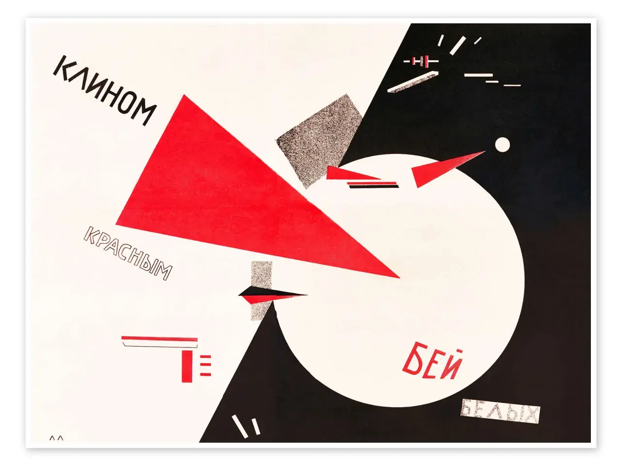
El Lissitzky’s Beat the Whites with the Red Wedge is one of the clearest examples of how modern art can act as a political statement without abandoning abstraction. The poster compresses the Russian Civil War, Suprematist geometry, and early Soviet agitation into a few hard shapes, which is why it still gets studied by art historians, designers, and collectors. Here I break down what the work means, how to read its composition, how it fits into Lissitzky’s career, and what matters when a paper work like this is preserved or authenticated.
Key facts at a glance
- Date: Usually dated 1920, as a lithographic political poster.
- Meaning: The red wedge represents Bolshevik force, and the white circle stands for the anti-Bolshevik White movement.
- Style: It uses Suprematist geometry, so the image argues through shape, contrast, and direction.
- Importance: It is a landmark in Russian avant-garde art and in the history of political graphic design.
- Care: As a work on paper, it is highly sensitive to light, humidity, and poor framing.
What this poster is and why it still matters
Lissitzky was working at the point where Russian avant-garde art, revolutionary politics, and graphic communication overlapped. Tate describes the poster as his first propaganda work, and that label is useful because it shows exactly what the artist was trying to do: use the visual language of modern art to make a political claim fast, clearly, and memorably.
I think the lasting importance of the piece is that it proves abstraction does not have to be detached from public life. The poster is not a neutral geometric exercise. It is a designed argument, and its force comes from the fact that it can be understood in seconds. That combination of speed and precision is rare, which is why the work still feels modern rather than merely historical.
Once you see it that way, the next question is how a few simple shapes can carry so much meaning.

How the red wedge turns abstraction into political argument
The composition is spare, but every element has a job. The image is built from contrast, movement, and opposition rather than from narrative illustration. That is why it works so well as propaganda: it does not explain the war, it stages it.
| Visual element | What it does | Why it matters |
|---|---|---|
| Red wedge | A sharp diagonal form pushing inward | Signals advance, pressure, and the Bolshevik side |
| White circle | A larger, enclosed mass | Stands in for the anti-Bolshevik White movement |
| Black background | An empty, high-contrast field | Makes the collision feel immediate and unsentimental |
| Typography | Direct text that frames the image as a statement | Removes ambiguity and pushes the poster into agitprop territory |
Suprematism, the abstract language Lissitzky inherited from Kazimir Malevich, was meant to move away from literal representation and toward pure form. Lissitzky adapted that language for explicitly agitational use, which is the key twist here. The wedge is not just a triangle, and the circle is not just a circle. Together they become a visual sentence about force, victory, and political direction.
That is also why the poster is often taught as a landmark in modern graphic design. It shows how a small number of forms, handled with discipline, can create a message that is stronger than a crowded image ever could.
With the visual logic in place, the historical setting becomes much easier to read.
The historical moment behind the image
The poster belongs to the Russian Civil War, usually dated to 1920, when Bolshevik forces fought the anti-Bolshevik White movement. That context matters because the title is not decorative. It names a real political conflict and turns it into a compact visual diagram. Lissitzky was working in Vitebsk in the orbit of UNOVIS, a collective that pushed Suprematist ideas toward public, revolutionary use.
The image feels tidy because propaganda often has to simplify what history refuses to simplify. The civil war was fractured and brutal, but the poster reduces it to red, white, and black, then tells the viewer how to read the conflict in a single glance. I would call that reduction both the poster’s strength and its limitation. It is powerful precisely because it leaves out complexity, yet that omission is also what makes it historically revealing.
That leads naturally to the practical side of the story, because famous posters are often copied, reprinted, and mislabeled.
What to check when identifying or authenticating a print
If I were evaluating a copy of this work, I would not start with the title alone. I would start with the object itself. The most common mistake is assuming that any clean image of the design must be a period print. In reality, later reproductions, posters after Lissitzky, and modern decor prints can all look convincing at a glance.
| Checkpoint | What to verify | Why it matters |
|---|---|---|
| Medium | Period lithograph or offset lithograph on paper, not a digital print | The printing process changes the look, feel, and value of the object |
| Provenance | Ownership history, exhibition records, collection notes, or sale documentation | Paper trail is one of the best defenses against misattribution |
| Surface and ink | How the ink sits on the sheet, whether the image is too sharp, and whether the paper looks mechanically uniform | Modern reproductions often look flatter or too perfect |
| Labeling | Exact title, date, publisher, and any notes about later editions or reproductions | Vague descriptions usually mean the listing is incomplete |
| Condition | Natural toning, old mounting residue, or honest conservation repairs | Condition tells you whether the sheet has been treated as a historic object or as a decorative print |
The Art Institute of Chicago records the work as a 1920 offset lithograph, which is a useful reminder that museum descriptions may differ depending on the object in question, the impression, or the way a work has circulated. For a buyer, curator, or researcher, the safest approach is simple: ask for the back of the sheet, the measurements, the paper description, and the full provenance. If a seller cannot explain whether you are looking at an original poster, a later authorized impression, or a modern reproduction, I would treat the listing as unfinished.
That same caution matters when the work is preserved, because paper ages in very specific ways.
How to preserve a paper work like this
A lithographic poster from 1920 is not fragile in a sentimental sense, but it is highly vulnerable to light, poor humidity control, and bad framing. For sensitive works on paper, I would keep display levels around 50 lux when possible, because prolonged bright light accelerates fading and paper damage. Stable conditions matter just as much as low light.
| Care area | Practical target | What you are preventing |
|---|---|---|
| Light | About 50 lux for sensitive paper works, with limited display time | Fading, embrittlement, and uneven deterioration |
| Relative humidity | Roughly 45-55%, with minimal fluctuation | Cockling, mold risk, and stress on the fibers |
| Temperature | About 65-70°F (18-21°C) | Faster chemical aging and unstable storage conditions |
| Framing | Acid-free mounting, UV-filtering glazing, and a spacer so the sheet does not touch the glass | Surface abrasion, glazing contact, and light damage |
| Handling | Minimal handling, clean hands or appropriate gloves, and rigid support during movement | Tears, creases, and handling stains |
Two paper terms are worth knowing here. Foxing refers to small brown spots that can appear as paper ages, often because of moisture or oxidation. Cockling is the waviness that develops when paper has absorbed and released moisture unevenly. If either is present, it does not automatically ruin the work, but it does tell you the sheet has lived through environmental stress and needs careful treatment.
Good conservation is not about making the poster look new. It is about slowing further change while keeping the historical object legible. That distinction matters, especially for a work whose power depends on the sharpness of its contrasts.
What this poster still teaches us about modern visual language
What I keep coming back to is that Lissitzky did not separate form from message. He made the message itself into form. That is why this poster still reads clearly in a museum, in a textbook, or on a conservation report. It remains a model of how a single directional shape can carry more force than a complicated scene.
- For art historians: it is a concise case study in the shift from pure abstraction to political abstraction.
- For collectors and curators: it is a reminder to verify medium, provenance, and condition before assuming a print is original.
- For designers: it shows that clarity often beats ornament when the message needs to land fast.
Seen that way, the red wedge is not just a symbol of one side winning a war. It is a compact demonstration of how art, typography, and geometry can be fused into a single persuasive image, and that is exactly why the poster still deserves close looking.
