Fernand Léger paintings are a clear way to understand how modern art turned machines, city life, and ordinary objects into a bold visual language. In this article, I focus on what makes his work distinctive, how his style developed, which canvases matter most, and what to look for when a Léger work is being studied, displayed, or evaluated.
The essentials at a glance
- Léger turns Cubism into something sharper and more graphic, with cylinders, blocks, and hard contours instead of soft fragmentation.
- His paintings move through clear phases: early abstraction, postwar machine-age imagery, domestic and mural-scale figures, and later simplified scenes.
- Scale is part of the meaning; many works feel built for wall-sized viewing even when they are easel paintings.
- People, objects, and machines often share the same importance in a composition, which is one reason his art still feels modern.
- For authentication and preservation, condition matters because Léger’s clean color blocks and contours are easy to disrupt.
What makes Léger's paintings instantly recognizable
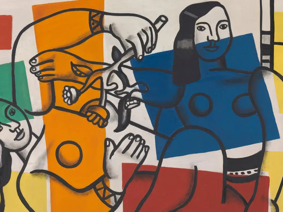
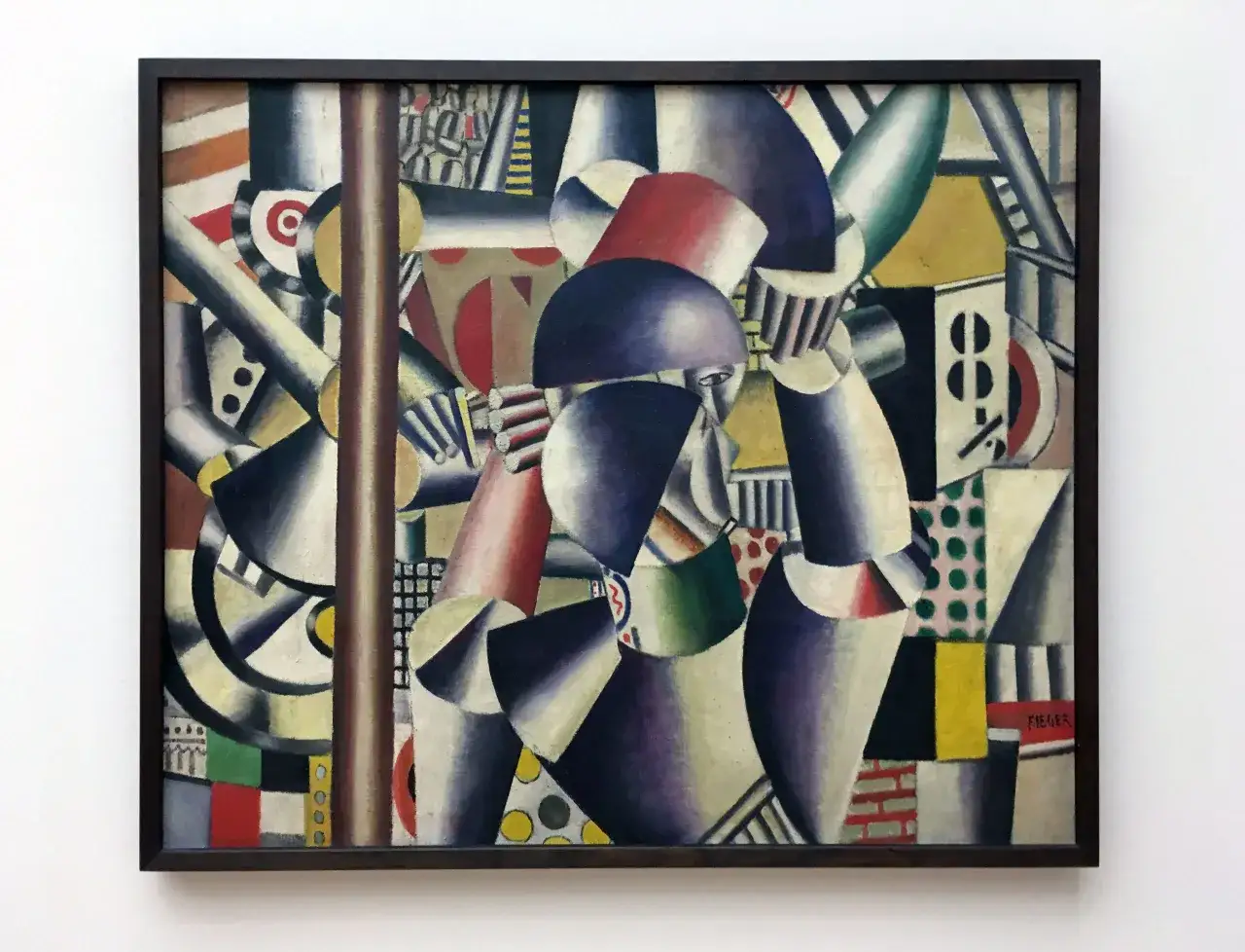
When I look at Léger, I do not start with symbolism. I start with structure. His early idea of Cubism, often called tubism, breaks forms into cylinders, cones, and other solid units, so even a figure, a pipe, or a city block can feel engineered rather than softly observed.
That hard-edged clarity is the core of his style. He prefers flat color, strong contour, and shallow space over atmospheric depth, and he lets the painted object keep its shape instead of dissolving it into light. The result is not decorative simplicity. It is a disciplined visual order that makes modern life look legible, almost systematized.
One detail I keep coming back to is how often Léger gives objects the same visual weight as people. A bottle, a chair, a hand, and a machine part can all sit inside the composition with equal authority. That decision matters because it shifts the painting away from narrative and toward construction. It also explains why his best work feels surprisingly current: it sees the world as a set of interlocking forms, not a hierarchy of subjects. That shift becomes easier to track once you look at the main stages of his career.
How his style changed across the main periods
I read Léger's career in four broad movements, each one still connected to the last. He does not abandon one visual language for another; he keeps refining the same basic problem of how to paint modern life without making it look sentimental or vague.
| Period | Approximate focus | What changes in the work | Why it matters |
|---|---|---|---|
| Early experiments | c. 1908-1913 | Forms become fractured into tubes, cones, and blocks; illusion gives way to construction. | This is where Léger moves closest to abstraction and defines his personal version of Cubism. |
| War and immediate aftermath | 1914-1919 | Industrial life, urban rhythm, and mechanical energy become more explicit. | The paintings begin to treat modernity as a lived environment, not just a formal experiment. |
| Figure and interior work | 1920s | People return in monumental, simplified forms; interiors and still lifes take on mural-like balance. | This is the phase many viewers remember first because it joins clarity with human presence. |
| Late figurative work | 1940s-1950s | Acrobats, women, flowers, and leisure scenes become brighter, cleaner, and more accessible. | The late paintings show that simplification does not mean weakening; it often means greater confidence. |
MoMA's reading of Three Women is useful here because it frames the painting as a machine-age update to a traditional subject, and that is exactly the kind of synthesis Léger kept pursuing. He was not chasing novelty for its own sake. He was trying to make modern life feel visually coherent. The clearest way to see that aim is to look at a handful of key works side by side.
Six paintings that show the range of his work
If I had to introduce Léger through a small set of paintings, I would choose works that show different answers to the same question: how do you paint the twentieth century without flattening it into design? These canvases are useful because each one emphasizes a different facet of his thinking, from radical abstraction to domestic order and late figurative clarity.
| Work | Date | What to notice | Why it matters |
|---|---|---|---|
| Contrast of Forms | 1913 | Repeated geometric volumes, blocked color, and exposed mechanics of representation. | This is one of the clearest early statements of his abstract method and his interest in structure. |
| The City | 1919 | Urban fragmentation, signage-like rhythms, and the energy of modern streets. | It shows how his art absorbs metropolitan life without becoming chaotic. |
| Three Women | 1921-22 | Monumental figures, metallic surfaces, and a domestic setting organized like machinery. | This is one of his strongest bridges between the human figure and industrial modernity. |
| Mural Painting | 1924 | Tall vertical format, clear blocks of color, and a composition that reads at wall scale. | It makes his mural-minded ambition explicit, even within a canvas format. |
| Leaves and Shell | 1927 | Still life elements simplified into bold shapes with a strong graphic pulse. | It shows how he could turn nature and object study into a disciplined modern composition. |
| The Acrobat and his Partner | 1948 | Late figures reduced to clean, confident forms with a lighter visual tone. | It proves that his late work stays modern without relying on the harder industrial vocabulary of the 1910s. |
| Two Women Holding Flowers | 1954 | Bright, approachable figure painting with simplified shapes and decorative clarity. | This late canvas is a good reminder that Léger never lost his taste for clarity, even when the mood softened. |
What I like about this group is the range. Léger is often reduced to one look, but these paintings show that he could move from almost severe abstraction to warm, human scenes without abandoning his core principles. Once those principles are familiar, the next step is to read a Léger painting the way a conservator or curator would: as an object with a history, not just an image.
How to read a Léger painting in a museum or collection
When I evaluate a Léger work in person, I ask three practical questions: does the composition still feel built, does the surface still support the color structure, and does the documentation make sense for the claimed date? That is a more useful approach than trying to force every painting into the same category.
Start with the structure
The first thing to check is whether the painting still has its internal architecture. A convincing Léger usually has a firm hierarchy of shapes, with contours that organize the eye rather than merely outline objects. If the geometry feels loose or decorative without internal logic, the work starts to read as a summary of Léger instead of Léger himself.
- Look for cylinders, bars, spheres, and blocks that lock together cleanly.
- Notice whether black contour lines carry structural weight instead of acting as decoration.
- Check whether the space stays intentionally shallow, which is one of his signature choices.
Then check the surface
Léger’s paintings depend on crisp relationships between color areas, so condition is not a minor issue. Abrasion, overcleaning, heavy retouching, or a weak varnish layer can flatten the very qualities that make the work read correctly. In a painter whose forms are already simplified, small surface losses can have a disproportionate effect.
- Watch for color shifts at edges, especially where one block meets another.
- Check whether darks still have density and whether bright areas still feel deliberate.
- Compare the handling of paint with known examples from the same phase of his career.
Read Also: Gwen John Paintings - Unlocking Her Quiet Power & Style
For attribution, follow the paper trail
I would never rely on a signature alone. For a Léger attribution, the useful questions are provenance, exhibition history, literature, old labels, and consistency of materials with the period in question. If a work is presented as an important original but lacks a coherent history, that gap matters. In the U.S. market especially, where modernist works are frequently reproduced and widely circulated, the paper trail is often the difference between confidence and guesswork.
That is also where a collector or institution has to be realistic: a painting can be visually convincing and still fail on documentation, or the reverse. A careful study should be able to explain the support, the pigments, the format, and the chain of ownership in a way that matches what Léger was doing at that moment. With that in mind, it becomes easier to see why his art still feels alive rather than merely historical.
Why Léger still feels modern in 2026
What keeps Léger relevant is not nostalgia for early modernism. It is the way his paintings anticipate how we now see the world through screens, graphics, interfaces, and compressed visual signals. He understood that modern life is built from strong shapes and repeated signs, and he made that fact visually persuasive instead of merely theoretical.
I also think his work matters because it refuses to separate the beautiful from the mechanical. Bodies, bottles, buildings, and tools all deserve the same compositional seriousness in his hands. That idea now feels very contemporary, especially in a culture that moves constantly between design, branding, and art. It is one reason Tate's framing of Léger as a forerunner of pop art still makes sense: he gave everyday visual language a monumental presence without stripping it of character.
His paintings also travel well across mediums. The same logic that works in a canvas can expand into murals, stage design, textiles, and graphic work, which is why the paintings never feel isolated from the rest of his output. They are part of a larger vision of art as something public, legible, and fully integrated into modern life. That makes the last question less about style and more about judgment: what should you look for when a Léger is in front of you?
The clues I would check before calling a Léger canvas convincing
If I had to make a fast but serious assessment, I would look for a few non-negotiables. The best Léger works do not merely use bold shapes; they balance them. The forms feel inevitable, the colors feel placed rather than sprayed on, and the image keeps its authority even when you stand a few feet away.
- Does the composition have internal discipline? If the shapes are loud but not ordered, the painting loses the Léger effect.
- Do the colors support the structure? In his best work, color is not an accessory; it is part of the architecture.
- Does the scale feel intentional? Léger often thinks like a mural painter, so a work that feels cramped can miss the point.
- Does the subject matter sit inside the design? People, objects, and space should feel integrated, not pasted together.
- Does the history of the work make sense? Period, medium, provenance, and condition should all tell the same story.
That is the practical lens I would use whether I were studying a museum canvas, reviewing a private collection, or assessing conservation issues. Léger is at his strongest when the painting still feels built, not merely illustrated, and that is why the best examples remain so compelling: they keep modern life orderly without pretending it is simple.