
Tone gives an artwork or a passage its first emotional temperature. When readers ask what is tone, they are usually asking two different questions at once: how artists use light and shadow, and how writers create attitude with language. I am separating those meanings here because the distinction is small on paper but huge in practice.
The short version is that tone shapes both visual structure and emotional attitude
- In visual art, tone refers to the relative lightness or darkness of a color, mark, or surface.
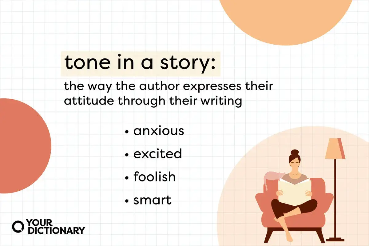
- In literature, tone is the speaker’s or author’s attitude toward the subject and the audience.
- Tone is not the same as mood. Mood is the feeling the audience receives; tone is the stance or structure that helps create it.
- Materials matter because graphite, charcoal, ink, watercolor, oil, and pastel all produce different tonal behavior.
- In preservation and authentication, changes in tone can point to varnish aging, fading, retouching, or overcleaning, but tone alone never proves anything.
- The fastest way to study tone is to step back, reduce detail, and judge the work in terms of light mass, dark mass, and middle value.
What tone means in art and literature
In visual art, tone is the lightness or darkness of a color or mark. In many studios, artists use tone and value almost interchangeably, although some instructors keep value for the scale itself and tone for the broader tonal character of the image. In literature, tone means something different: it is the writer’s attitude, which may be formal, ironic, intimate, severe, playful, detached, or mourning.
That split matters because each medium uses tone to guide interpretation before the viewer or reader consciously explains why the work feels a certain way. A charcoal study can feel tense because its darks are compressed and its lights are exposed. A short paragraph can feel cold because the narrator sounds clinical and unsympathetic. In both cases, tone is doing real structural work, not just decorating the surface.
- Visual tone organizes light, shadow, and form.
- Literary tone organizes attitude, voice, and emotional distance.
- Both influence how quickly the audience trusts, resists, or settles into the work.
Once that distinction is clear, the next question is not definition but effect: why tone changes the way a work reads.
Why tone changes the way a work reads
I treat tone as one of the first things the eye and mind register. Before symbolism, subject matter, or narrative structure becomes clear, tonal organization tells us where to look and how to feel about what we are seeing. A narrow tonal range can make a painting quiet, atmospheric, or compressed. A wide tonal range can make it dramatic, sharp, or theatrical.
Tone can change the same subject without changing the subject itself. A still life with soft midtones may feel hushed and contemplative; the same arrangement pushed into hard contrast can feel severe or even confrontational. In prose, the same event can sound compassionate, satirical, or bureaucratic depending on sentence length, diction, punctuation, and how much the narrator reveals or withholds.
This is why tone is never an afterthought. It can alter the emotional read of a portrait, the weight of an interior scene, or the temperature of a memorial text without changing a single object or event. From there, the practical question becomes how artists actually build that effect with materials.
How materials and techniques build tonal range
Different materials handle tone in different ways, and that difference is not cosmetic. Some media invite gradual transitions; others are better for bold contrast or crisp edges. When I look at a work on paper or canvas, I usually ask two questions first: how much tonal range does the medium allow, and how controlled is the artist’s handling of it?
| Material or technique | Tonal behavior | Why it matters |
|---|---|---|
| Graphite | Clean midtones, precise edges, subtle gradation | Useful for studies, underdrawing, and controlled modeling of form |
| Charcoal | Deep blacks, soft transitions, wide expressive range | Excellent for dramatic contrast and rapid block-in work |
| Ink wash | Transparent layers and gentle tonal shifts | Good for atmosphere, distance, and delicate shadow structure |
| Watercolor | Luminous light areas with limited lifting once darkened | Rewards planning because tone often depends on preserving the paper |
| Oil glazing | Rich, layered depth with slow tonal buildup | Creates the kind of tonal complexity often associated with classical painting |
| Pastel | Immediate color and tone, soft edges, strong surface presence | Useful when the artist wants a velvety transition or luminous flesh tones |
| Chiaroscuro-based painting | High-contrast light and dark | Directs attention forcefully and can make form feel sculptural |
What I find most useful here is the relationship between surface and light. Transparent media let the paper or ground do part of the work. Opaque media can sit on top of the surface and push contrast more aggressively. That is why a tonal study in charcoal feels different from one built in thin oil glazes, even when both are aiming at the same subject.
Once the material side is clear, the next confusion is usually terminology, especially the differences between tone, value, mood, color, and atmosphere.
Tone versus value, mood, color, and atmosphere
This is where a lot of beginners get tripped up, and I see the same confusion in writing and art analysis alike. Tone, value, mood, color, and atmosphere overlap, but they are not identical. If you keep them separate, your reading becomes sharper and your own work becomes easier to control.
| Term | What it means in art | What it means in writing |
|---|---|---|
| Tone | Lightness, darkness, and overall tonal character | Attitude or stance toward the subject |
| Value | The measurable light-dark scale | Not a standard literary term |
| Mood | The feeling the viewer receives from the work | The emotional effect on the reader |
| Color | Hue, saturation, and temperature | Word choice that can create color imagery |
| Atmosphere | The overall spatial or emotional environment of the image | The larger felt environment of the scene or passage |
In practice, value is the sharpest technical term for lightness and darkness, while tone often covers the lived experience of that scale in the finished work. In literature, tone is closer to voice and attitude, while mood is closer to the emotional climate the reader absorbs. I have found that once people separate those two pairs, they start reading art and prose with much more confidence.
That distinction matters even more when a work has been cleaned, restored, or examined for authenticity.
Why tone matters when you study a preserved work
On a conservation table, tone is not just aesthetic. It can be evidence. A painting that looks too yellow, too flat, or too dark may not have changed because the artist intended it that way. It may have changed because varnish aged, surface dirt accumulated, pigments faded, or past retouching altered the balance of the image.
- Yellowed varnish can compress highlights and darken midtones.
- Fading pigments can flatten the original tonal range.
- Overpainting can interrupt subtle transitions and create hard, unnatural patches.
- Overcleaning can strip away glaze layers and make a surface feel visually thin.
- Technical imaging and material study are needed before anyone treats tonal change as a sign of authorship or forgery.
I would be careful here: tone can support an attribution conversation, but it never settles one by itself. Authentication depends on a cluster of evidence, including support, ground, pigments, brushwork, craquelure, provenance, and any later intervention. Tone is valuable because it reveals whether the work is reading as the artist likely intended, but it is only one part of the larger diagnostic picture.
That is why I start with a simple eye-training routine rather than a stack of theory.
A simple way to train your eye for tone
The best tonal reading is usually the simplest one. When I teach this, I begin by removing as much distraction as possible: step back a few feet, squint slightly, and ignore detail until the big value masses make sense. If the work still holds together in simplified form, the tone is probably doing its job.
- Look first for the darkest dark, the lightest light, and the middle tone.
- Check whether the transition between those areas feels smooth, abrupt, or intentionally broken.
- Compare edges, because sharp edges usually intensify tonal contrast while soft edges diffuse it.
- View the work in neutral light, since warm bulbs and colored walls can distort tone.
- Use a grayscale photo preview when you want a quick reality check on tonal structure.
If a drawing still reads clearly in grayscale, the artist has built a solid tonal foundation. If it collapses, the problem is usually not detail but structure. That is the practical lens I keep returning to: tone is the backbone that lets form, language, and feeling hold together, and once you learn to see it, you start reading art more accurately and making it more deliberately.