Drawing is one of the most direct ways artists think on paper, board, or screen. To answer what is a drawing in a useful way, I start with the medium itself, then move into the materials, mark-making techniques, and the preservation concerns that separate a casual sketch from a work meant to last. If you understand how line, tone, surface, and support work together, the medium becomes much easier to read and to make.
Key points to know before you look closer
- Drawing is built from marks, line, tone, and gesture on a support such as paper, board, or a digital surface.
- Materials matter: graphite, charcoal, ink, chalk, pastel, and digital brushes each create a different visual language.
- Technique changes everything. Hatching, contour, blending, and erasing can make the same subject feel precise, loose, or atmospheric.
- Not every drawing is a quick sketch. Finished drawings can be independent artworks, studies, or mixed-media pieces.
- Because many drawings are works on paper, they are often more sensitive to light, humidity, and handling than works on canvas.
- The strongest drawings usually show control of edges, value, proportion, and intentional mark-making, not just technical polish.
What a drawing really is
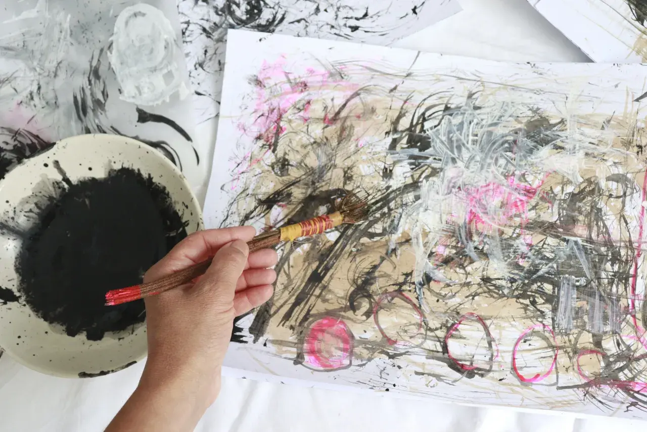
I think of drawing as the art of making decisions visible. At its core, it is a composition created primarily through marks rather than through modeled masses of paint or carved form, and those marks can be as simple as a pencil line or as complex as layered washes, ink, pastel, and erasure. In museum language, the definition is pragmatic. MoMA treats drawings as unique works, often on paper, made with dry or wet media, but contemporary artists have pushed that idea into thread, tape, and other mark-making systems.
That flexibility matters because drawing is defined less by a single material than by the logic of direct mark-making. A sketch made in 30 seconds, a finished portrait, and a preparatory study for a larger work can all belong to the same medium if line, tone, and gesture are doing the main visual work. The subject can be almost anything. What makes the piece a drawing is the way the artist has organized marks on a support. Once that distinction is clear, the next question is practical: what do those marks come from?
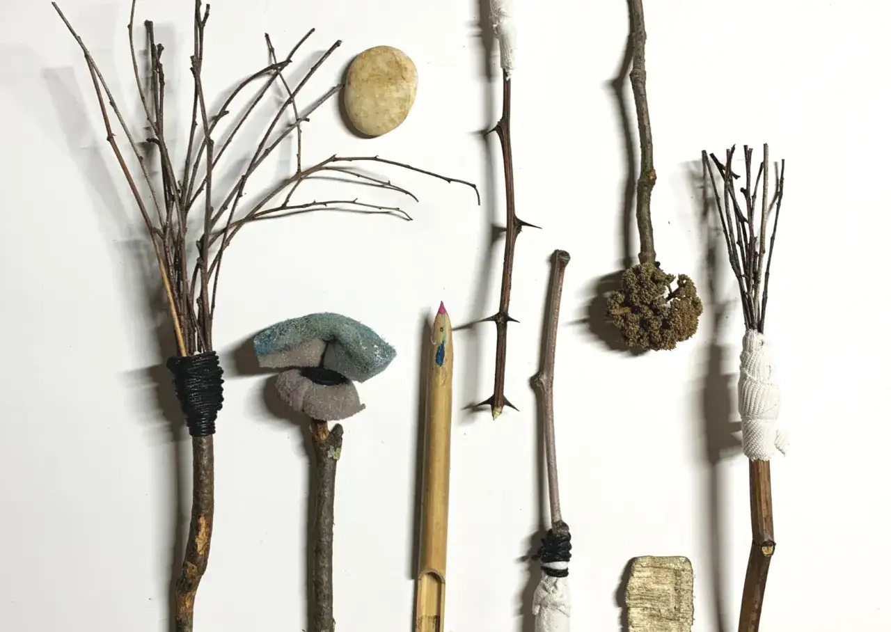
The materials that shape the medium
Materials do not just change the look of a drawing. They change its behavior, its speed, and even the kind of thinking it invites. A sharp graphite point rewards precision, while charcoal encourages broader, more physical movement. Paper also matters. Smooth sheets favor crisp line, while paper with more tooth catches loose particles from charcoal, pastel, and conté and gives the surface a more tactile finish.
| Material | What it does best | Typical feel | Main tradeoff |
|---|---|---|---|
| Graphite | Clean line, subtle shading, controlled detail | Versatile and precise | Can become shiny if heavily layered |
| Charcoal | Deep blacks, soft transitions, expressive gesture | Bold and atmospheric | Smudges easily and needs careful handling |
| Ink | Strong contrast, decisive edges, calligraphic line | Sharp and immediate | Hard to erase, so mistakes stay visible |
| Colored pencil | Layered color, fine detail, illustration work | Controlled and patient | Color builds slowly |
| Pastel | Soft color, luminous surfaces, painterly blending | Velvety and tactile | Fragile surface, easy to disturb |
| Digital brush | Flexible revisions, layered workflows, stylistic variety | Adaptable and fast | Depends on software, device, and screen calibration |
As a rule of thumb, many sketchbooks sit in the 90 to 120 gsm range, which is fine for quick studies and dry media, while heavier papers around 150 to 300 gsm hold up better when you erase hard, layer heavily, or add light washes. If you are choosing paper for serious practice, I would rather see a modest tool set on the right surface than a crowded kit on the wrong one. The medium starts to make sense when the support and the mark agree, and that is where technique comes in.
Techniques that build line, tone, and depth
Technique is where drawing stops being a generic category and becomes a language. Two artists can use the same pencil and produce completely different results because they handle line, pressure, spacing, and value in different ways. In practice, good drawing is not just about copying an image. It is about organizing marks so the eye understands form, light, and movement.
Line and contour
Contour drawing follows the visible edges of a subject, often slowly and with close observation. It is one of the best ways to train the eye because it exposes where your hand wants to simplify too early. A contour line can be clean and elegant, but it can also be varied, broken, or thickened to describe weight and direction. I use contour work when I want to see whether the structure of a subject is actually understood, not merely guessed.
Hatching and cross-hatching
Hatching uses parallel lines to build tone, while cross-hatching layers lines in different directions to deepen shadow and model form. The direction of the line matters as much as the density. If the marks follow the turn of a cheek, a sleeve, or a piece of fruit, the surface begins to feel three-dimensional instead of flat. This is one of the oldest and most reliable methods in drawing because it gives the artist control without relying on heavy blending.
Shading, blending, and erasing
Shading creates gradual shifts from light to dark, and blending softens the transitions between those values. Used well, it can produce atmosphere and volume. Used badly, it turns everything into a smudged middle gray. I usually think of erasing as a drawing tool rather than a correction tool. A kneaded eraser can lift highlights, open space in shadow, or clean an edge, which means subtraction can be as expressive as addition. That said, too much blending too early often flattens the drawing, so it is better to preserve some structure in the marks.
Gesture and proportion
Gesture drawing captures movement quickly, often in 30 seconds to 2 minutes, and it is less about detail than about energy, balance, and action. Proportion keeps the drawing believable by measuring how parts relate to each other. If the head is too large, the hand too small, or the shoulder line too high, the whole image feels off even when the line work is beautiful. This is why many instructors push gesture and proportion together. One teaches speed and confidence, the other keeps that speed from becoming sloppy. Once those techniques are in place, the next step is recognizing the different kinds of drawings artists actually make.
Common drawing types and when each one works
Different types of drawing solve different problems. Some are meant to observe, some to plan, some to communicate, and some simply to explore form in a way that no other medium can match. I find it useful to think in terms of purpose first and style second, because the function of the drawing usually shapes the look more than the other way around.
| Type | Main purpose | What it teaches |
|---|---|---|
| Gesture drawing | Capture movement and action quickly | Speed, observation, proportion under time pressure |
| Contour drawing | Track edges and outlines with care | Patience, accuracy, visual discipline |
| Life drawing | Study the human figure from observation | Anatomy, balance, weight, and pose |
| Still life drawing | Work with light, objects, and composition | Value control, shape relationships, and spatial planning |
| Technical drawing | Communicate measured information clearly | Precision, scale, and clarity |
| Expanded drawing | Use thread, tape, collage, or other materials to extend the idea of line | How drawing can leave the page without losing its identity |
That last category is more important than it first appears. MoMA’s exhibition history on drawing shows how artists have repeatedly moved the medium beyond the page, turning line into spatial action and mark-making into something closer to installation. The lesson is not that paper no longer matters. It is that drawing is broader than many people assume. Once you see that range, it becomes easier to understand why conservation and condition matter so much.
Why paper condition matters in preservation and authentication
Because many drawings are works on paper, they age differently from paintings on canvas or sculpture in durable media. The Library of Congress advises cool, dry, stable storage and minimal light exposure for paper-based collections, and that is not overcautious. It reflects how quickly paper and media can change when they are exposed to humidity swings, pollutants, heat, or rough handling. Even a beautiful drawing can lose clarity if the sheet yellows, ripples, or sheds its surface.
- Foxing shows up as small brown spots, often tied to age or moisture.
- Cockling is a rippled or wavy surface caused by moisture changes.
- Smudging is common with charcoal, pastel, and other loose media.
- Fading can reduce contrast in light-sensitive inks and pigments.
- Acid staining can come from poor-quality mats, adhesives, or paper.
When I look at a drawing for historical or authentication purposes, I do not start with the signature. I start with the support, the pressure of the mark, the erased passages, the paper edges, and any watermarks or inscriptions that match the period and medium. None of those clues prove authorship on their own, but together they can tell a convincing story about how the work was made and how it has lived. If you want to make stronger drawings yourself, the fastest gains usually come from simplifying the setup rather than multiplying the tools.
A practical way to begin without overcomplicating it
The best entry point is a small one. A 9 x 12-inch sketchbook, one graphite pencil in the HB to 2B range, a kneaded eraser, and a stable chair near a window are enough to begin seriously. You do not need a large studio to learn how drawing works. You need repetition, observation, and a habit of comparing one mark to the next.
- Start with 5-minute gesture drawings to loosen your hand and stop overthinking the page.
- Move to 10-minute contour studies so you can watch how edges behave.
- Draw one simple object under a single light source and focus only on value shifts.
- Repeat the same subject in a different medium, such as charcoal or ink, to see how the material changes the result.
- Review the page for line economy, proportion, and edge control instead of chasing perfection.
The common mistake is to start with detail too early. Beginners often outline every object, fill the page with texture, and then wonder why the drawing feels lifeless. I would rather see a drawing with a few strong decisions than one covered in hesitant marks. A subject becomes convincing when the structure is clear, not when every surface is overworked.
The marks that make a drawing worth returning to
- Support should suit the medium, especially if the work uses charcoal, ink, pastel, or wash.
- Value structure should still read clearly if you step back from the page.
- Line quality should vary with purpose, not stay mechanically uniform.
- Process should be visible enough to show judgment, not so hidden that the work loses character.
- Condition matters, because a drawing can be altered by light, humidity, and handling long after the artist finishes it.
If I strip the medium down to its essentials, drawing is the art of making thought visible through marks. The strongest sheets are not always the most polished; they are the ones where the support, material, and intention line up cleanly. That is the standard I keep coming back to whether I am studying a museum work, evaluating a sketchbook page, or starting a new drawing from scratch.